Fluid ResponsiveDesign Philosophy
First published by Pat Godfrey: July 2017
…
Applying a Fluid Responsive philosophy makes development easy and offers additional opportunities for a great user experience across devices, and across viewports; even within emerging ('mobile-first') development frameworks such as Google's Accelerated Mobile Pages (AMP) project*.

* For an AMP balance also read the Register's Kill Google AMP before it KILLS the web article.
Shared Learning
Flag this content to your friends, connections, and colleagues.
Fluid Responsive?
Responsive Web Design (RWD) is a great methodology that may increase your effort; all those breakpoints that no longer corellate to device screens!
Fluid Responsive design is an approach to RWD and an additional philosophy. As the description suggests, it presents HTML dynamically according to the live-width of the viewport. RWD may only respond to the programmed breakpoints.
Lore states that:
- HTML is for Content
- CSS is for Presentation
- JavaScript is for Function
The Lore is straight forward, but the approach and philosophy may blur the boundaries. JavaScript functions should support responsive behaviour, but should not style it. For example, JavaScript should write CSS Classes to the HTML, but should not write in-line CSS selectors, attributes or values to it. (I recognise my own habit as a jQuery newbie, and I am working to change it.)
| Term | Definition |
|---|---|
| Fixed Width Layout | The presentation is of one fixed width. As the viewport shrinks to less than the width of the presentation, the presentation outside the viewport will no longer be in view. |
| Fluid Layout | The width of the layout is determined as a proportion of the viewport width; most commonly as a percentage. As the viewport shrinks, the presentation "squeezes" to fit it. |
| Responsive Web Design (RWD) | The layout responds to programmed breakpoints (media queries or scripts) that detect the viewport width and trigger a specified change in the presentation to fit the viewport. |
| Fluid Responsive Layout | As for RWD, the layout responds to programmed breakpoints (media queries or scripts) that detect the viewport width and trigger a specified change in the presentation to fit the viewport. Additionally, relative element widths enable the presentation to respond to a changing viewport even between the programmed breakpoints. |
Fluid Responsive presentation is a part of our usable presentation strategy. The use of relative heights and font sizes completes it. More on relative font and height sizing later...
A Brief History
80% of Internet consumption is reported to be via 'mobile' devices. The phrase of choice is now, Mobile First.
Table layouts only became redundant when CSS2 (c2000) facilitated percentage widths. Fluid layouts were possible and RWD, too by adding JavaScript breakpoints.
CSS3 recommendations (c2012) introduced Media Queries (to specify breakpoints). Fluid Responsive design became possible without JavaScript.
Still, we see digital design in fixed frames and our users experience on mobile devices can be shoddy, at best. And this isn't only amateur work or from WYSIWYG website building platforms (for amateurs and professionals), but from global digital content publishers.
It's 2017! We should move on. There are so many great HTML and CSS toys to play with: grids, viewport height and width units, and more...
Mobile First Methodology (and Mobile Only)
As HTML presentation technology and now even HTML evolves, so some tired scripting habits should devolve or expire. Fluid Responsive philosophy is the immediate future. Add the Mobile First methodology, and investment in Mobile Only - even some mobile apps - is just a waste of effort.
Mobile-First design is an approach to coding that enables an equal user experiences across devices. It is not a design methodology or Fluid Responsive philosophy. It serves the presentation to the smaller viewport first, and then to subsequent viewport sizes using breakpoints. The designer's approach to the visual design is immaterial. It is the coding that is 'Mobile First'.
Designers and engineers tend to follow fashion without fully understanding it. Fashions are often behind the pace of browsing technology, which has accelerated to meet a competitive consumer market. RWD and fixed layouts should for the most part be out. Fluid Responsive design is should be the mantra.
Even today, dated debate about "mobile only" websites still takes place with, "Mobile Friendly" confused with Mobile First. There is no need for a separate mobile only website if Mobile First methodologies combine within a Fluid Responsive philosophy? Mobile "apps" could benefit the same.
Approaches
Fluid Responsive design is reactionary. The presentation updates according to the width and, or height of the viewport.
Media queries can apply to any allowed media type but in the case of the popular "screen" type, it is often misunderstood to mean the dimensions of the presentation device screen. This is not accurate. It is the size of the viewport. We can use a script to detect the device type, size, and orientation to adapt our presentation, too.
| Term | Definition |
|---|---|
| Screen Size | The width and height of the physical device screen. It's maximum presentation area. |
| Viewport Size | The width and height of the presentation provided by a software and only constrained by the screen size. |
These definitions are important for designers to understand. A viewport can be adjusted by our user or their device's software, where a screen size cannot.
In the CSS3 recommendations, Media Queries can prescribe the presentation according to the maximum or minimum width of a viewport. Any number of Media Queries can be used. The more media queries there are however, the less fluid the responsive strategy?
Media queries for specific devices
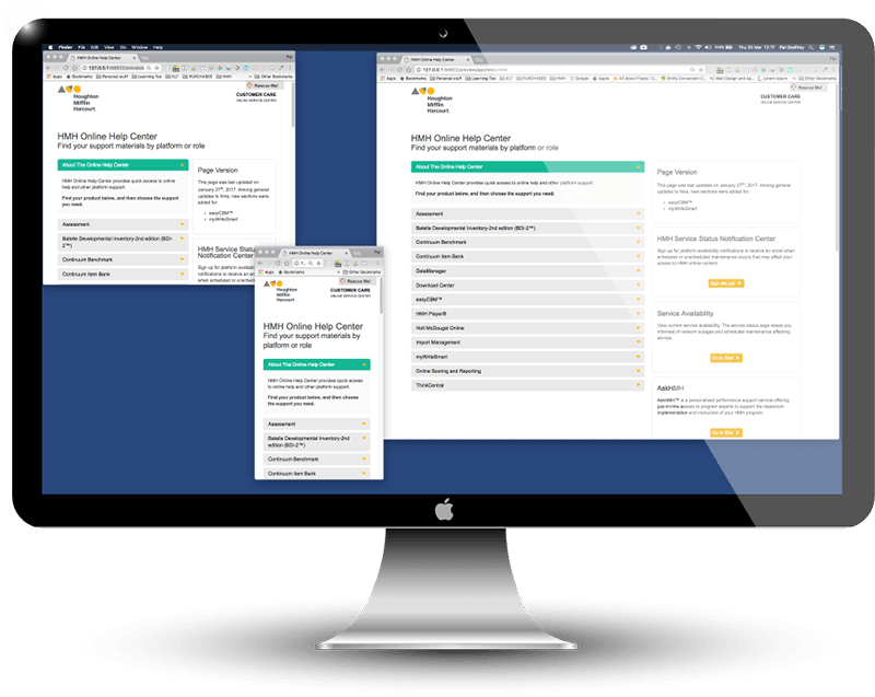
Following Apple's iOS 8 release, targeting a viewport by screen size is a risky practice. Software now enables multiple applications to run in multiple viewports even on smaller device screens. Designing for specific device screensizes is no longer wise. Catch up!
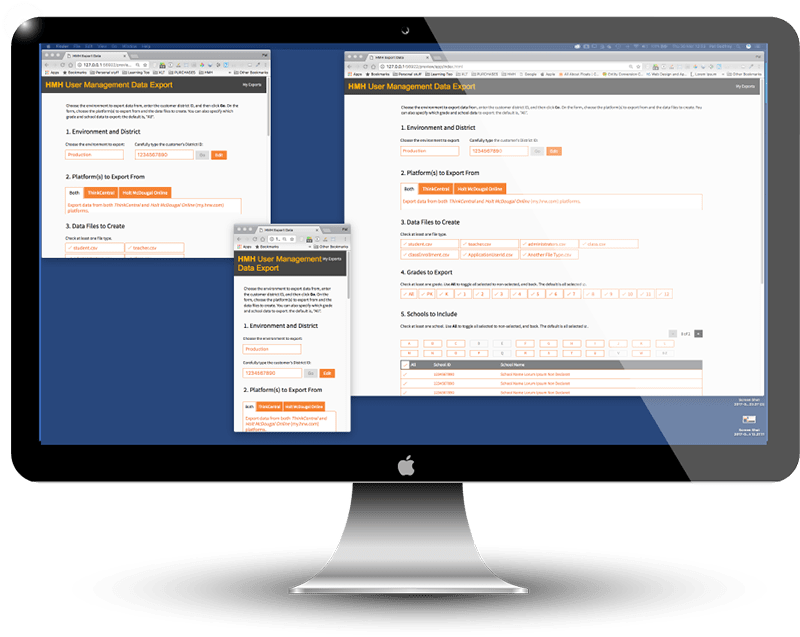
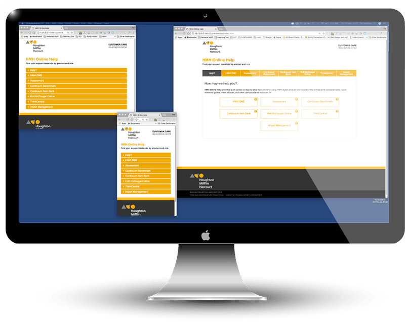
This is an illustration of responsive design on a tablet device with two browser apps displaying in the viewport. (If you use a larger viewport, then you will experience an emulation using iFrames.)

Demonstrating this site's responsiveness using iFrames to embed the page. Adjust the viewport width to observe the effects. In smaller viewports the presentation updates to an image to avoid Safari IOS issues. If your browser stalls, then refresh its display.
Adaptive JavaScript adjuncts
The detection of a "mobile device" is useful in some adaptive circumstances. JavaScript can test what user agent is present to conclude which "mobile device" is being used and to inject CSS classes or attributes "on the fly".
The use of a script enables a fluid-responsive presentation in "desktop" browsers using CSS media queries while adapting it on-demand in "mobile device" presentations.
This article's Feedback Form is within a fluid-responsive container in "desktop" browsers and two CSS media queries to affect its height. The Typeform plugin's presentation on "mobile devices" is simplified so needs less headroom.
I have used a JavaScript function to test for common "mobile device" user agents. If the test proves positive for a "mobile device", then the Feedback Form's container's height is updated with a CSS attribute.
Note: the ideal is to add or remove CSS classes. I mean to do better. Using a relative height attribute will be an improvement, too...
//DETECT DEVICE EXPERIMENT
//(From https://jstricks.com/detect-mobile-devices-javascript-jquery/)
	var isMobile = {
		Android: function() {
			return navigator.userAgent.match(/Android/i);
		},
		BlackBerry: function() {
			return navigator.userAgent.match(/BlackBerry/i);
		},
		//...etc...
		any: function() {
			return (isMobile.Android() || isMobile.BlackBerry() || isMobile.iOS() || isMobile.Opera() || isMobile.Windows());
		}
	};
	if(isMobile.any()) {
   $('.typeform-widget').css('height','200px');
}
//BROWSER DETECTION
Philosophy
Move beyond the constraints of a device. Respond as well as adapt.
Fluid Responsive design philosophy goes beyond the constraints of a device's screen. Applications may have menu bars and other chrome that compress the available presentation space (the viewport) to much less than the device screen dimensions. Our user can often adjust the size of the viewport too, even on smaller devices. The viewport is a result of software, not the device's screen width.
The over riding philosophy of Fluid Responsive design is to offer a meaningful presentation to our user no matter what viewport they are experiencing.
Semantic Layout
Fluid Responsive design encourages semantic HTML. Although discussed largely as a visual presentation strategy, we must remain vigilant to the needs of non-visual users. Accessibility and usability are our primary concern.
Caution: moving elements out of the semantic content flow with CSS or scripts may result in non-visual browser users receiving a confused message.
Bandwidth and Data Considerations
The philosophy may be extended to include protecting our user's bandwidth and data use. We can serve only the files required for their viewport and optimise them for the bandwidth and the expense of data metering.
Mobile First: Methodology of Choice
The Mobile First methodology is likely the safest and most future-proof approach given 80% of Internet content is consumed over 'mobile' devices.
If your users use desktop monitors exclusively, then the Mobile First philosophy may not be for you? However, if for example their facilitators rely on the mobility of a tablet, then you should follow the Mobile First methodology. As with anything in design, it depends.
Mobile First is the methodology of choice!
Relative Units Complete the Picture
Fluid Responsive design and Mobile First methodology needs an understanding of relative units such as the "em" and percentages for accessibility and usability.
Relatively scaled fonts, when our user scales texts up or uses 'zoom', may overfill elements that have fixed widths, or a y-axis scroll bar will be added where the copy cannot avail of a line break. Using relative units means, when our user increases the size of the font, all the text containing elements adjust accordingly.
Fluid Responsive designs must consider relative units.
Demonstration: Follow the instructions inspired by Alice in Wonderland. (If your browser becomes overwhelmed, then refresh the page.)


Fluid Responsive Examples
Page Layout
The "classic" Fluid Responsive page design pattern is to place core content above ancillary content in the smaller viewports, and then have the ancillary content flow to the right in the larger viewports.
This pattern worked well for a semantic search feature. I researched, designed, and developed the page. The primary user task was to find the exact link to the resource they needed (even if they didn't know what link it might be), and the secondary task was to provide signposting to additional content or escalating through available support.
Images
To meet the Fluid Responsive philosophy - and at the very least - images should be styled to scale to the viewport. This is easily done using CSS, which at its most basic may appear like the following snippet:
img {
	width:100%;
	height:auto;
}
But large images that display well on a desktop monitor may discourage a mobile device user cautious of bandwidth charges. Alternatively, an image that looks great on a small viewport may not loo so hot on a large desktop monitor. Add the demands of Retina displays and there may be cause to serve one of any number of images that suit the device.
We can only be certain that a narrow viewport means our user is using a small mobile device with scripting. If you know your users' browsing habit, then it may help determine your image-serving strategy. For mortals, we can serve images according to the viewport width and make the wild assumption that narrower viewports equal smaller devices.
Scalable Vector Graphics (SVG) go a long way to negating some bandwidth and performance concerns while also competently rendering text sharply in graphics at any scale. On the plus side they scale responsively although you may need separate versions for different viewports depending on how you size text within them. On the other hand, there is a learning curve to using SVG, which is why engineers may wish to avoid using them. The HTML5 <picture> element can ease the transition to SVG.
Example Responsive Image
The following PNG image uses the HTML5 <picture> element to demonstrate this principle. Smaller viewports are served an image of a mobile device, while larger viewports receive an image of a desktop monitor. If the browser cannot work with HTML5, then a default image is served:

Here's the syntax. Of course, you can use media queries in the CSS, but then all the images would be served even if only one is presented. If the media queries are written correctly in the cascade, then the <picture> method serves only the image requested to the smallest viewport:
<picture>
<source media="(min-width: 650px)" srcset="largest_image.jpg"><!--larger viewport-->
<source media="(min-width: 100px)" srcset="smallest_image.jpg"><!--smaller viewport-->
<img src="default_image.jpg" width="937" height="746" alt="Default image"/><!--default -->
</picture>
The <picture> element is new in HTML5 and we may not yet understand how to best use it. An article by Jason Grigsby, "Don't use <picture> most of the time" is more cautious and outlines a risk to this technique.
Video
The Fluid Responsive design philosophy extends beyond the page layout in viewports. It encompasses the way our viewports interact with every element on the page.
Elements should scale according to the viewport. In particular, this advantages the needs of smaller device users. Being controlled by CSS, desktop users also experience the scaling.
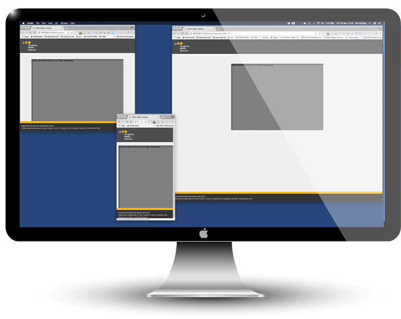
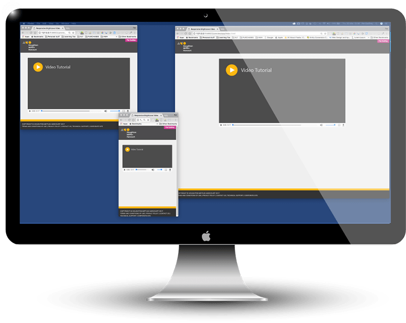
It could be argued that there are disadvantages to scaling elements in a Fluid Responsive manner, and like everything in design, it depends. Test your solutions! But the advantages of a Fluid Responsive philosophy and mobile first methodology can be seen clearly in this example of a video landing page.
Vendor Failure
The vendor's version of the page was severely flawed and demonstrated a thorough misunderstanding of the Fluid Responsive philosophy and fell far short of the quality I expected.
I fed back the issues to the vendor after investigating their HTML, CSS and HTML5 player and I supplied a full-page solution by return, which they ignored. On reporting the continuing issue to my clients, they did not have the skill with Fluid Responsive or accessible design philosophies, and no further action was taken.
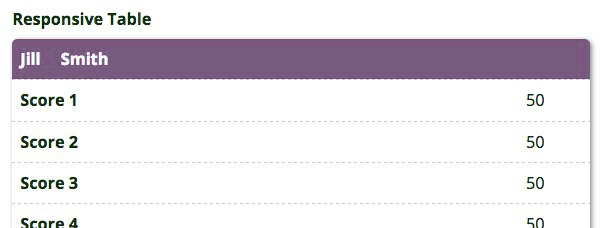
Tables
The tables on this page are created following the Fluid Responsive philosophy. Read more about some of my work with tables on the Responsive Tables page of my portfolio.

Forms
Forms are ideal candidates for the Fluid Responsive philosophy.
Forms are what we use to receive input from our users: they drive transactions and convert sales. Given that over 80% of web content and e-commerce is now consumed on 'mobile' devices, it is more important than ever that our forms are Fluid Responsive, and even Mobile First.
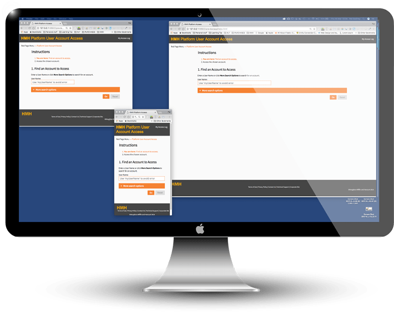
My client's platforms are not Fluid Responsive. Their engineers said they could not be made Fluid Responsive. I proved them wrong and changed the way this "back end" administration platform looked and behaved with HTML, CSS, a touch of jQuery, and the application of Fluid Responsive philosophy.
Tabs
UI tabs are a progressive reveal and content organisation strategy based on the tabs you may find in a real-world file binder. But what happens to the metaphorical tabs when the viewport squeezes?
Pete Love's "Responsive Tabs" method converts a group of semantic headings and their following content into unordered lists, and from there styles the lists as tabs or, when the viewport narrows, into accordions. It is a very effective solution. Minor modifications improve the experience.
Converting Legacy Products
With only a little work, we can convert fixed-layout digital products to a Fluid Responsive presentation using a formula attributed to Ethan Marcotte: target ÷ context = result
This formula enables us to take an element's width in pixels and convert it into a percentage of the parent container width. For example, the container is 96% f the viewport width. This is the Context. The existing element to convert is 698px. This is the Target. The Context percentage can be made "fixed" at 960px - a leap of faith, but follow along for now. So, target ÷ context = result translates now to 698px ÷ 960px = 0.72708333.
Move the decimal point two places right, and our percentage width is 72.7083333%. We don't round up the answer as computers like to be accurate.
There's a little more to adjusting the design than this, but it's not impossible. Only doubt and disbelief make it difficult. You can read more about this technique in Ben Frain's excellent book, Responsive Web Design with HTML5 and CSS3, PACKT Publishing. Find the Second Edition on Amazon.
There really seems no reason why any platform, website, or app would not be Fluid Responsive? Yet, they are still out there!
Is your digital work Fluid Responsive? (If not, then let me at it!)
Responsive Frameworks
There are some great fluid-responsive frameworks that offer a low engineering solution and relatively low learning overhead. It's so easy to create your own framework be certain you know why to use them. Remember, just because some big companies do something doesn't mean it's right for you.
Popular frameworks include:
Our Own Grid Framework
We can employ a 12-column Fluid Responsive grid in our own CSS, which should keep most layout-perfectionists happy. Here's an underused example grid from this site's CSS.
Note: the media query is written following the Mobile-First methodology (min-width).
@media only screen and (min-width: 1200px) {
/* For larger devices: */
.col-1 {width: 8.33%;}
   .col-2 {width: 16.66%;}
   .col-3 {width: 25%;}
   .col-4 {width: 33.33%;}
   .col-5 {width: 41.66%;}
   .col-6 {width: 50%;}
   .col-7 {width: 58.33%;}
   .col-8 {width: 66.66%;}
   .col-9 {width: 75%;}
   .col-10 {width: 83.33%;}
   .col-11 {width: 91.66%;}
   .col-12 {width: 100%;}
}
Strengths and Weaknesses
There's every strength in adopting a Fluid-Responsive design philosophy and, where appropriate to the business, a Mobile First methodology.
Strengths
- Adaptive presentation to match our users' viewport
- Ability to hide or disclose content according to the viewport size
- May entirely remove the need for a separate "mobile app" channel
- Encourages semantic HTML architecture and therefore improves accessibility and usability
- Benefits digital publishing Lore: HTML for content, CSS for presentation, and JavaScript for functions.
- A Mobile First methodology can restrict demands for bandwidth over metered connections
- The same philosophy can serve retina-ready devices with images optimized for their displays
- Promotes improved digital design. Period.
Weaknesses
There are no weaknesses with the Fluid Responsive design philosophy. It saves effort, saves time, and saves money. It benefits our users and is more likely to meet standards for accessibility and usability.
The only weakness is with the designers and engineers: poor visual styling for cross-device use and over engineering where simple techniques are simply better.
Using relative units can challenge particularly print-based designers. Their pixel-perfect layouts get "broken" and they loose control. They should be reminded, placing the presentation closer to our users' control can only benefit their experience. Visual designers will fear "fugly", but must be reassured and also learn that Fluid Responsive design can be beautiful only with their support.
Designers tend to over-specify the Media Queries or scripted break points required. This is not a bad thing, but it may cause more effort, affect performance, and complicate our user's experience.
Engineers want to script everything. Perhaps they feel threatened by the opportunities HTML5 and CSS3 have given non-engineers? Reassure your engineers that Fluid Responsive implementation needs engineers more than ever to enable our designers to add those little extra "somethings" that turn a fluid presentation into a joy to use. And there's always their "back end" to look after..."
The Digital Paradigm
I am impatient with poor quality output delivered by vendors within the direction of clients lacking insight into the inclusivity of the digital paradigm.
Managers must step away from citing their, "Section 508 compliance", which too often excuses poor accessibility, usability, learnability, or usefulness. I am hopeful that 'Section 508' will be upgraded to W3C WCAG AA+ standards next year. Maybe then our US cousins can finally start to work for our users inclusively, and the European fashion followers will promulgate the same?
Summary
As with most UI, it depends. Test your solutions.
Consider your users and your digital product's environment. There are many, many benefits in using the Fluid Responsive design philosophy within your business and by extension, a Mobile First methodology, but there are also applications where it may prove less useful than a fixed layout presentation? I just can't think of any that design cannot overcome.
Reference this article
Godfrey, P. (Year, Month Day). Article Heading. Retrieved Month Day, Year, from URL
Contribute to this article
Please add your comments.