Show and Hide Table Cells (case study)
First published by Pat Godfrey: July 2017
…
Content is King and it can place unrealistic demands on our users. Pyramid writing, brevity, active voice, information mapping, and other writing strategies aim to reduce these demands, but volume of content remains a challenge in the already noisy web space.
On a new platform page, the amount of table cell data contents threatened to overwhelm our users and their task to select from it.
My solution was to use Show and Hide techniques on individual cells within a large table presentation of a dataset. Engineering said it could not be done within the legacy environment. I didn't know: but I made sure that it could be.
Shared Learning
Flag this content to your friends, connections, and colleagues.
Task outline
User needs
Following significant security upgrades to the legacy HMH Holt McDougal Online (HMO) platform, our teacher and administrator users were required to activate their class products.
Our users may administer a large number of classes, and each class may be entitled to any one or more of 300 products. The user task was to identify and to activate one or more selected to one or more classes.
Priority
The task was high priority. Without completing this process, new platform users could not access their learning products in the classroom, or proceed with managing learning in the platform.
Platform environment
HMO is a legacy product created using 2004 web presentation technologies including fixed width iFrames, table layouts, and an aged visual dialogue. Due retirement in 2012, it survives as a testament to its "back-end" strengths, continuing utility, and the work and agility of its New Features design teams.
Design environment
Working remotely as the UX/UI designer with the HMH Holt McDougal Online (HMO) new features team including:
- Product owners and stakeholders in the USA
- Product management in Dublin
- Engineering in India.
Team methodology was Agile Scrum (Learn more from Amanda Athuraliya on Cprime and Creately), communication was by Altassian JIRA project management software, email, and Skype for Business (VOIP and screen-sharing).
Constraints
The following constraints were absolute:
- Visual dialogue
- HTML Table presentation (a single page, and without modal window adjuncts)
- "Back-end" data management and scripting
- An emerging need for (US) "Section 508" compliance
Design
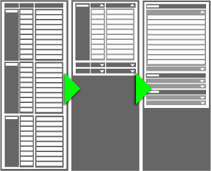
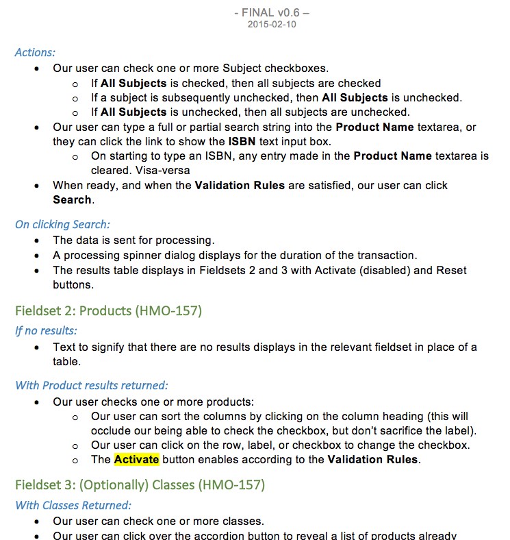
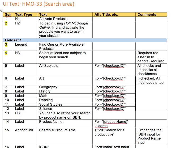
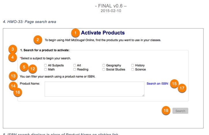
The form flow required:
- User orientation to the task
- Search for and activate products by:
- One or more Subjects
- Product Name OR* product ISBN
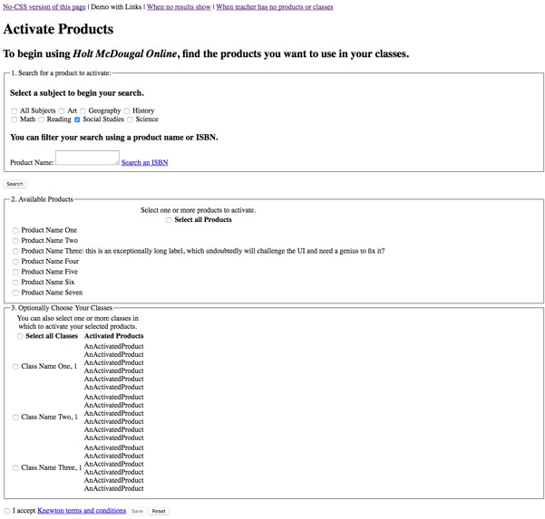
- Product or Program
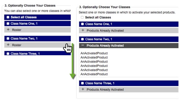
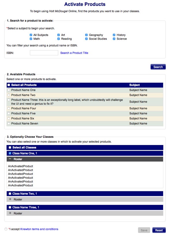
- Class Name (to display columns for potentially 100 - 300 previously activated products, and the class roster of up to 100 students). This amount of data was a major concern to me.
- Confirm selections
- Confirm activation
*Note: ISBN search was not to be encouraged due to imminent phasing out.
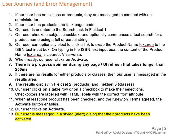
User journey and data presentation
The general presentation and flow were quite obvious from outset and were constrained only by a legacy visual dialog. Only the initial search fieldset needed confirming against evolving business rules. The single biggest issue was the sheer volume of activated products and the student roster cells that needed listing against each class in the third table interaction.
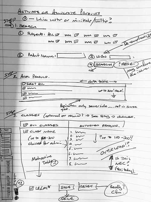
Using show/hide on the table cell was not popular with engineering as it had not been done and would add effort to an already frugal backlog.
Axure prototyping was employed to establish layout and business rules, but I needed to prototype the page if I was to get buy in and to prove that the effort was all in the CSS and jQuery, not the HTML calls for data.
Solution
Against time, and I tested and introduced a pseudo element to the cell via CSS. This acted as the notice that a Show/Hide action was available. The show/hide acted on the cell's height. Although a new visual dialogue, it was not a conflicting one and the stakeholders accepted it.
I produced a high-fidelity prototype. Much of its HTML, CSS, and jQuery made production. The engineers were pleased, but this presented a new issue requiring an adjustment to the CSS to better present the stripes. But that needed to wait to the next tranche of new features due added to the page.
Approaches
I initially used Axure for wire-framing, but quickly swapped over to an HTML prototype to give engineering the support and encouragement needed with the concept, CSS3, and JQuery.
The prototype was sufficiently detailed to illustrate accessibility requirements. An un-styled version was also supplied to visualise the semantic HTML architecture I had prescribed. (Engineering habit was to use non-semantic HTML tables from which to create an impression of a form, which proved inaccessible).
Error management principles were applied to the design: to design out errors with disablements and on-screen instructional texts and legends.
Show/Hide strategies can use copy text, + and − symbols, or chevron "levers" to indicate that more content is available to present on user demand. The visual dialogue for HMO specified + and −.
Product tour overlay
Acceptance Criteria (AC) specified a product tour. For architectural reasons, Hopscotch was ruled out. I created an alternative: a bespoke tour. On wire-framing, the resource and effort were considered too great for
My earlier static informational overlay design was implemented to show on first use and for n days or until dismissed by our user.
Deliverables
I supplied the HTML, CSS, and JQuery for the engineers to work from. I was pleased much of the code I supplied made it to production, including the process spinner and CSS-styled HTML buttons. Yes, even in 2017, HMO's buttons are images except where I supplied CSS to new pages. Now that's legacy.
My deliverables were the UI/UX Design Document including:
- User Journey
- Business Rules and Error Management
- Copy Texts
- Prototype of show/hide interactions
User Journey
Business Rules
Copy Texts
Prototype
Video demonstrations
Prototype walk-through
The following video walks through the HTML prototype (at that time to show a student roster for each class).
Production walk through
HMO can be found at my-hrw.com. An account is required to access the production page. The following video walks through the finished page in the legacy production test environment with only little available data.
Reference this article
Godfrey, P. (Year, Month Day). Article Heading. Retrieved Month Day, Year, from URL
Contribute to this article
Please add your comments.