Writing for UX Center-align text?
First published by Pat Godfrey: October 2017
…
From every web search result ever on center-aligned text:
"Research suggests that center aligned copy text..."
YAWN! Read on...
Shared Learning
Flag this content to your friends, connections, and colleagues.
Dispelling borrowed beliefs
After searching for web articles concerning center-aligned text we will inevetably read that it affects readability and that can only mean that it affects our User Experience (UX).
The advice and its reasoning is consistent: center-aligned text makes finding the next line of text to read difficult because of the raggedy left edge of the copy.
Really? And how many comentators link to any primary (peer-reviewed) research in these articles? Is this not regurgitating a "borrowed belief", a myth, or some tradition?
Research
I recall researching center-aligned text briefly when compiling my dissertation in 2007 at University of Portsmouth. I am quite certain that a majority of readers expressed a preference for left-aligned copy texts and that a small proportion of respondants preferred center-aligned texts. (if only I could find it today).
The reasons concerned the left edge of the text. Some respondants preferred the center-alignment as they felt their eyes were given a better clue on where the next line would start using symatry and peripheral vision to guide them.
The strong advice and reasons for only left-aligning text are understandable, fair, and must be flawed?
Regardless, there are some hideous examples of center-aligned designs on the Interweb that really ought to be adjusted! 😂 Many seem to live on graphic designer-turned-Ui designer vendor template pages (Grrr!)
Why center-align text at all?
Most graphic designers love visual symmetry and alignment: 12-column layouts, centred buttons, and a-symmetrical imagery balanced by a-symmetrical elements. Balanced. Centre alignment is the ultimate in balanced content.
Executed properly, there's nothing wrong with this. Only, this agency should give more thought to how their strategy presents on smaller devices?
Note: if you are using a larger viewport, shrink it down or rotate it to be narrowed. The woman disappears from view. She's there for eye contact, probably some candy, and personification. She is designed to connect with our user. So why is it acceptable to allow her face to disappear in narrower viewports? This is a poor desktop-first, pretty, and untested design.

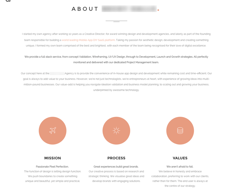
The following screen-grabs are from the same agency's homepage. Any lores concerning center-alignment and column width are certainly ignored. Everything is centred. The design looks perfect and that's all that counts.
Silly art direction results in poor text contrast over images, too small font-sizes, persistent animations, wide columns of center-aligned texts that erode any advantage some users may have found in them, and a loading spinner of above 8-seconds via rural Ireland's data speeds.
The designer has become a slave to center-alignment, magazine-like visual design, and all the bells, whistles and other crap money and time can buy. As a potential collaborator or client, it turns me off.

I appear to be damning center-alignment? And that isn't my intention or position at all.
It's not so bad?
In the introduction I hinted that some of our users may prefer center-aligned texts - even in longer columns. The raggedy left edge of the center-aligned text actively assists their readability of the copy.
The majority of our users have learned that center-aligned copy text is bad. If you ask a user with a preference for center-aligned text if it affects readability, they may only respond with the majority. "It's so bad...isn't it?" A learned response and need to conform.
And that is sad because we may never uncover the truth and we will remain divided by devil-may-care centre alignments for aesthetic reasons and hard-nosed puritans vertically lining their copy with a ruler.
What are we to do? Well, as with everything in design, that depends!
Solutions
Common lore directs that center-aligned text must never be used or, if it is used, that we use it for only very short texts. I agree, despite my opinion that fashion should never ace the results of peer-reviewed research.
And left-aligning text in a center-aligned layout can look so ugly, can't it? Is there a compromise? Yes!
So how may we present copy centrally in our design while still offering a left-aligned margin? It's so simple - columns!
Which do you prefer?
Center-aligned
Common lore directs that center-aligned text must never be used or, if it is used, that we use it for only very short texts. I agree, despite my opinion that fashion should never ace the results of peer-reviewed research.
And left-aligning text in a center-aligned layout can look so ugly, can't it? Is there a compromise? Yes!
So how may we present copy centrally in our design while still offering a left-aligned margin? It's so simple - columns!
Center-aligned columns
Common lore directs that center-aligned text must never be used. If it is used, that we must use it for only very short texts. I agree, despite my opinion that fashion should never ace the results of peer-reviewed research.
And left-aligning text in a center-aligned layout can look so ugly, can't it? Is there a compromise? Yes!
So how may we present copy centrally in our design while still offering a left-aligned margin? It's so simple - columns!
Note: only one column will show in narrower viewports.
Summary
I'm not professing a right and wrong here. There are clearly examples where center-aligning for the sake of visual design balance will compromise readability.
I believe a short paragraph of center-aligned text is OK. Longer texts should be left aligned. A compromise solution may be to centralise two or more columns of left-aligned text.
If we must centre text...
Useful hint: if we must center-align texts, then avoid "orphaning" individual words at the end of paragraphs. Use a non-breaking space in the HTML between the last two or three words. 😉
Reference this article
Godfrey, P. (Year, Month Day). Article Heading. Retrieved Month Day, Year, from URL
Contribute to this article
Please add your comments.