Example Work A Simple UX and UI Review (case study)
First published by Pat Godfrey: July 2017
Mention the words, "back to school" or "BTS" to any member of an education product team, and watch their faces blanch! This is the period the year's planning and marketing excesses all catch up with the shop floor. A great deal relies on delivering the many promises sold to the customer.
With the Dublin Design Team at capacity, I was asked to review a new feature that they just didn't have the time to research or refine, but which had maximum impact on my own platforms' BTS experience.
The problem
In 2016, the legacy ThinkCentral (TC) and Holt McDougal Online (HMO) platforms were both within my remit and were now each needed to interface with the emerging HMHOne (later HMH Ed) platform data architectures.
The background
One area of incompatibility was within en-mass data importing of school records: both platforms had their own import routines and as customers often used both, this was already a problem.
I had already updated the new .CSV file column architecture from the two "traditional" formats, so I was familiar with the business needs and data requirements.
Pressure situation
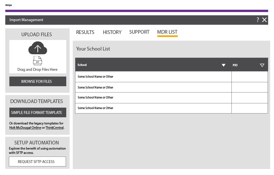
The design studio led the project effort, but the result was not consummate to their effort. The journey to the new page (called Import Data Management or IDM) and the new platform's contemporary visual dialogue and interactions, was disorienting.
Beta testers accepted that the universal experience was inelegant, but there was a disatisfaction with the new page. Contingency thinking included forming a team to physically import files on our customers' behalf: it seems insane, but that's the presure BTS puts on the enterprise, and the pressure the enterprise put upon us!
Simple risks
The joint Program Manager (the energy-filled Jim Cveykus) asked me to take a look. As custodian of the legacy platform UX, I was certainly the best placed to - if only the design studio had engaged with the legacy teams earlier! But there was no time to benefit from hindsight and little time to work. The page was already with engineering and I had my own deliveries to make. Anything that was to be done needed to be simple, and only simple would be done.
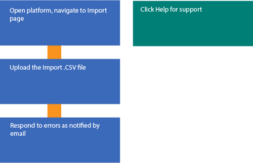
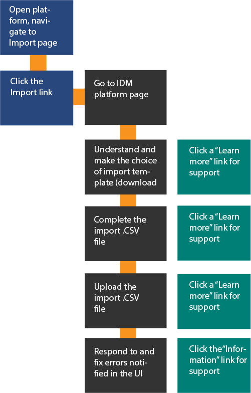
The following diagrams illustrate the legacy versus the new process flow, perhaps unfairly showing the new flow to be more complex than it really was. But this was our customers' "Back to School" perspective: any change or perceived increase in cognitive and motor effort or complexity would flag as a risk to their business.
Metaphorically, the new diagram needed simplifying. The easiest approach would be to reduce the complexity of the cognitive and motor flows by improving access to the learning. This could improve the page's reception without re-engineering anything but the presentation.
Analysis
There was no chance to sample our Beta users' opinions in the time we had. We could safely assume Version A had failed. Jim acted as our users' advocate and having spoken with the Beta users, he had a clear idea of where the design had fallen short of expectation.
On transitioning to the new page from the parent legacy platform, our users were faced with a change in environment as well as a barrage of new information and decissions to make. The simple-looking visual design simply failed to guide them through the tasks. This resulted in their making significant errors if they completed the task at all.

Using my Basic User Journey (see below), and by re-establishing a work-flow with a new Content Inventory, I found we could improve on the following experiences:
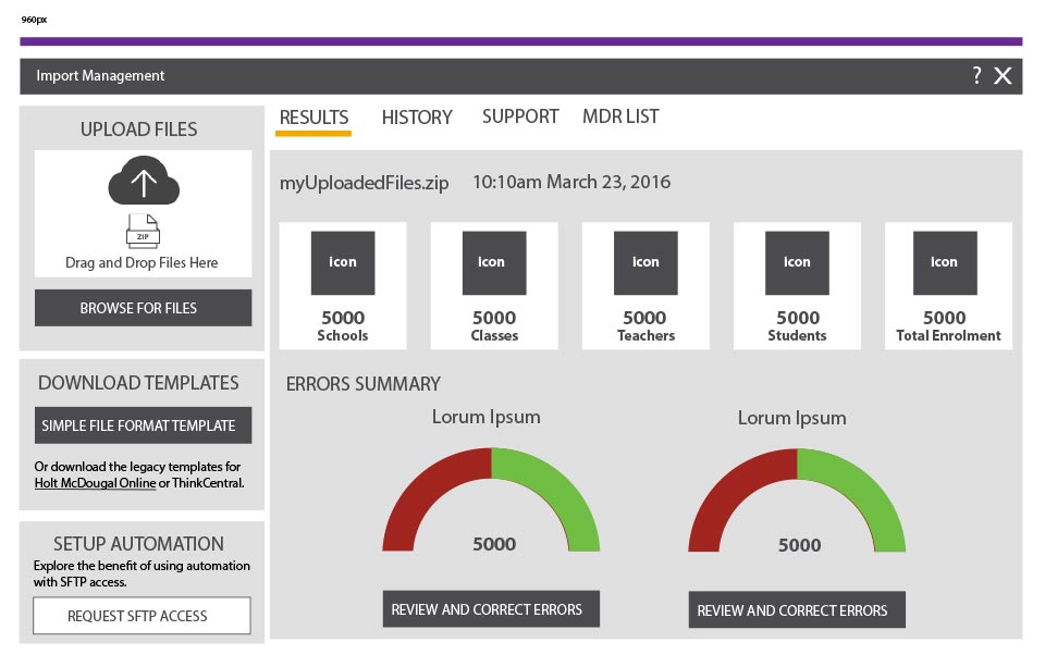
- There was no "Help" button although in-line "Learn More" links had been included. A significant piece of support had been written by our Technical Writers, but our users had no idea of its scope, location, or to access it.
- The interface changed visual dialog between the page entry and subsequent tabs. Placing the Upload interaction on the left with the tabs on the right would highlight the primary task and simplify the UI and navigation within it .
- An invitation to upload the new (unifying) file type de-emphasised the "traditional" file types, but failed to emphasis what the "preferred" template actually was.
- The download task was placed in primary position, although in practice, once the file had been downloaded, then it was unlikely to be so again. In the long-term experience, the primary task was to upload a file. What is the "approriate file"?
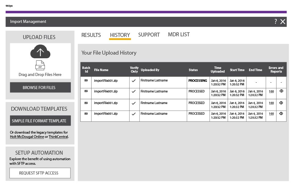
- The requirement for a "MDR List" (a list of unique organisation identifiers) had been omitted at one stage or other of the design.
- Responsiveness stopped at "iPad". I saw an advantage in enabling the design to respond to even smaller devices to meet a future user need (admittedly an edge case at this time before iPads allowed two-apps to display at once). It was reasonable to design the presentation properly, but there was no time to implement and test it. The compromise was to complete the design but wait to implement the "nice to haves" (such as the aditional responsiveness) in a post-BTS sprint.
The basic user journey
In reviewing the IDM page design, I applied my basic user journey and UX design process:
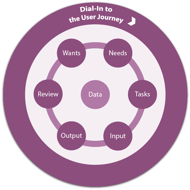
Applying this "test", coupled with Jim's feedback between juggling his impossible BTS schedule enabled a rapid iteration of wire-frames via email.
| Journey Stage | Analysis |
|---|---|
| Wants | Our user wants to import classes, teachers, and students for the new school year. Our business wants to use a new unified file format. |
| Needs | Our user needs to have confidence in the routine. Our business needs to limit errors to build compliance. |
| Tasks | Our user must understand the task, and choose how to best proceed to avoid errors. Our business must receive the imported data and confirm the data rows that pass inspection, and to report those that do not in order our user can correct the errors. |
| Input | Our user must choose the method they use to input the import. Our business must communicate the choices accurately and offer the simplest and most familiar interactions (including that to call for Help). |
| Output | Our user must confirm their upload of a .CSV file and be ready to correct any data errors it is found to contain. Our business must manage errors caused within the UI and also report errors found in the file. |
| Review | Our user can review the progress and level of success of their data import. Our business must report the file's success and enable our users to revisit past imports with which to form a wide breadth of review. |
| Recycle | Our user can return to the parent platform. (There was discussion in progress on whether the page would now appear as an overlay, for which we added a Close button, just in case). Our business must preserve the History and MDR List information and, if the business rule were implemented, then the "show support tab" flag needed removing (although this would be a great user preference setting if we had the time). |
Updated design
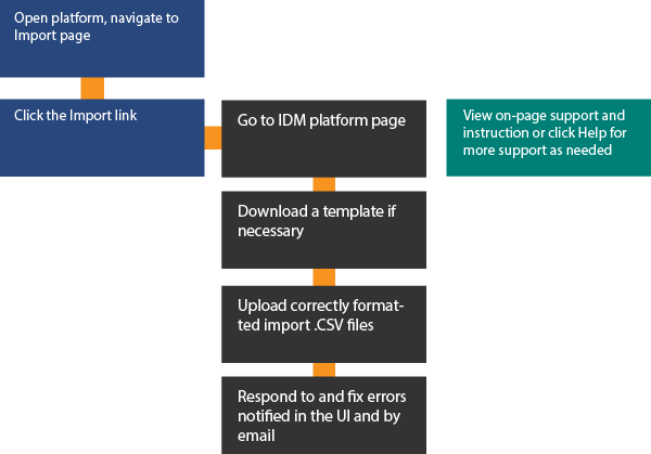
From the application of the Basic User Journey and a revised Content Inventory I learned that:
- Our user needed on-screen support - particularly on their first visits to the new page. (A new support video had been prepared and was an ideal candidate for inclusion to play directly within the UI).
- That the existing visual design for tabs was too subtle
- That the primary task should be displayed consistently and be separate from the tab presentation throughout the user journey.
- That the offer of "traditional" template files was visually and architecturally disconnected from the file template download area, which may leave the offer missed, resulting in errors or frustration.
- That the primary user task is to import files and not to download templates so the tasks' visual priority needed changed.
- That the page was "missing" the Help link our users were familiar with in the parent platforms.
- That the UI copy texts needed tweaking to make clearer what tasks to complete with support on how to complete them.
I needed to remain within the HMHOne visual design as much as possible, but as HMHOne was not complete, and as this was the first new page encountered by our users, it seemed reasonable to make minor changes locally if not universally in this instance.

Responsive design work
With Jim's dedication to his email client (at "OMG it's early" in the States), I had time to supply the design wireframes for narrower viewports than iPad's 960px. Given that iPads were already destined to display two apps simultaneously (see my Article, Fluid Responsive Design Philosophy), it seemed good business sense to "future-proof" the design.
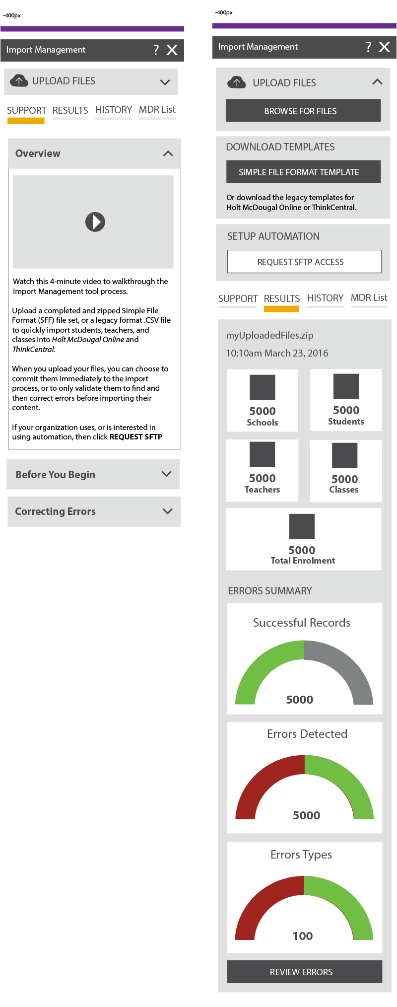
Essentially, the Upload and Download area becomes a show/hide accordion to preserve the primacy of the tabs. Similarly, using a Responsive Tabs strategy (see my Article, Show and Hide Content), the support tabs also expand and collapse on demand. The first is open by default to orient our user to its purpose and content.
Summary
The Program Manager, Jim was delighted with the timely design updates:
So impressed with your work Pat. I wish you were on the UX team as your ideas come so natural. With...UX there is a lot of back and forth and opinion differences that we often agree to disagree. But every project I have worked with you on, it’s been amazing...it makes my job so much easier and I believe the customer experience is top notch. Thank you!
Not all of the updates made production, but I was pleased to have had noted by a wider team that UX is not all about visual design fashions. It is entirely about the analysis of even the most Basic User Journey and advocating for our user with intelligence.
I don't see the problem with that. It's what I do.