Forms and Data for UX
First published by Pat Godfrey: July 2017
…
I believe that form design is the single largest point of failure in enterprise/customer communication.
Shared Learning
Flag this content to your friends, connections, and colleagues.
Forms are designed?
Form design is not just drawing minimalist or pretty boxes! I'm a form evangelist and I wish to rid our lives of crap form experiences. That means you have to employ the right designer to craft your forms.
Forms only benefit our enterprise and our users if we apply cognitive and learning design, information architecture principles, sound engineering methodologies, and more.
You may have put your form design in the hands of the wrong designer, or of the wrong team? If so, hire me. If not, then your enterprise is ace, and I'd like to work with you to learn more.
What's wrong with forms?
We complete forms every day. They have become a routine barrage of challenges. We find poorly compiled questions, unexpected input rules, unnecessary details to complete, no support, and a feeling that we can only respond but not communicate. A simple interview becomes an aggressive cross-examination.
Forms need designing: and form design is not only determining what data to capture. Unfortunately, this means few forms are truly designed: its just, "too much effort", or simply beyond the knowledge of the enterprise. Trite designs and complexity easily overwhelm us.
Over time, we have likely developed a fear of printed forms. For example, you may automatically input your postal code in the address line, and then the next input is Post Code. It’s not an exam!? Why should I read all the questions before answering them?
Online, we fare no better: input your correct Irish Eirecode in the Post Code box, and the form insists that you are wrong because the enterprise hasn't written the validation for an Irish post code.
There are good forms around. You know which they are. You are guided through completing them and they feedback on your work; input by input, instead of leaving the disappointment until after you click the Submit button.
There are so many less than optimal forms around we no longer notice. We just want to get the job done. But that should not excuse poor design!
Important Note: we haven't started to explore the presentation! That comes later. Get the form architecture right first!
Turning frustration to delight
A delightful experience must surpass expectation.
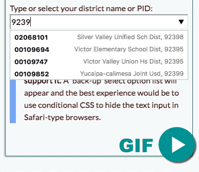
We do not expect to scroll through an option list for over 20-seconds to sign in to an account? Sure, we may know to type the first letter of our selection—and if we don't? And what if we know the numeric data ID but not the name stored in a long text string? Wouldn't life be easier if we could just start typing the string or the numeric ID and for close suggestions to appear?
It's difficult enough to find one of fifty States, although I'm certain it gets easier with time. But over 20 seconds to scroll to my school district in this day and age? There are so many alternative methods that give our user so much more control and make for a more delightful experience. For example, we can build a table with a search like My Bookshelf list table.
And it's not difficult to implement them, either. We can and must do better!
Watch the example HMH Ed sign-in form featured in the video. Perhaps our UI design team are stuck in a design pattern and they don't have the HTML skills to escape it?
In compliant browsers, the demonstration above illustrates that there are alternative input strategies to explore. The demonstration uses the HMH district IDs as the option <datalist> values. Your list may be designed better.
My preference for such a large list of data is to build a searchable table from which to search, sort, and find the desired option with less cognitive and motor effort, and possibly improved usability and accessiblity. As with everything in design, it depends.
Learning from a poor experience
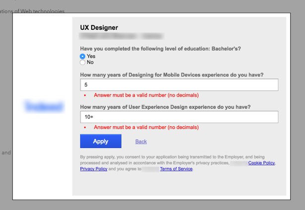
This simplest of forms invites a poor user experience. Long answers are invited by two wide text input boxes, each capable of holding 50 characters (as presented in my viewport).
I entered a long answer and, on clicking Apply, I received an 'error': Answer must be a valid number (no decimals). It was a frustrating experience:
- I expected to give a long answer
- I formed and typed a long answer
- The enterprise wanted only a whole number
- The effort forming and typing my answer was wasted
- I felt blamed for the 'error' but knew it was poor error management
- I needed to type a 'valid' answer, which was easy now I knew the rules. So I ask, "why didn't you tell me, you eejits?"
Clearly, there was something wrong with my experience.
Summary feedback
Manage the data or input instead of making all this song and dance over it!
There are a number of issues here that we can fix by managing the errors; by preventing them. A Boolean choice or range of choices would do this. If the text box was absolutely necessary, then we can improve on the current design considerably:
- Present the "error message" as an on-page instructional text. Highlight it when an error occurs, and give the offending input label the focus, and scroll to it.
- Reduce the input width to indicate no more than two figures are required
- Configure the input box to accept no more than 2 figures
This is not the worst of forms, but it does highlight the complexities of form design that go beyond making it pretty. It should be First Year student basics.
But then, I understand the cause. It is not the designer's fault. It is the enterprise's. They should give the form design task to the right designer: one with the right background. Call me, I may be available!
Choosing the correct input type
The example above uses unrestricted text input boxes and is not the ideal solution here. It creates opportunity for errors. Error management is not how we handle errors, but how we prevent them.
The ideal input type for this example is the <select> option list (or an equivalent). It can be given a "Smart Default" that needs no error strategy.
Choice of Select Option List
The <select> option list is a simple and accessible list strategy. For example:
There is no harm creating a "fill in the blanks" interaction. You may consider it a more conversational approach that would best suit your users? The select option box has a default value of 0, so there is still no user error to worry about.
How Long is Too Long a List?
How many alphabetically listed countries must we scroll through to find our own? If living in the UK, are you searching for England, Scotland, Wales, or Northern Ireland, or for Britain, Great Britain, or the United Kingdom? Consider an option list of 196 countries, where your enterprise delivers to only 29 – and 96% of your deliveries are to just five of those. What should you list: and how do you list it?
The use of the <datalist> technique can help users select from long lists but, as with everything, it depends. Research the best input type to use.
Note: This autocomplete feature is not supported in the Safari browser or by iOS. You can include a <select> option list in the <datalist> as a backup. Although not the same experience, if you can see the Select Option list, try typing a number in the box, and then selecting another number from the list.)
In conformant browsers, the following country selection list should now be easier to complete than the one above. In the others, the interaction clearly needs work.
This GIF animation illustrates the UX using the Chrome browser.
Alternative Boolean Solutions

If you must use an input box
The select option list or alternative Boolean input patterns are ideal in our example - if the number of selections are practicable. If you must use an input box, then we must enhance our user's experience of them by reducing opportunities for errors. We can make clear our validation rules and explain the task we have set as in-line instructions or show/hide 'tooltips'.
Caution: tooltip content must be short. Complex instructions or business rules quickly exceed our users' capacity to remember them once the tooltip has been dismissed.
Adding copy to the form may upset your minimalist designer, but who are we designing for? If we chose a Boolean input type in the first place, then the interaction would be natively minimalist. Minimise that! 😀
Input Type and Design
Error Text
Error Presentation
The error message in the example form is in red text and is written with poor grammar; "Answer must be..." The message is for our users: not a note to our engineers confirming the input's business rules.
At least 10% of our male users and 9% of female visual users won't recognise red as an attractive highlight. Without coding, non-visual users may miss that they have been given focus on an error at all? Accessibility lore directs us, "Not to use colour alone" to communicate anything.
Highlighting is required, yes. But not red text? Perhaps we could create something more attractive and maybe add an indicator to confirm which interaction the error or instruction refers to? It's only CSS, after all!
Or, if red really is the color de jour:
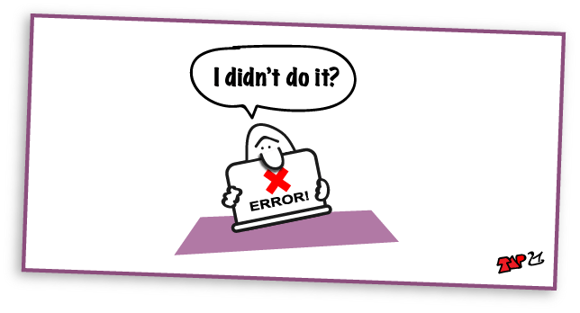
I believe red text is similar to using all Caps, it SHOUTS AT YOU: a good telling off. It is NOT MY FAULT that the form design did not make clear what I was to do. It's not my error - it's the enterprise's error! You deal with it: not our user. Then again, up to 19% of the population may not see red as a highlight? That may need more work?

Accessibility and usability
Form design should follow accessibility and usability best practices. UX and UI designers and our developers and engineers must be HTML, accessibility, and usability aware. It is my experience when reviewing digital products that this not always the case. You may consider that your forms should:
- Use a conversational tone and not be an interrogation
- Ask for only service-essential inputs
- Not appear or be too "difficult"
- Be organised logically and semantically (using forms, fieldsets, and legends)
- Using semantic markup and/or a tab-index, allow users to navigate the form using keyboard controls
- Break stages across navigable pages if lengthy and display progress and what is still to do
- Have Required and Optional inputs made clear
- Use the approriate input types
- Explain data rules upfront
- Give all inputs a label indicated by the "for" attribute
- Allow for voice activated browser agents where possible
- Contain "Smart Defaults" where possible to reduce "errors"
- Validate data in-line
- Demonstrate "correctly" completed fields
- Present error messaging proximal to the failed input
- Have a programatically assigned "Submit" button, a "Reset" button, and give feedback when each is clicked
- Display a progress meter after "Submit" if calculations delay feedback
- Enable an "escape" strategy such as an, "Are you sure you want to do this?" message.
- Enable an "escape" strategy such as "on-release" so our user can change their mind about pressing buttons.
Note: this list is for your information and is not exclusive or exhaustive. Positive experiences come only with design and programatic knowledge and effort combined with an understanding of your users' needs and goals.
Summary
As with most UI, it depends. The user experience of your forms depends on the strengths of your designer, the clarity of the task, and the needs and wants of your users.
There are a wide variety of inputs available to designers. With still-sketchy browser compatibility, we can also look to building our own searchable tables to help improve cognitive and motor loads as well as to boost usability and accessibility to take our forms from frustrating to delightful.
Reference this article
Godfrey, P. (Year, Month Day). Article Heading. Retrieved Month Day, Year, from URL
Contribute to this article
Please add your comments.