Inclusive and Responsive Table UX
First published by Pat Godfrey: July 2017
…
Update 2019: with an improved experience of, and skills in accessible design, I can see where the responsive table strategies are far from inclusive. My caveat then in 2017 was to return and work on them. They need that—sometime. In the meantime, I've added ARIA to improve the screen reader UX of tables generally.
W3 Schools claim to have the solution to the responsive table, and I do not believe it is sufficiently inclusive. HTML and CSS supports a more inclusive experience for visual and none-visual users.

Note: some visual styles and link behaviours may be disrupted on this page due to its demonstrating a JQuery Mobile adjunct. (data-ajax="false" is deployed).
Shared Learning
Flag this content to your friends, connections, and colleagues.
Inclusive design
I am driven by fluid-responsive and inclusive design principles to step clear of popular "Glass Slipper" development frameworks - those that only fit Cinderella. I champion the simplicity of inclusive, accessible, usable, learnable, and useful design.
It is the UX designer's role to study and research our users. What are their goals, needs, and wants, and how do we meet them? If your users include general Interweb consumers, then your design needs to be inclusive or you will not communicate with all of your potential customers.
Whoops (2019)
As noted, my inclusive table aim went untested with screen readers. Their experience is broken in smaller viewports: the pseudo elements appear to have broken the semantic.
As part of my discovery, I noted that the screen reader UX in the following performance score tables isn't ideal. When you transit from a cell to a cell in a new row, the row isn't identified. It set me thinking.
I've added a script to add ARIA to the custom tables' cells that identify who's row each data point is on. Give it a whirl.
I may update the overall design in time - based on the accessible tabs model converting the table tags into nested list items is an idea. Anyway, here's that script:
//Set up the classes for the First and Last name and data columns:
$(".dataTable tbody tr td:nth-of-type(1)").addClass('firstCell');
$(".dataTable tbody tr td:nth-of-type(2)").addClass('secondCell');
$(".dataTable tbody tr td:not(.firstCell,.secondCell)").addClass('scoreCell');
//Get the ID of the first and second cells on each row using the classes added above:
	$(".dataTable tbody tr").each(function(){
		var firstName =
			$('.firstCell',this).text();
		var lastName =
			$('.secondCell',this).text();
		//Combine the variable into one:
		var fullName = firstName +' '+ lastName;
		//Add the ARIA to each cell in the table body except those containing the names:
		$('.scoreCell',this).attr('aria-label',fullName);
	})
When using a screen reader, you can compare the effect between the W3C table and the others with the strategy employed.
Example business needs
Our Technical Writer team put what should semantically have been definition list <dl> content into tables. And tables, we know are for data and not for layout. This was due in part to our Writers having inadequate digital knowledge, but also due to Adobe RoboHelp's negative attitude toward definition lists. (I affectionately referred to RoboHelp as "No-Go-Help" at times).
My initial reaction was that the Writers should adapt their literary style and use unordered lists to describe the definitions. I may as well have suggested basting their words with arsenic: I was not Mr Popular! They were clear that they wanted a visual representation for the defined terms using bold copy. And they had a point, their preferred presentation would ease visual scanning.
Styling definition lists though, even using semantic code and CSS, can be extraordinarily difficult if not impossible. I was thankful that a pair of online journals had recently tested definition lists vs. tables using alternative browser technologies. I was surprised to discover that tables are the more accessible strategy! I was sold, if slightly sour that my Writer friends were right.
Note: The journal findings also emphasised that role="column" was to be placed in each <th> cell to guide the browsers which cells were the column headings. However, as the ARIA default <th> value is, role="columnheader", this may be unnecessary. As always, test!
User cases for tables
Our users are not Cinderella (although she may be among them) and our solutions must be inclusive. Persona groups can lack enlightenment if they do not include users with different abilities and needs.
Many personas are built on overly-emphasised lores of age vs. computer literacy and are limited to just three user groups containing mythical - not typical users. They become a range of glass slipper templates; compromises to time, effort, and budget. But this frugal habit must be challenged if we are to derive experiences that truly reflect our user demographic and to justify our research.
Using tables in place of definition lists needed to be usable for everyone. They needed to respond to the viewport width and to offer the same experience of the data to everyone.
Table solutions
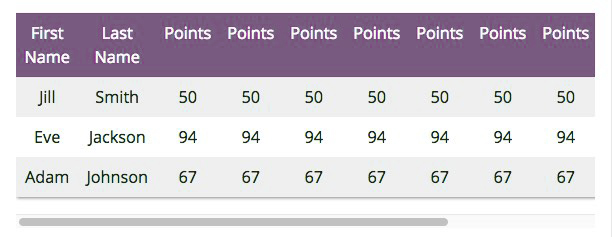
I was not satisfied with W3C School's "Responsive Table". It is not responsive: at least, the method does nothing to update the data presentation. It puts the table in a scrollable container when squeezed by the viewport. It is not an inclusive solution for accessibility or usability. For example, users with motor challenges may find the horizontal scroll difficult - if they know to at all (on some devices).
I had previously researched and found that the HTML <table> tag can be given any CSS display attribute. For example, the table, its rows, or cells can be styled display:block; or display:in-line; and that these attributes can be updated using media queries (breakpoints) or scripting. The table can respond: not only its container.
Updating the table's visual behaviours enables it to retain its accessibility for non-visual browsing technologies while also maintaining - if not adding - usability for visual users. Although visually changed, the data experience remains largely the same. The table doesn't need to respond, of course. It can be styled as "cards" or "tiles" in all viewports. It's just a useful technique to display data in narrow viewports.
Caution: as suggested in the Strengths and Weaknesses section below, this technique may not replace the scrolling table adjunct in all user cases.
W3C School's responsive scrolling table
W3C School demonstrates a responsive table as being contained in a div, <div style="overflow-x:auto;">. This allows your user to scroll across wide tables. The style can be set within a media query so the scrollbar only displays when you want or need it to.
But, is the table really responsive?
| First Name | Last Name | Points | Points | Points | Points | Points | Points | Points | Points | Points | Points |
|---|---|---|---|---|---|---|---|---|---|---|---|
| Jill | Smith | 50 | 50 | 50 | 50 | 50 | 50 | 50 | 50 | 50 | 50 |
| Eve | Jackson | 94 | 94 | 94 | 94 | 94 | 94 | 94 | 94 | 94 | 94 |
| Adam | Johnson | 67 | 67 | 67 | 67 | 67 | 67 | 67 | 67 | 67 | 67 |
Note: scrollbars are not displayed in some small device browsers. This renders W3C School's solution rather useless in some cases? Our users may not recognise that the table has more data columns to explore, or they may not know to swipe the table to scroll it on touch-enabled devices. (Now you know!)
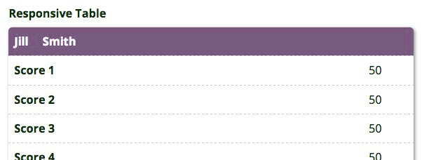
The accessible and usable responsive table
We know that not all of our users find horizontal scrolling easy on desktop or touch device. Why make them scroll as the W3C School's responsive table solution does?
We can use media queries and convert our table elements to "block", or "inline-block" elements. The semantic table mark up and basic column roles <th><td role="column">... (needed for accessibility, although disputed in some journals) are left intact. The table is accessible! We then update the visual presentation to something more usable than a scroll bar.
In the table below, we update the tabular layout to one resembling cards or tiles. We hide the column headings and style the first two cells of each row to look like a heading. You can do what you want, really.
We can also break the, "HTML for Content and CSS for presentation" lore guilt-free. Pseudo elements with content:"My CSS-generated Content"; are presented to only visual users. But that's OK here if it's to match the experience of visual to non-visual users for example, by adding content to the pseudo element that matches the otherwise "missing" column headings. It's inclusively accessible!
Here's a demonstration wireframe. In wider viewports (above 900px width) the presentation is as a tabular table similar to the W3C School's example above. On narrowing your viewport below 900px wide (or perhaps rotating your device), the table transforms into cards - or tiles, depending on your favoured framework UI names.
| First Name | Last Name | Score 1 | Score 2 | Score 3 | Score 4 | Score 5 | Score 6 | Score 7 | Score 8 | Score 9 | Score 10 |
|---|---|---|---|---|---|---|---|---|---|---|---|
| Jill | Smith | 50 | 50 | 50 | 50 | 50 | 50 | 50 | 50 | 50 | 50 |
| Eve | Jackson | 60 | 70 | 80 | 60 | 70 | 80 | 80 | 60 | 70 | 80 |
| Adam | Johnson | 70 | 60 | 30 | 70 | 60 | 30 | 80 | 60 | 70 | 80 |
Strengths and weaknesses
Tables are for data presentation and not for layout. In this case we exploit the mark up using CSS to change the visual layout to meet the viewport circumstance while leaving the semantic table layout intact.
It seems a win-win? However, if your user task is to compare scores across a rows, then it may be better to keep to a table presentation and to enable the scroll? There is no rule here. This is an alternative strategy that may solve some problems.
Scrolling across the table and hiding the student names, for example, may challenge cognitive load. Our user must remember which row is which student's. This may be OK for small numbers of rows, but for a class of thirty students the challenge to memory will increase exponentially. It is possible to "freeze" the student name columns and to only scroll the score columns, but the engineering complexity and physical demand for some users is increased.
What this technique achieves is a presentation. It may fit our problem, or assist with presentations on smaller devices. It may even be an improved presentation for our data in any viewport width? We only need to be cognisant of the technique's strengths and weaknesses.
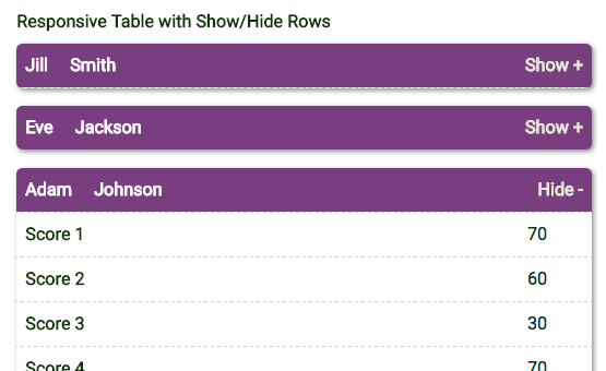
Show and hide hybrid
I installed a fluid responsive table within a legacy architecture and added a Show/Hide row effect. It used jQuery to affect the cell height with the function called on a pseudo element. This gave the presentation of cell show / hide but as the platform was not inherently accessible, I did not test its accessibility.
Accessibility testing aside, this may lead to a solution when the fluid-responsive table technique is used with wider data tables? I've included a prototype here for your interest.
Note: ideally, the cell content would be selectable and not toggle the hide function and we'd achieve a smoother transition.
| First Name | Last Name | Score 1 | Score 2 | Score 3 | Score 4 | Score 5 | Score 6 | Score 7 | Score 8 | Score 9 | Score 10 |
|---|---|---|---|---|---|---|---|---|---|---|---|
| Jill | Smith | 10 | 50 | 50 | 50 | 50 | 50 | 50 | 50 | 50 | 50 |
| Eve | Jackson | 60 | 70 | 80 | 60 | 70 | 80 | 80 | 60 | 70 | 80 |
| Adam | Johnson | 70 | 60 | 30 | 70 | 60 | 30 | 80 | 60 | 70 | 80 |
jQuery Mobile option
The jQueryMobile JavaScript library's strategy is to display the full width table, but to enable our users to select which columns they see using the Columns button.
| First Name | Last Name | Score 1 | Score 2 | Score 3 | Score 4 | Score 5 | Score 6 | Score 7 | Score 8 | Score 9 | Score 10 |
|---|---|---|---|---|---|---|---|---|---|---|---|
| Jill | Smith | 50 | 50 | 50 | 50 | 50 | 50 | 50 | 50 | 50 | 50 |
| Eve | Jackson | 60 | 70 | 80 | 60 | 70 | 80 | 80 | 60 | 70 | 80 |
| Adam | Johnson | 70 | 60 | 30 | 70 | 60 | 30 | 80 | 60 | 70 | 80 |
Note: the jQuery Mobile solution may not work well in all browsers. It works with the table examples above but proved flaky on re-selecting columns to show.
Shorten tables using filters
Table width is not our only problem. Lengthy tables may need pagination, filters, sorting, and show-and-hide techniques to help control the amount of scrolling required to view their data, or to keep the data presentation usefully above "the fold". All these adjuncts can be added to our fluid-responsive table.
The table used on My UX Bookshelf page and the example table below use a touch of JavaScript to dynamically call a text input box in which to type search terms from the table. The table uses a modified CSS style to those used elsewhere on this page but is otherwise the same.
Using JavaScript
The JavaScript filter script can be applied to lists, divisions, etc. In this demonstration a table seems appropriate for a bookshelf list.
The table is configured to apply the typed filter expression to the first three content columns of the four available. (The fourth contains a link to Amazon.co.uk, which serves no purpose in the filtering).
As letters are typed in the text box and if they match those in the table cell text strings, rows containing cells with matching strings are retained in view. Any rows not containing the string are hidden, shortening the vertical height of the table to make it more manageable.
There is some cognitive load here. There needs to be context: what to type that will best show what data rows are needed. The interaction is not overly complex and is easily learned. Accordions could be used to compress the vertical impact of each table section too. The complexity this could add needs balanced against the desire to show and hide rows at all. As with anything in design, it depends.
Improving the experience in smaller viewports
The demonstration below highlighted that on small devices, it was not obvious when the list is filtered.
Something is needed above the fold to indicate when the presentation is updated - and how. The solution is to add a row counter to the script and use it to update the HTML in the table <caption> tag. Now our user can see that a change has occurred and figure out if the filter is strong enough before scrolling down what may still be a long list.
Filtered table demonstration
Demonstration. Type "user", or any other string such as "2012" or "lu" in the Book List filter box. The script will work on the table as you type, hiding any table rows that do not match your filter term in the Book Title, Book Author, or Publish Date columns. The table section headings will remain in view.
Note: Mobile performance may be slow when typing and jQuery Mobile is affecting this site's core font styles. I am certain full-time UI developers would soon fix any jQuery and CSS I may have botched.
Demonstration Book List
| Book Title | Book Author | Publish Date | Link |
|---|---|---|---|
| E-Learning Strategies How to get implementation and delivery right first time | Don Morrison | 2004 | View ❯ |
| User Experience Books | |||
| 100 Things Every Designer Needs to Know About People | Suzan M. Weinschenk | 2011 | View ❯ |
| Axure For Mobile 2nd Edition Building mobile prototypes with Axure RP 7.0 | Lennart Hennigs | 2014 | View ❯ |
| Sketching User Experiences The workbook | Saul Greenberg et al | 2011 | View ❯ |
| The Practitioner's Guide to User Experience Design | Luk Miller | 2015 | View ❯ |
| Undercover User Experience Design Learn how to do great UX work with tiny budgets, no time, and limited support. | Clennydd Bowles | 2011 | View ❯ |
| Interaction and Usability Books | |||
| Design Accessible Websites 4th Edition Thirty-six keys to creating content for all audiences and platforms | Jeremy J. Sydik | 2007 | View ❯ |
| Designing Interfaces Patterns for effective interaction design | Jennifer Tidwell | 2011 | View ❯ |
| Interaction Design beyond human-computer interaction | Jennifer Preece et al | 2002 | View ❯ |
| Designing Mobile Interfaces Patterns for interaction design | Steve Hoober & Eric Berkman | 2011 | View ❯ |
| Responsive Design Workflow | Stephen Hay | 2013 | View ❯ |
| Simple and Usable Web, mobile, and interaction design | Giles Colbourne | 2002 | View ❯ |
| Web Application Design Patterns | Pawan Vora | 2015 | View ❯ |
| Web Form Design Filling in the blanks | Luke Wroblewski | 2008 | View ❯ |
| Writing Skills Books | |||
| Developing Quality Technical Information A handbook for writers and editors | Michelle Carey | 2014 | View ❯ |
| Letting Go of the Words Writing web content that works | Janice Redish | 2007 | View ❯ |
| Microsoft Manual of Style Your everyday guide to usage, terminology, and style for professional technical communications | Microsoft Press | 2012 | View ❯ |
| The Non-Designer's Design Book Fourth Edition Design and typographic principles for the visual novice | Robin Williams | 2014 | View ❯ |
| Top of list | |||
Summary
As with most UI, it depends. Consider the responsive table techniques and employ the one best suited to the task and to your users.
Reference this article
Godfrey, P. (Year, Month Day). Article Heading. Retrieved Month Day, Year, from URL
Contribute to this article
Please add your comments.