Writing for UX Optimizing Images Step 3: Performance
Updated by Pat Godfrey: August 15, 2020
…
This is the last of three articles exploring steps of a typical Image Optimisation Workflow:
- Step 1 reflects on our choice of images, their inclusivity, and their source.
- Step 2 discusses optimizing the alternative content and experience of digital images.
- Step 3 outlines strategies to optimize images for performance before uploading them.
Each step guides an approach to, and design of our users' experience of images. This is of immediate interest to anyone writing and uploading content to enterprise CMS or B2C web applications.
Important
Always back up your image files before optimizing them.
Shared Learning
Flag this content to your friends, connections, and colleagues.
3.1. Why optimize images?
Poor image performance contributes to an overall poor impression of our product. Read why and how to improve the performance of your images.
3.1.1. What is performance?
Digital product performance measurements include those for:
- Carrier bandwidth.
- Size of data delivered by HTTP.
- Client and server-side data processing.
Poor performance may cause:
- User dissatisfaction with loading and reaction speeds.
- Loss of platform function.
- Loss of browser function.
- Expensive data costs.
3.1.2. What does optimizing do?
We optimize image to improve:
- Presentation.
- The image must be necessary, relevant, contextual, and discernible.
- Performance.
- Large image files can consume large quantities of metered data and slow page loading times.
- Usability.
- When an image is more than decorative, its content must be available to everyone.
- Accessibility.
- When an image is more than decorative, its content must be accessible to everyone.
- SEO.
- Search engines recognise when our images are optimized and surface them when useful. This promotes our brand's identity, too.
Photograph files from cameras can be large. A 5000 pixels wide and 18 million mega-pixel landscape photograph may exceed 20 MB file size. We can reduce the scale of the image to 1200 pixel wide.
Two 1200 pixel wide images may look the same side-by-side and one may have a larger file size: compare 100 KB to 20 MB! We need to reduce, or compress the image file size and without affecting the quality.
Note: Our users may open our content in a much smaller viewport than their screen size suggests.
3.1.3. What do we optimize?
- Scale.
- Scale is the 'physical' size of an image. The size an image displays in a Web browser does not depend on the actual scale of the saved file.
- Resolution.
- The resolution of an image is how sharp it is at its default scale. Image compression reduces the numbers of unique pixels and colors in an image. This can blur details and affect quality.
- File size.
- File size depends on the scale and resolution of the image. Image compression blends unique pixels together. This reduces the number of individual data bits and the file is smaller. Image complexity and colors affect the amount of compression available before quality reduces.
3.2. Optimizing image scale
3.2.1. What can we do?
The best practice is to style images to fit their container regardless of their saved scale. We must know:
- When displaying a large image smaller than its true scale is pointless.
- When an image is available to view or download at its native (larger) scale.
- When an alternative and larger scaled version of the image must be available to download. For example, as a PDF.
Important. Repeated image optimization reduces the quality of the image file.
    img {
        width:100%;
        height:auto;
    }
3.2.2. Optimizing image scale
It is generally pointless importing a 2400 pixel wide image to display it at 1200 pixels wide. It may increase the file size, wasteful. Excess file sizes slow page loading and frustrate our users on metered connections.
An exception is when a user can demand to have the larger image served. This often happens by clicking the image and the browser navigates to the file.
3.2.3. Find the image scale
Finding the scale of an image is usually easy to do. These instructions are for popular operating systems and browsers.
| Condition | Process |
|---|---|
| On your PC or Mac. |
|
3.2.4. Edit an image's scale
You can update an image's scale in a range of image editing software.
| Software | Process |
|---|---|
| Photoshop. |
|
| MS Paint. |
|
| Mac Preview. |
|
Notes:
- Displaying an image saved with a width of 300 pixels at 600 pixels wide on a screen gives a poor result. Images need to be at a scale fit for purpose.
- Text on images degrades when the image is over-optimized or enlarged. When printing images or the texts must be legible on screen, then use a larger scale or offer a PDF version.
Insight. Why are we prioritising image widths? When we style images to be responsive, we set the image width to 100% of its container's width. The height is set to auto. As the image container grows in width, the image width grows with it. The height grows in proportion to the width.
3.2.5. Scaling Scalable Vector Images (SVG)
Unlike the raster image formats like PNG and JPG, we can increase the visible scale of a SVG image without losing quality. This is great news.
Unfortunately, unconstrained SVGs can cause severe accessibility and readability concerns. Their default scale is 100% the viewport or container width and they can occlude written content when their HTML scaling and, or CSS styling is not available.
SVG Rule
Always give SVG and particularly those used as icons an HTML width="n" and height="n" attribute where n represents a number of pixels.
In addition, when employing the img {width:100%;height:auto} CSS rule or similar to override default scale attributes, always add a specific rule for SVGs used as icons.
Note: The following CSS2 and CSS3 examples are conceptual and are not complete code solutions!
Targeting HTML <img> tag use cases
img {width:100%;height:auto}
  .img__icon {max-width:42px;}
  .img__pictogram {max-width:80px;}
  img[src$=".svg"] {max-width:42px;}
Misusing the semantic <i> tag and an image sprite sheet
These methods apply to any container:
i {
  display:inline-block;
  width:2.625rem;
  height:2.625rem;
}
  .i__cloud {
    transparent url(img/spritesheet.svg) no-repeat 0 0;
  }
    #parent:hover .i__cloud,
    #parent:focus .i__cloud {
      var(--iconHover) url(img/spritesheet.svg) no-repeat 44px 0;
  }
  .i__desktop {
    transparent url(img/spritesheet.svg) no-repeat 0 44px;
  }…
3.3. Optimizing file size
Important. Always set the image scale before compressing the file.
Photograph files from cameras can be large. A 5000 pixels wide and 18 million mega-pixel landscape photograph may exceed 20 MB file size.
Optimizing the image scale and resolution decreases image file sizes. And we can make further performance savings. For example, two 1200 pixel wide images look the same side-by-side. One may have a larger file size: compare 100 KB to 20 MB!
Our image file comprises information about the color of each pixel. Images comprise many millions of individual pixel values. Each need saved making larger file sizes. Software can reduce the file size by reducing the numbers of individual pixel values. Unneeded information saved with the image file is also removed. This is image compression.
Saving an image to JPG, JPEG, and PNG will compress a RAW image file and reduce its file size. JPG and JPEG files work well for photographs and PNG works well when we want to keep image transparency.
Compressing a file too much will lose definition (resolution). Images become, "jaggy" edged and blurry, or colors no longer blend as smoothly.
Some image editing software enables you to choose the amount and type of compression. Without that software, an excellent option is to use an online tool like www.tinyPNG.com. The tool will compress image files by as much as two thirds without losing visual quality.
Hint
PNG file compression is near "lossless", which means your images stay sharper. It also preserves transparency. This makes it ideal for graphic images. Choose 8-bit PNG for the optimal compression for web use. It reduces the colour pallet so use wisely. It works very well for line and vector images.
JPG files are "lossy", which means your image definition can degrade the more compression you apply. Blurring an image slightly will reduce the file size considerably.
New kid on the block is WebP, which is Google's disruption of image compression. Browser support is not great (August 2020), and as an optional source in a <picture> element, it needs considering. Play at Squoosh.app.
Aim to keep combined image file payload under 100 to 150 KB per page (rule of thumb). When possible, have your page deliver images at file sizes in accord with the network speed, browser type (mobile or desktop), or viewport width. This assumes the smaller the device, the more likely connection will be metered and cost our user per MB. Skip to 3.5. Dynamic loading of images to learn more.
| Software | Process |
|---|---|
| tinypng.com. |
Note: TinyPNG allows for batch processing of up to 20 files of up to 5 MB each. |
| Squoosh.app |
Hint. Use the slider to overlay a before and after view and zoom in to check for resolution loss or gain. |
| Photoshop (for Mac) |
Hint. In spite of its label, the PhotoShop Export for Web (Legacy) tool gives the most useful WYSIWYG feedback on your image optimization choices. |
3.4. Optimizing image resolution
this section aims to explain why a 5 MB, 1000 pixel by 1000 pixel image is the same resolution after compression to 1.5 MB. Intrigued?
3.4.1. What is this resolution madness?
Image resolution is integral to and affected by the image scale and file size. We seldom adjust the resolution alone. It is a result of adjusting the image scale and file size.
Compressing images removes data from the file. The data is there for a purpose including meta-data. Some data can be safely discarded.
Compression uses algorithms—often very clever ones—that analyse groups of pixels. They aggregate the attributes of neighboring and like-pixels.
If each pixel is unique then each has an individual data cost. The more pixels that share their attributes with others, the less individual pixel attributes there are.
Here's the money shot: compressing images alone does not remove pixels. It reduces the numbers of unique pixel attributes and the data needed to communicate them. The file size reduces.
Go on. Let out that little, "wow". You are among friends.
The more pixels that share their attributes the greater the risk that shaded and graduated portions will loose fidelity. Blocks and edges appear; "jaggies".
The only way to reduce the number of pixels is to reduce the image scale. Our example 1000 pixel by 1000 pixel (1,000,000 pixels) image can be resized to 500 pixels by 500 pixels (250,000 pixels). The resolution—the number of pixels—is reduced. (That's worth another, "wow"?)
Once an image has been compressed or scaled down, the lost data can never be completely retrieved although software working on fractal algorithms do a good job of improving the fidelity and increasing the scale of some images.
3.4.2. How is image resolution measured?
The image resolution is often related to dots per Inch (dpi), which is a print measurement. Regardless of the image file, images display at around 72 dpi. This is regardless of their native dpi or the screen dpi, which varies device to device. So, let's not go there!
There is no rule to save images at 72 dpi. It depends on the user case. When an image prints as a photograph in a glossy magazine, then it needs a dpi between 220 dpi and 300 dpi.
For our purposes, 72 dpi is the minimum to display well on the screen. Work to each use case. An image saved at 1200 pixels wide and 72 dpi will display the same as an image saved at 1200 pixels wide and 300 dpi. Both may share the same file size, too.
The image scale and its compression are important considerations to its resolution. Images will become "jaggy" or ill-defined when:
- A small image is displayed at a larger size.
- The file size is overly compressed.
Insight: A retina display has more pixels per inch (a high dpi). This is confusing, we know. If the screen is double the dpi of a normal screen then an image saved at 300 pixels wide will display at 300 pixels wide.
The retina screen expects the image to be 600 pixels wide to display at 300 pixels (being double the normal dpi). It enlarges the image to 600 pixels wide. This will appear of lower quality.
The image displayed at 300 pixels wide on the Retina screen should be one saved at 600 pixels wide. The HTML5 <srcset> attribute allows us to load the right image from an array of duplicate images saved at different scales.
3.5. Dynamic loading and, or display of images
There is a variety of methods to optimize the serving of images to the browser. The assumption is that the narrower the viewport, the smaller the screen and therefore the smaller the image necessary. And that is not always true. It is sometimes better to divide between 'mobile' and 'desktop' browsers. As always, test.
This is an illustration of responsive design on a tablet device with two browser apps displaying in the viewport.
In wider viewports you will experience the interactive emulation using iFrames. Narrower viewports display an image.

Demonstrating this site's responsiveness using iFrames to embed the page. Adjust the viewport width to observe the effects. In smaller viewports the presentation updates to an image to avoid Safari IOS issues. If your browser stalls, then refresh its display.
3.5.1. The Picture element
Using the HTML5 <picture> tag and source media=“…” and srcset=“…” attributes, we can use viewport parameters to show different versions of an image depending on the viewport size, etc.
This technique is invaluable to our users who need to increase the font size and when we employ a fluid-responsive design philosophy.
We can also use CSS media queries to update the background image of an element: its size, position, and even to add interesting filters. Elements can have more than one background and each can be positioned and animated individually to produce engaging visual effects.
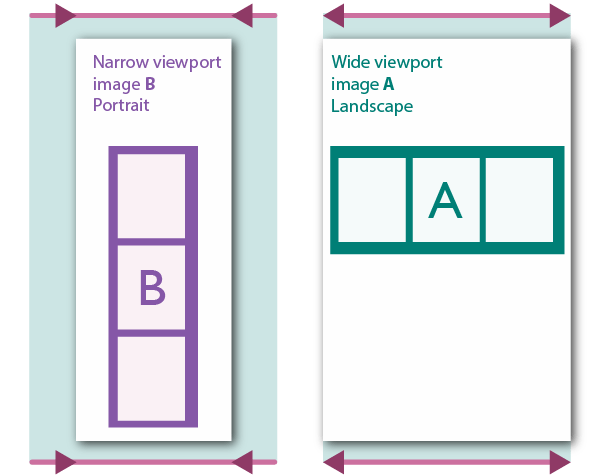
When needed, we can show a landscape image in wider viewports and a portrait version of the same image as the viewport is narrowed.
Try it. Narrow your browser to 449 pixels wide and the image swaps from landscape to portrait.
The HTML
Using the HTML <picture> element, we can wrap a set of different versions of an image to display in different widths of the browser. Browsers that do not understand the source attribute serve the <img> version by default. It's not a perfect system. As always, test.
<picture>
  <source media="(min-width: 450px)" srcset="img/optimization/viewport-scaling-images-wide.png">
  <source media="(min-width: 100px)" srcset="img/optimization/viewport-scaling-images.png">
  <img class="centerImage" src="img/optimization/viewport-scaling-images-wide.png" width="601" height="475" alt="A landscape image with three boxes left to right and portrait version top to bottom">
</picture>
3.5.2. Lazy loading, etc.
Many CMS and content platforms manage what image file size is downloaded to the browser. Some only load the image when the browser window is scrolled to its position.
The aim is again to save data on metered data plans and to serve the best quality image to the best quality (and size of) monitor.
Hint
Very few users operate their desktop browser window at full-screen and even mobile devices can offer a reduced width browser window as a of multi-tasking feature. Consult with your front-end developer and user research to determine the strategies to follow.
3.5.3. Testing Optimization
After our images are optimized, we can test for and enhance their usability.
Color JPG and PNG web image compression targets are:
- 50 KB for 800 pixels wide by 500 pixels tall.
- 70 KB for 1200 pixels wide by 750 pixels tall.
Notes: Darker images and complex photographs tend to compress less well. Aim for under 110 KB in the worst cases.
Always test your images across different viewport sizes and devices. Some browsers offer developer tools that enable some quality of testing across simulated viewports sizes.
| Test | Condition | Procedure |
|---|---|---|
| Test the image scale. | In your Browser. |
|
| Test the image scale. | On your Computer. |
In PC Windows File Explorer:
In Mac Finder:
|
| Test the image resolution. | On your Computer. |
In PC Windows File Explorer:
In Mac Finder:
|
| Test the image file size. | On your Computer. |
|
3.6. Import to CMS
3.6.1. Upload your images
Upload your image to the CMS or website image directory and import it into your document. Set the image display size, alternative text value, and the caption as designed. Save your changes.
3.6.2. Testing captions and alternative text and content
Captions should be tested in each of two scenarios:
- Image shows.
- Image does not show.
After publishing our document, we can test how the captions and alternative texts work together in our browser.
| Condition | Process |
|---|---|
| In your Browser. |
|
3.6.3. Testing image scale, resolution, and size
You can test your own images or those on other documents and websites. This is useful when checking when a source image is suitable to download.
| Condition | Process |
|---|---|
| In your Browser. |
|
3.7. Publish
That's it. Your images are meaningful, their content is accessible, and files optimized. Grab a coffee. There's more work to be done on that copy text!
Reference this article
Godfrey, P. (Year, Month Day). Article Heading. Retrieved Month Day, Year, from URL