Writing for UX Optimizing Images Step 1: Choice
Updated by Pat Godfrey: February 1, 2020
…
This is the first of three articles exploring steps of a typical Image Optimisation Workflow:
- Step 1 reflects on our choice of images, their inclusivity, and their source.
- Step 2 discusses optimizing the alternative content experience of digital images.
- Step 3 outlines strategies to optimize images for performance before uploading them.
Each step guides an approach to, and design of our users' experience of images. This is of immediate interest to anyone writing and uploading content to enterprise CMS or B2C web applications.
Design thinking
Is an image needed, or is there a gap in our written content?
- What is our image for?
- When does it achieve our enterprise and our users' goals?
- Why THAT image?
- Where should it be positioned?
- How should the image be optimised?
Shared Learning
Flag this content to your friends, connections, and colleagues.
1.1. Decide what content the image must convey
1.1.1. Why is an image needed?
We use images to:
- Decorate.
- Decorative images look pretty and are not necessary to understand the content. When we remove the image, nothing is removed from the content's meaning or context.
- Illustrate.
- Illustrative images:
- Support content. For example, process flows or photographs illustrating instructions available in the text copy. When we remove the image, we may remove content and, or the context needed for some users to understand the content.
- Stock photos may fall into this category. (See any enterprise website).
- Inform.
- Informative images have imagery, text copy, or data that may be essential to the topic. Examples include images containing text copy, processes, and graphs, etc. often found in info-graphics.
My article on UX Delight with Accessible Visual Design may be useful. It examines the content and accessibility of images for UX.
1.1.2. Where does the image sit in the content flow?
How does the image support or convey the content? The image position within the content flow conveys relevance and, or importance. Images on the same page should connect with the content and with each other.
Content and images consume real estate. When the viewport narrows, fixed width layouts can hide parts of an unresponsive image. Flexible layouts may cause an image to shrink too small to see details or read copy texts. Consider where the image focal point is in relation to its display across viewport widths. (Read my article on Fluid Responsive Design Philosophy).
1.2. Consider accessibility, inclusion, and culture

Consider accessibility, inclusion, and culture for ethical, legal, and business reasons. Accessing our populations who experience temporary or permanent disablement is a competitive advantage.
Accessibility is our Human Right. It is compromised when talking about inclusion is felt to be difficult. The topic is discriminatory by nature—and only in a good way. We must view our content and images from different and new-to-us viewpoints that may exceed our experience. Consider the following action research:
- Study W3C's WAI accessibility perspective videos and YouTube for videos posted by people with cognitive, physical, and visual differences to you and your team:
- Capture notes.
- Who are they and what are their challenges?
- What solutions are we able to design, write for, or implement?
- Ask to access less-able users to interview or to user-test your ideas.
- Create personas, problem statements, and empathy maps:
- Map our less able users' journey through our content.
- Where can we add support, coded adjuncts, or alternative content strategies?
Tip
When we write for our users' experience we must follow UX and inclusive design principles.
1.2.1. Inclusion and culture
Gender, race, and religious inclusion are important values to our enterprise. What other values do we support, and what must our image include or omit to share those with out users?
Inclusion can be silo-ed negatively as lists of ability: color blindness, age, cognitive function, etc. And that is not enough. Cultural use of colors and our and others' demographics or beliefs feature within our inclusive design process too.
From a chat with a digital UX leader, they clearly lacked insight:
…we don't need to test blind people because we only build enterprise software…
When we know what enterprise software is and that blind people not only need to work with it and can develop it, the ableist culture of digital design becomes clear. We design for the percentile we are comfortable designing for. And that has already changed. Accessibility is our Human Right.
1.2.2. Create and consult personas
Segmenting our inclusive and discriminatory personas and their experiences may lead to an advantageous image selection and creation standard.
Personas written to represent the widest range of people reflect and extend our enterprise's values and culture of inclusivity and accessibility. Capturing difficult inclusion viewpoints from cultural, societal, racial, ableist, gender, and other concerns strengthens our design.
Be mindful that our personas should reflect user research and not every user may be represented by it. Even proto-personas based on researched assumptions may identify 'red flags' and opportunities.
Teams writing or illustrating digital content without reference to inclusive proto-personas may omit a basic business perspective. Content written for everyone is easily globalized and translated.
Tip
Inclusive content design and presentation is a competitive advantage.
1.3. Plan to enable
We can each become disabled or less-abled today.
1.3.1. Ability
Disability is a range of situations and not a condition. The following is from Barnett and du Toit (2018):
Ability (functional capacity) + Barrier (created by product)
= Disability (conflict between ability and barrier)
Barnett and du Toit list three ability areas where ability ranges from poor to excellent:
- Cognitive.
- Physical.
- Visual.
If we convert "visual" to sensory, then we can more easily understand to include other disabilities such as hearing deficit. When dealing with a range or combination of user needs, we can understand that we must offer a combination of accessible and inclusive design solutions.
Images that convey complex content may be difficult for some people to understand or fail to meet their learning preferences.
Alternative content and accessible image design benefits everyone. Practical examples of temporarily reduced ability are:
- Reading from screens in bright sunlight.
- Being under distraction or haste.
- Navigating content on a mobile device while on the move or carrying something.
- Working on the too-small and cheap enterprise laptop screen?
Tip
Quality image selection and optimisation assists people with a long-term, temporary, or permanent impairment. For example, everyone.
This article touches only lightly on the very broad topic of inclusive and accessible content. User research beyond your target demographic and the abilities of your team is key.
1.3.2. Visual impairment
Reduced visual ability is a challenge to writers and visual designers working within an ableist culture. We work with a largely visual medium.
Our approach begins with browsers presenting content on a screen where our users may employ browsers that interpret content as speech.
News just in: blind people shop and search and consume news and politics and banking online.
1.3.3. Cognitive impairment
Age, injury, and learning differences affect our cognitive ability. Widening our understanding of cognitive impairment to include attention span, motivation, and emotional engagement with our content is essential:
- What is our image for?
- When does it achieve our enterprise and our users' goals?
- Where should it be positioned?
- How should the image be optimised?
- Why THAT image?
1.3.4. Color perception
Designing for differences in color perception has to be the quickest win? We can quickly anticipate color perception and contrast easily using online tools and common sense.
Statistically, 10.2% of people are color blind. Color-able designers and writers often use color to convey meaning. Perhaps they provide a color-key on a chart? It is not helpful to everyone and is far from inclusive. Famously, Ted Lowe commented on a televised snooker game:
…and for those of you who are watching in black and white, the pink is next to the green.
Color design guidelines
Web Consortium Accessibility Guidelines (WCAG) inform NA and EU accessibility legislation. WCAG Section 1.4.1. encourages using shapes, patterns, contrast, or text copy to communicate meaning.
You can experience your images as a color blind person using a color blindness simulator. Reducing colors to grey-scale can also guide contrast differences.
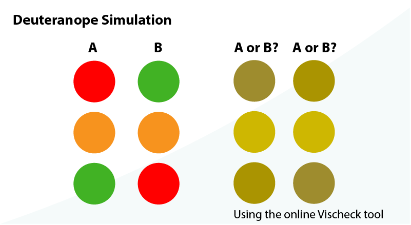
Note: your results will depend on the tones and color you employ. Some are better than others. Test.
1.3.5 Color pallets
The colors within an image may need to blend with the brand. Be wary of different cultural meanings and how users perceive and respond to colors. Read more about colour meanings on Web Designer Depot and Smashing Magazine.
Contrast is important, too. Especially when text is placed over an image.

1.3.6. Color contrast
Vision and color impaired people benefit strong contrasts between the foreground and background. Wearing glasses, working on a reflective screen, or working in bright light are vision impairments.
WCAG 2.0 Success Criterion 1.4.1 (Level AA) recommend a color contrast ratio of at least 4.5:1 for normal sized text against a background. The ratio is higher for level AAA at 7:1. What does that look like? Go to WebAIm's Contrast Checker to test your ideal color combinations.
Specific Benefits of Success Criterion 1.4.1:
- Users with partial sight often experience limited color vision.
- Some older users may not be able to see color well.
- Users who have color-blindness benefit when information conveyed by color is available in other visual ways.
- People using text-only, limited color, or monochrome displays may be unable to access color-dependent information.
- Users who have problems distinguishing between colors can look or listen for text cues.
- People using Braille displays or other tactile interfaces can detect text cues by touch.
Note: This should not in any way discourage the use of color on a page, or even color coding if it is redundant with other visual indication.
W3C, Understanding WCAG 2.0, Use of Color - Understanding SC 1.4.1
Color or Colour?
I have deliberately broken a European English grammatical rule by spelling colour as "color" —that's C O L O R. It is a purposefully inclusive strategy that acknowledges the American influence on HTML tags. American brains are less used to converting 'proper' English spellings to their own, too. It's science. 'Jus' sayin'.
😜
1.4. Decide the image that best conveys the content
1.4.1. Searching for images
We know what content our image must convey and we may have an idea of its 'look and feel'. When browsing an image repository for inspiration:
- What are we looking for and what resources do we have?
- If we were to design, create, or photograph an image ourselves, what would that look like?
- Can we source an image that matches our expectations, or should we create it?
1.4.2. Stock imagery
It is awful. Must we? No. Exercise extreme prejudice. Find an alternative. In a World that is discussing Fake news and authenticity, look only for authentic images.
If we MUST choose a stock image or lose our job, then it MUST appear authentic. Check the contexts where it is already used. If previous contexts do not match your content, then don’t use the image.
1.4.3. Product ‘shots’
To support our enterprise, our content, and our users' product images must be of high quality. The setting must match our content’s and possibly our users' context. Our users may identify with neutral images better than lifestyle settings they cannot match.
If in doubt, ask a Marketing team for support. They may have, ‘the shot’, which our Product team overlooked in haste.
1.4.4. Copyright
When there is a doubt about the source or copyright of an image, seek advice from the Legal team’s copyrighters. A simple attribution may be all that is necessary, whether proximal to the image or in a footer note.
Even if the image is sourced 'free' from the Internet, someone owns the copyright.
Read image repository terms and conditions carefully before reproducing their images in a public space. Even, 'open source' images may caveat attributing the image's creator.
1.5. Select or create the image
1.5.1. Image selection
Our image search or design must match the content the image is intended to convey. Try not to compromise. Choose a range of images that meet your criteria before narrowing down your choice to what fits best.
Conduct user research when possible. Our mantra:
When a picture paints a thousand words, choose it carefully. If an image is dumb, then don’t use it.
1.5.2. Copying an image from the Internet
Images on web pages should be at the right scale, resolution, and file size for our needs. Often they are not.
| Condition | Process |
|---|---|
| In your Browser. |
|
Note: Do not save gallery index or thumbnail images. Always open the full-size images in a new browser tab or window, and then save.
1.5.3. When the right image is not available
When the right image is unavailable, create it. Get support from graphic designers, Marketing, or other expertise as necessary.
MS PowerPoint (PPT) is a powerful image creation and editing tool. It is available on our enterprise desktop. Using PPT we can:
- Create vector graphics including flow charts, graphs, icons, and illustrations.
- Remove backgrounds, composite, use layers, etc.
- Crop, rotate, scale, and enhance images.
- Add annotations to images.
- Export or Save images as TIFF, JPG, PNG, SVG, etc. and right from the ‘slide’.
Note: you can use PPT to make final images or ‘mock-up’ your ideal images when reaching out for support.

Image by Pat Godfrey
Caution: File sizes may increase when saving an image in PPT.
1.5.4. Scalable Vector Images (SVG)
Unlike the raster image formats like PNG and JPG, we can increase the visible scale of a SVG image without losing quality.
Unconstrained SVGs can cause severe accessibility and readability concerns. Their default scale is 100% the viewport width and they can occlude written content when their CSS styling is not available.
Learn more about the risks and strategies for Scaling Scalable Vector Images (SVG) in the third article of this series.
SVG Opportunities
SVG file sizes can be frugal and can be reduced further by removing unnecessary content from their code. SVG files can be edited visually in image editors or as code in an HTML editor, MS Notepad, or Mac OS TextEdit.
Although suiting simple graphics and icons, SVG images can be elaborate and animated like the following example. Photographs saved to SVG are unlikely to display well or to save on file size. Like PNG, SVG preserve transparency.
Instructions. Click on the smaller face to update the SVG code and back using JavaScript to update style attributes. The color updates and an eye shape moves.
Note: The Mermaid mark-down graphic script outputs to SVG. What interactions can we add to them?
1.5.5. Animated Graphic Interchange Format (GIF)
GIFs are made of one or more images, which can be sequenced as looped or play-once animations.
Although popular on social media platforms, they can cause accessibility and usability problems:
- Animations are not experienced by some users.
- GIF do not have a soundtrack or closed captions. They need alternative content made available.
- GIF files can be VERY large.
- GIF files that loop on a screen can be distracting at best and irritating at worst.
These issues each have a solution. The easiest is to avoid GIF altogether! They can be invaluable to some learners for short 'how to' screen-grabs of software processes and useless when they fail or are not seen to play.
As always, it depends. Design and test.
Note: You can compress your animated GIF files online using GIF Compressor
The BBC Global Experience Language guidelines are a valuable resource to those planning to use annimated GIFs. 'Lazy loading' using scroll-event detection with JavaScript is prescribed to swap a static holding image with the annimated GIF. This programmatic timing of content may not meet our users' preferences and can complicate the review of the GIF after the annimation has completed. My example uses a hover or press event as follows.
This GIF example is activated on hover and rather sweetly illustrates that well-designed interactions are vital to a delightful UX (and a planet's safety). Ideally, the solution would work for keyboard users.

GIF created from a Guardians of the Galaxy Vol.2 movie trailer © 2017 MARVEL
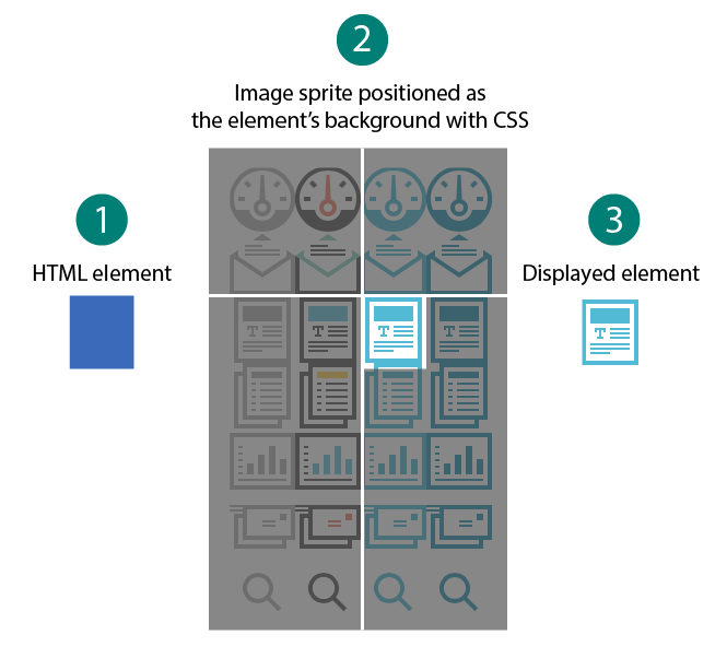
1.5.6. Image sprite sheets
Image sprite sheets are a single image file comprised of two or more images. Using CSS, only a defined area of the sprite sheet is displayed. The remainder is masked off by its containing element.
By using an image sprite sheet, we can save on HTTP calls to download individual image files, which can dramatically improve browser performance.
This technique is invaluable to platforms that share an array of icons.
Note. You can learn more about sprite sheets from CSS-Tricks.
How the image sprite works using CSS:
- Style the element width and height.
- Position the image sprite "behind" the element.
- The element acts as a mask and only the portion of the sprite needed is shown.
The source sprite image is from CSS-Tricks.
Hint
Punctuation can be inaccessible to AT and have a different meaning to that you intended.
You can insert punctuation under the hood in HTML (or 'text view' in some CMS) using codes that browsers understand. For example, ... (three periods) are three periods while … is an ellipses (…). Discover more at HTML By Topical Designers.
Reference this article
Godfrey, P. (Year, Month Day). Article Heading. Retrieved Month Day, Year, from URL