Semantic Search UX Using a messaging design pattern
First published by Pat Godfrey: March 2018
…
Large collections of related data are easy to store. Problems arise when we enable our users to search them.
A semantic search is one answer. Our user is invited to answer a series of diagnostic questions to arrive at one or more suitable results or recommendations.
Shared Learning
Flag this content to your friends, connections, and colleagues.
About semantic search
As its name implies, a semantic search is intended to be semantic: to work in a logical way through language or symbols. In the data search environment, our user is offered a logical pathway through options or recommendations to arrive at the content they want. It is very similar to a branching training scenario and can take as much design to get the experience right.
In a past project we aimed to offer six results within six clicks from a library of several hundred resources. The data set was not the easiest to work with although any information architect worth their salt could organise it. A clear database design and ontology was key. Stakeholders' 'wants' added complexities and the result was still on the money. Again, design and great organisation was key.
A conversation
Semantic Search opens a conversation with our user. In the past example above, we laid out a pathway across one or more pages of forms. Today we can mimic familiar social messaging patterns to improve the affordance of a discourse. The cognitive design is much the same as for dividing options through a form or across pages and the experience is improved by the familiar UI style.
Managing a linear conversation
Although our semantic search design is linear our users' pathways through it may not be.
At each stage in the interaction we must offer a way back. And here's a rub; with pages of forms 'back' is an easy concept familiar to browsing any web pages. In a messaging UI, more thought needs given to the 'back' interaction, which is not natural to the popular messaging affordance or UI.
A simple solution may be to give the last 'message' a close or delete button, enabling new threads while preventing messages being deleted out of sequence. On deleting the last stage or message, the previous message becomes the last and receives the button. Common messaging gestures such as swipe to delete are available, too.
Enabling user review
The advantage of the messaging presentation is our users' ability to review their pathway: perhaps by scrolling back up the 'messages'? It is a familiar pattern and reduces the risk of loosing work, or the scripting required to store it across pages.
UI design considerations
We have all the usual inputs available to us in the presentation. The visual detail is in your graphics.
Accessibility must remain the priority closely followed by usability. Poor code and visual design will potentially turn this successful and engaging design pattern into a user frustration.
Div and span soup
Although "span and div soup" is on the increase following the simplification of JavaScript through various libraries available to our engineers, the HTML architecture should remain semantic.
The inline <span> and block <div> (division, or layer) tags are neutral containers and have no semantic of their own. For example, a <p> (paragraph) or <button> tag each have a meaningful context; <span> and <div> do not.
A semantic meaning may be added using adjuncts such as ARIA attributes sure, but we should consider the semantic HTML patterns available to us before essentially creating our own and confusing browsers – particularly alternative browsing technologies required for accessibility, usability, and inclusivity.
You can use <span> and <div> to control the layout and presentation while the underlying code remains semantic – just use them sparingly!
A form solution
In this case, each stage of our conversation takes place within an HTML form element. The conversation stages suit fieldsets, inputs, and labels.
The advantage of this semantic approach is that, in addition to being accessible, usable, and inclusive, when CSS is turned off or fails the interaction is still visible and available in a usable (if not ideal) format.
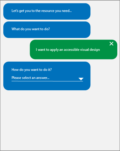
Let's get you to the resource you need...
- What do you want to do?
- Write good copy text
- Write semantic code
- Apply an accessible visual design
Question 1. Please select...
<form class="semantic-search">
<p>Let's get you to the resource you need...</p>
<fieldset>
<!-- QUESTION 01-01 -->
<legend><span>Q1</span></legend>
<label for="q1">What do you want to do?</label>
<div><!-- (to style the input) --><select id="q1" required="required">
<option value="one">Please select...</option>
<option value="two">Write good copy text</option>
<option value="three">Write semantic code</option>
<option value="four">Apply an accessible visual design</option>
</select></div>
</fieldset>
<!-- QUESTION 01-02 -->...
</form>
All you need to do now is style the form container and its elements and then add the script to show/hide the fieldsets as messages and display your users' responses, etc.
Here's a wireframe of the example encoded above.
How may we help you?
Note: The above example is a conceptual wireframe and not a click-thru, prototype, or emulation.
Technical writing and copy texts
Technical Writing is important. Poor or confusing copy will quickly step the interaction away from delight!
The writing style should be informal and yet exacting. Test it thoroughly with users who are not familiar with your project. Familiarity with the project may introduce distorted feedback from expectations not shared with your 'real world' users.
Writing should be simple to allow for the internationalisation of the page, whether provided in-house or by third-parties such as Google Translate. Test, test, test! In my clinical instruction past, Google Translate's French version of an Airway Management chapter spoke highly of airport security!
Summary
As with most UI, it depends. The user experience of your semantic search architecture and UI depends on the strengths of your designer, the clarity of the task, and the needs and wants of your users.
There are a wide variety of inputs and UI patterns available to designers. Even with still-sketchy browser compatibility for some form elements we can ease the cognitive and motor loads on our users and boost usability and accessibility to take our search patterns from frustrating to delightful.
Key to success is employing a solid process foundation such as (R)ADDIE (research, analysis, design, implementation, and evaluation) to ensure that the semantic search you deliver is only what your users need and will find delightful to use.
Reference this article
Godfrey, P. (Year, Month Day). Article Heading. Retrieved Month Day, Year, from URL
Contribute to this article
Please add your comments.