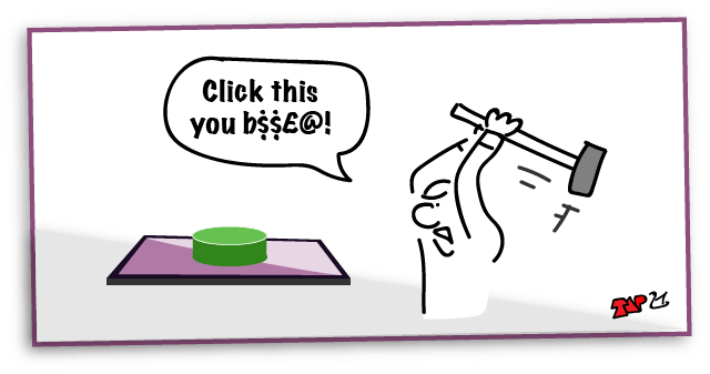
Writing for UX Click or Tap?
First blogged by Pat Godfrey: April 2016
…
We 'click' buttons presented on our screen whether by pressing a key, using a mouse, or tapping the screen or track mat. We still 'click' when we gesture to act upon a button in the air or when sucking on a straw if that is the Human Computer Interaction (HCI) of choice or need.
When faced with a style choice between using "Click" or "Tap", then we should only write, 'Click'. Not 'Tap". Read on to find out why.
Note: this article focusses on "Click" vs. "Tap". The outcome is relevent to alternatives such as "Choose" or "Select", which may entirely fit your context and when not used only for fear of a "click".
Note: this article originally appeared on my blog in 2016.
Shared Learning
Flag this content to your friends, connections, and colleagues.
A standards argument
The seemingly endless debate on writing 'click' or 'tap' aims to describe the interaction between our users' cursor and the graphical user interface (GUI), or user interface (UI) to include non-visual use.
This argument highlights a growing divide between knowledge and fashion as the affordance of semantic/native HTML GUI elements is eroded and colloquialism is legitimised through lack of research, poor insight, and bad habit.
Note: This is all rather academic if the button or link doesn't look "clickable", but that's another article!
What's the beef?
Writing 'tap' in user-facing instructions steps away from a common and standard dialog between us and our users.
Given the growth of widgets, we are in a critical time for vocabulary to describe our UI. Where stakeholders, engineers, and designers cannot agree to terminology, how can we expect our users to know what we are writing about?
Standards in GUI and writing for digital instructions are important. They should reduce:
- The need for our users to learn new GUI visual dialogs.
- The need for our users to learn and translate inconsistent written description, commands, and instruction into what they already know.
- Our users' anxiety when faced with each new GUI.
The consequences of poor standardisation distract our users from the learning and transactions we want them to make; they're too busy learning your (new) language.
That's not to say we must reduce creativity and innovation – far from it. It is only important to understand that localising standards within each office negates standards across our digital platforms and apps on the World stage. And that's not only a shame, but from a universal experience viewpoint, it's irresponsible.
Click, tap, or wave?
To make the point clear, 'click' was never intended, and nor should it ever be used to refer to the noise that a computer mouse might make! The 'click' is the noise that our native, on-screen button's real-world affordance carried into our computer program, and later our browsers and applications. You must understand that. It may be history, but it is a key understanding that may lead us eventually to agree 'click' as the standard.
And, if the majority of designers and writers still don't understand, or chose to ignore this 'previous generation' affordance and context of clicking on a GUI button, and if they proliferate the myth of the mouse 'click', then we face three real risks to accessibility and usability:
- Legitimising arguments for and the design of many different executive interaction commands/descriptions for the same interaction based on ever-evolving technology of Human Computer Interaction (HCI).
- Legitimising the issues already faced in making our products accessible: the click is nothing to do with the alternative pointing methods and devices, but to do with the 'click' of the GUI button's affordance as a clickable button. Using a description of the user's action on a device is flawed by the number of pointing methods and strategies required for access and usability.
- Introducing company or even product-level standards that perpetuate the paucity of global standards that our users, accessibility adjunct developers, and browser vendors need to improve global usability across operating systems (OS) programs, applications (apps), presentation, and devices.
What's this about buttons?
Native HTML buttons (input types button, submit, reset, for example) and link anchors are all buttons. They are the basic building blocks of HTML semantic, utility, and presentation. The same applies to any computer language written for interaction. So this is 'bigger' than just websites. It is about improved and accessible writing of GUI descriptions in a common language.
Buttons and links do differ. Their transactions are ideally:
- Buttons: command and effect a change on the page, platform, database, program, or application, etc.
- Links: offer the command to navigate.
At times the boundaries are blurred, but generally the semantic is true. It is a designer's understanding of the intent of the interactions that affects where these definitions get blurred. The degradation of the interaction is also exacerbated by easily implemented scripting so almost any HTML element can action and appear as a button or link - better when combined correctly with their accessible mark-up using strategies such as the World Wide Web Consortium (W3C) Web Content Accessibility Guidelines (WCAG) Accessible Rich Internet Applications suite (ARIA).
Add JavaScript event listeners and the whole page can become a button!
Importantly, the group of button interactions extends to the other input types inviting interaction. So watch that affordance! I lament how designers are causing our users to guess on what to 'click' while following the fashions of visual design at expense great iteration design!
Note: Affordance is the abstract or concrete metaphor or analogy given to a non-real-world device to give it a real-world context. You look at a chair and know you can sit on it; see a clickable button and know you can click it.
Interacting with the button
When our user choses to interact with a button (including links) or a non-semantic scripted HTML equivalent, our user performs the following actions:
- Identify the offer to commit the interaction. Visually this is projected by our designers by giving the button a visual affordance, but also by using accessible and semantic mark up, even of non-semantic scripted HTML equivalents.
- Choose to interact with the chosen element to enact their command.
- Interact with the element in the way the element needs interacting.
- Understand that the command has been carried out.
Clicking the button
The part of this interaction sequence that our 'click' debate should concentrate on is the third; to interact. Let's examine this in detail.
The arguments made for writing 'tap' are:
- 'click' describes a sense that our user may be deprived of: they cannot perceive the sound of a 'click'.
- The click sound is made by a mouse button. We don't use mice in touch-screen environments. We tap with our fingers/stylus.
Yet clearly, there is a fundamental misunderstanding of what the 'click' is:
- The click sound implied by the GUI button's native affordance (the sound made by the on-screen button, which was designed to sound like the click of a real-world button – like the mouse button might make).
- 'Click' is the short, sharp sound of two objects coming smartly into contact with one another.
- Sound needs an object to resonate: the objects need to vibrate to produce sound waves.
- The objects smartly contacting with one another produce resonance, which can be felt, or represented by tactile or kinaesthetic haptic feedback.
Of course, our crusaders may venture down the “felt by what?” But that is exactly why touch devices are being given haptic feedback – because their GUI button 'click' needs communicating visually and accessibly as an alternative to visual or audible cues; the sense of touch!
Our user using a breath-controlled pointer strategy should expect a confirmation of their interaction; perhaps haptic feedback - not through the mouth, but whatever body part they chose acording to their needs? We digress, but the accessibility of the word, "click" is obviously undervalued.
Tapping or not tapping: a timed interaction?
I lament that the word, 'tap' is already entered into our colloquial and trendy writing world. Maybe it now has a place? But its fashionable acceptance and proliferation doesn't dilute the argument to use 'click' correctly in technical writing.
Any HCI 'button' requiring a pointing device - even using the Mk 1 digit (our finger) - is surely 'clicked'? If we all stuck to 'click', the technical writing world would become a more standard place, and that's a good thing. How often is the action of 'tap' now in fact a long-press: not quite long enough for a tap-and-hold, but programmatically timed to recognise the difference between an intentional 'click', or an alternate gesture or touch used to scroll, zoom, etc?
Some of our users may have trouble performing the timed 'tap'? Try using vibrating gas-powered garden machinery for an hour before making a call on your smartphone. Getting the right touch on the on-screen menus can be devilishly difficult. But then, it's a while since I called my mother-in-law, so she was delighted!
Tap is fraught with these timing issues: and that's an issue with accessibility right there. We should avoid them. If only writers would understand the difference between the HCI and interaction with the UI (User Interface).
Why not tap?
Other than the issue with tap-timing and confused gestures outlined above, the problem with 'tap' is much the same as for 'click' if used to reference the device - its physical HCI. The HCI and UI contexts are technology dependent. So, 'tap' is more discriminatory than 'click' where 'tap' refers clearly to our users' chosen or needed access strategies and 'click' refers only to the affordance of a real-world command button that we all interact with regardless of access?
In the emerging world of virtual reality, HCI has evolved beyond the use of mice, contact with a screen, and in some cases has moved beyond physical interaction at all. The UI is where the interaction takes place; not the physical device or body.
So, to include all our users, their HCI strategies, and all foreseeable future UI interaction strategies, 'click' should be the term of choice for technical writers writing for any device or UI when referring to the command action on an element given the affordance of a button.
Button affordance
When introducing new technology, the wise seek to introduce it using contexts already familiar to the intended users. It's the same power of the analogy to ease change and encourage understanding and engagement that we use in everyday communication of speech, stories, and learning too.
For HCI we call these analogies and metaphors an affordance. The onscreen UI is given a real world affordance so we can understand or at the least adjust to how it operates. A UI command switch has an obvious similarity to a real world button. At the time computers were becoming useful, buttons were themselves changing. Perhaps driven by the need for improved HCI switches?
Switches
We can trace the history of levers, lever-switches, and buttons back to prehistoric times, but the past 100 years has seen the most of their evolution.
Lever switches are not necessarily Boolean (On/Off), nor necessarily a lever. Some switches were round or long-travel multi-switches, but for the sake of argument concentrate on the On/Off lever switch. Think of some real-world examples:
- Railway points (railroad switches)
- The distributer cap of a combustion engine
- Irrigation controls; taps (faucets), or sluice gates
- Toggle switches in classic car (automobile) dashboards.
A switch in these cases is a toggle On/Off; a Boolean lever-switch perhaps designed to be up in the Off position, and down in the On position. (Ignore the silly confusion electrical engineers bring with up for on (red - danger) and down for off (green - safe) vs. domestic switches with up for off (red - stop) and down for on (green - go). Silly people).
So a switch would be an ideal operator for a computer operated on a basis of binary On/Off, yes?
Note: For completeness, levers and switches are employed to make music, too. Piano keyboards being one great example as they give our array of levers, switches, or buttons on our keyboards their collective name. Wind instruments also used button-like sliding switches, but they were called valves as they controlled the rate of air passage in a regulatory More/Less manner, rather than On/Off. Besides, in electronics, 'valve' was a word reserved for the for-fathers of transistors. So we didn't introduce valves to our UI…but here's HTML5 with regulatory sliders…
Anyway, with emerging HCI, and the technology of binary (Boolean) On/Off, an On/Off switch was the ideal device with which execute a command and translated well to a GUI affordance. But in the 1960s and 1970, we were becoming used to a new switch design fashion; one with an improved user experience - enter the button.
The look and feel of a button
Press On, press Off switches evolved from lever-switches: the locking On and Off technology shrank in scale, so the spring action was modified to enable a press down for On and lock, and press down again to unlock for Off.
The new switches resembled familiar items – buttons – and familiarity helps introduce change. Buttons are tactile real-world objects, and these new switches didn't half resemble the same shapes as buttons. So these switches were called buttons. (Actually, the name button was given to switches much earlier, but I'm building a case here so will take a little licence, thanks).
The evolution of the press-on, press-off button offered advantages:
- Less chance to entangle the projecting lever with clothing, hair, or children.
- Less chance to break the lever.
- Less space required than a rocker switch.
- Reduced motor effort.
- A satisfying modern 'click'.
Buttons could be any shape and depth you cared for too, so novelty and fashion designers immediately loved them as a new stage for their creativity.
Perhaps the sweetest of buttons were found during the heady emergence of arcade games in the 1980s: Space Invaders being the sweetest experience of all. Lament. But from the late 1960s through early 1970s, television sets (TVs) lost their rotary tuning dials and toggle switches for press-on, push/pull-off buttons. Car cockpits evolved from lever-switches, to rocker switches, and then on to the ultra-modern, press On/Off button switches. How we clicked our way through the 70's to 90's years!
But then the need for a physical lock/spring was replaced with modern cushioning alternatives – buttons became even flatter. The the electronics were used to determine whether the switch was toggled On/Off, and buttons became touch-sensitive, light-sensitive, and how our designers went to town on them! Buttons became less 'feely' and our fingers complained clinically that there was no longer 'give' in buttons; no suspension.
Computer operators discovered repetitive strain injury (RSI) of their digits, and some buttons have devolved back into large, soft, tactile and in places audible devices again. For example, keyboards are devolving back from hard-surface touch-sensitive flat planes marked out in lines and LEDs or laser projections on a table top to beautifully clickable and comfortable keys made to press, to click, and to cushion. User satisfaction is everything!
The sound of a button
When two solid objects collide they may produce sound waves. A large lever being switched on may produce a low pitch 'clonk', while a small toggle switch may only produce the tiniest, 'click'.
Obviously, to hold the lever in each position a mechanical mechanism is needed to 'gate' the lever in each position. This prevented the lever flopping about and messing about with the electronics. This 'gate' could be a pin that the user removed and replaced between each change of interaction transaction (on and off), or an automated gate or crank operated by a spring or movement such as a lock. This mechanism would make a noise…if you could hear it above all that antiquated machinery!
A large mechanism is likely to make a 'clonk' (large objects resonate at lower frequency than smaller ones). The 'clonk' of course is an onomatopoeia: a word that sounds like the noise it describes. Lever technology shrank over time as technologies do, and they became more often labelled as 'switches'. As they shrank, so too did the mechanism to hold them On or Off using a spring and the noise reduced from a 'clonk' to a 'click'.
You can see where this is going, yes? Buttons clicked!
Pointing devices
The first on-screen computer User Interfaces evolved into Graphical User Interfaces (GUI) that could be manipulated using an on-screen avatar moved and controlled by keyboard shortcuts. But the idea of using a peripheral device to control the GUI was revolutionary. The mouse, named for being small with a tail, became the de facto pointing device and in time evolved to track balls and track pads.
The on-screen avatar was shaped by default like a cursor – the selection line on a slide rule (the only calculator before LEDs, transistors, and buttons not called an abacus).
As the World had become button mad around the same time, the GUI quickly adopted the affordance of buttons for links and command controls, and real-world buttons clicked. And so do did the onscreen button using sound to strengthen their affordance and offer an alternative sensory strategy for feedback.
It's only a coincidence that early mouse buttons clicked – they were buttons, after all. They had a tactile click and an audible click. Wonderful. But mice don't need to click – so if you still argue for the 'click' being made by the mouse, what antiquated mice have you been using and what are you going to write now?
The click comes from the multi-sensory affordance of the onscreen button inside the GUI - not from the pointing device!
Microsoft clicks too
Microsoft's Manual of Style (MMoS) is a popular reference for Writers writing interaction instructions. It's worth noting (on Page 59 of Edition 4) that they advocate the following:
Click: Use for command buttons, option buttons, and options in a list, gallery, or palette.
Microsoft clicks "command buttons". That'll include links then! - Writers Against Click, take note. You are wrong. 'Just saying. And if you are still a doubter, turn to P.60.
MMoS Kindle Edition (Sample)
Here's a sample of the MMoS with courtest of Amazon Kindle.
Summary
'Click' refers to the affordance of a UI button, and not to the click made by a pointing device such as a mouse.
Tap is not the optimum description of the action of interacting with a UI button:
- 'Tap' describes the physical HCI with a touch-enabled device. It does not describe alternative HCI methods and is not a universally accessible action.
- On touch enabled devices, a tap is a timed event to reduce the system's confusion between alternative touch gestures like scroll. How long is a 'tap'? (Actually it's anything from 200ms to 500ms depending on the research and standards of each device and app vendor – it's not quite standard!)
- The context of evolving HCI methods and strategies, both physical and non-physical, fully negate the argument for 'tap' as alternative gestures and HCI strategies command buttons across devices and the use of gestures on a screen are made redundant by alternative HCI methods.
A writing standard must be based on the affordance designed into the UI button, else other physical and non-physical methods HCI strategies and methods across different devices and systems an unmanageable, instance-dependent vocabulary. Imagine the conversation, "do we use; wave, wiggle, or shake a leg?"
Conclusion
The one constant across all HCI (at this time) is the 'click' on a UI element given the affordance of a button, whether that affordance is absolute or abstract, visual or only programmatic. The UI operates on switches. The use of, 'click' is the ideal standard description of an interaction with HCI with a UI button.
The standard to use 'click', will reduce the learning required by our contemporary and future system users and enable them to recognise instructions to interact with their multi-system buttons: a universal understanding of the instructions we write.
Remember, it's about Learning Too!
Click!
Caveat
I want to add the following caveat against the way we perceive metaphors (not affordances) in modern, usable UI design:
Leather buttons, stitches, torn paper edges, multi-screen multi-column pseudo newspaper layouts… on the screen it’s just kitsch. Kitsch, as in: it tries to be something that it’s not – and miserably falls at the attempt: Paper doesn’t wear down in the digital dimension. There are no leather buttons in the real world. Meaningless stitches in the UI distract they eye from the information...
The same rule applies to visual metaphors: Just as with any literary metaphor, a visual metaphor hurts if it doesn’t clarify; it breaks if you stretch it; it becomes ludicrous if you combine it with a second or third metaphor.
Oliver Reichenstein, (2010). Designing for iPad: Reality Check, iA website. (Nov 2016).
Hmm. Leather buttons, stitching and no doubt, Lederhosen – more like Frankenstein than Reichenstein? As much as I agree with the sentiment, I fear for the utilitarian dream of having no fun in a formulaic web or learning space. It is pleasing that Microsoft Fluent Design system has rejuvenated depth on our screens.
I’m certain there is a place for leather buttons, stitching - and even dragons when they enable our users to experience learning too.
Reference this article
Godfrey, P. (Year, Month Day). Article Heading Retrieved Month Day, Year, from URL
Contribute to this article
Please add your comments.