UX delight with accessible visual design
First published by Pat Godfrey: December 2017
…
Using two simple-looking UI graphic examples, we find that visual design is much more than graphic design alone.
We want to cement our user pathways and functionality with a delightful UX and with a great visual design. We need Learning Design to evolve our UI to 100% UX.
Shared Learning
Flag this content to your friends, connections, and colleagues.
Learning Design?
Learning design guides art direction towards a more accessible, usable, learnable, useful, and delightful user experience. Without learning design, we may be left wondering why our immaculate, beautiful, and imaginative UI fails to engage or to convert our product users.
Learning design encompasses all the great psychology, cognitive science, and common sense knowledge UX needs to push UI to delight. Digital learning designers will consider the accessibility, usability, learnability, and usefulness of elements and their layout, sequencing, and presentation to guide visual design in supporting a delightful user experience rather than to lead a poor one.
In the following two graphic design examples, we will explore how even simple visual adjuncts benefit from Learning Design and Interaction Design principles to support a delightful user experience.
Visual design for UX
Contrary to our industry leaders' belief, visual design is not user experience. But then, they are generally graphic designers or fully able stakeholders. In reality, visual design is only one small element of UI and UX design. Great design delights non-visual users, too.
For our visually acute users, art direction alone cannot deliver the cognitive design needed to create or to support delightful user experiences. We are selling the UX short with 50% UI design if our art direction does not apply cognitive design and learning theory. Our users' experience depends on so much more than only looking at stuff.
Accessibility, usability, and inclusiveness
Accessibility, usability, and inclusiveness are an integrated set of design strategies essential to a delightful user experience.
Only around 70% of digital consumers enjoy the full visual acuity, motor dexterity, or cognitive ability required to be delighted by visual design. (It is likely our visual designer enjoys all three. Mantra - do not design for ourselves).
"Ah, but our users all use mobile devices so can see just grand, right?" No. You are wrong. The use of mobile display devices is not restricted to our users with high visual acuity, full physiological ability, or a guaranteed cognitive ability.
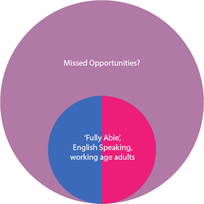
Note: your enterprise may deliberately target the fully able population? That's fine, if you are not found to be discriminating. But what of when that market is saturated or you need an edge over your competition? Take another look at that graphic above. Depending of course on your product, you may be missing a vast number of customers?
Personas, samples, and demography
We may get so wrapped up in our beautifully presented personas that we miss opportunities to delight our real-world users. Too quickly, personas may express only the frugal compromises of our enterprise—they are a compromise strategy, after all. The ideal would be to take the whole team to meet all of your users?
Additionally, user testing a sample of 5 people may have become your mantra to "identify 85% of usability issues"? What are the other 15% issues, how vital are they to delight one or all of our users? And what went well? There may be too great a focus on finding evidence of what to improve than on what to leave be.
Prejudices and assumptions
A user persona of a 20-year-old into skiing down his neighbour's roof in moccasins for You Tube has very different expectations and experience of the World when compared to their neighbour. And who do you imagine that neighbour to be?
What prejudice have you just conjured up? Is it their twin, a more studious geek, or a grandmother aged 30 to 92+? Have they the same dexterity and visual ability as the skier? Do they like the same colours? We are all physically and mindfully different. Celebrate that. Celebrate them. Be mindful not to occlude them from being your customer.
We must not design for ourselves or for our most impressive Resume entry. We must constantly test your personas against the real users we may encounter. Update them. Keep them fresh. Expectations and technology advance too quickly not to.
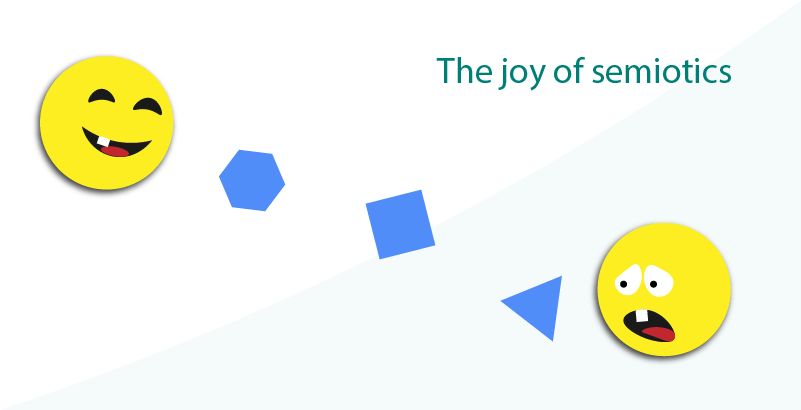
Semiotics and UX
Design for cognition and motor efficiency. It is more important than visual design alone and at once vital to visual design. Design for cognition is our priority. It's not all about gestaltist theory or whitespace! This is why Learning Designers may excel as User Experience designers and in the evaluation of our UI.
Stay with me on this. Let's take a look at presentation and visual design for cognition and confirm our understanding of what that means.
Semiotics is the science of packaging information at source and then ensuring that it is understood by the receiver exactly as intended.
This GIF animation sweetly illustrates that well-designed interactions are vital to a delightful UX.

Gif created from a Guardians of the Galaxy Vol.2 movie trailer © 2017 MARVEL
Our childhood game of Chinese Whispers is the best surviving example of how information can be modified between concept, issue, and consumption. The British Charge of the Light Brigade is another:
...Raglan sent the order via Captain Louis Nolan. Nolan, instead of passing on the order verbatim complete as given, passed it on to Lord Lucan orally as "There, my lord, is your enemy! There are your guns!", and added the word "attack"...
Wikipedia, Charge of the Light Brigade
Semiotic theory and practice are key to our icon design, image choices, and to our UI layout and interaction design. It's what we do, it's what we leverage in our design thinking.
We may get so wrapped up in our personas that we miss opportunities to delight our users. (Personas serve frugal compromises - not our users.)
If semiotics is unfamiliar to you, then you may have a knowledge gap in your design arsenal. Look it up on Wikipedia or, if you have time, read through my MSc dissertation about visualisation as a cognitive design process.
We cannot approach UI design without semiotics being at the forefront of our process, whether visual, or not. What we design (the denotation) is not always what our user finds (the connotation). What are the connotations that we want to re-enforce or to avoid toward a delightful user experience?
Incidental learning (and meta-cognition)
Caution spending long hours designing what conveys what message only to discover our user learns, recognises, misinterprets, or otherwise misunderstands something we over-looked.
We learn all the time. Consciously and subconsciously. Our internal dialogues narrate our expectancy v. the experience. If the experience does not meet the expectation, then the dialogue will run riot and become a negative distraction or misdirection from the task you intend completed. If the experience exceeds expectation, then we are reaching areas of delight. Positive vibes come your way: rave reviews; viral sharing; FT 100; fame; fortune; yachts... Success!
Knowledge is the sum of learning and experience. Unintentional distractions, misconceptions, conflicts with prior experience, and misdirection must be eradicated or our users' impression—their experience and engagement may not be what we intend it to be. Their experience and learning result in knowledge we'd rather they didn't have. (It doesn't work). And they will share the negative so much more easily than any positive. Find a new career.
Icons
A case in point is icons. I see designers using icons without truly understanding why we use them. The result may be to use icons where they are not useful to our user, or in a way that is inconsistent with the reason to use them.
Letters and words are symbols. They are learnable and recognizable icons. Should we replace icons with icons if there is no reason to? Sometimes design habit and fashion drive the presentation where logic and semiotic should.
And to make them accessible, usable, learnable, and useful we must consider what our UI does not display. For example, this site's menu (the "hamburger") icon is marked with the word, Menu in the HTML, which is hidden by the CSS. The icon is the graphic for visually able and the word, "menu" for alternative access to the button's meaning and their learning of what is its function.
Skeumorphism
In a recent post on Medium, "Skeuomorphic Design — A controversial UX approach that is making a comeback", Justin Baker (a UX designer) questioned the Skeuomorphic meaning or affordance of a "hamburger" icon when used to indicate a menu or content list.
Let's look at the hamburger menu for instance.
This interaction did not exist in the real world prior to digital interfaces. It was introduced to conserve space in a confined UI and provide a standardized affordance to toggle additional settings or navigation.
I was surprised that Justin did not appear to know that the icon represents of a chest of draws. He believed it was an collapsed a tab navigation list. A UX or UI designer can only employ symbols safely if they know what, why, and how they signify?
In 2007, we asked whether we should continue to use the 1970's telephone symbol ☎ (UTF ☎) as a phone contact icon. Mobile phones had long lost the dial and body having evolved to just a handset. In just five-years' time from now, how many of our users will recognise the common symbol of a mouse 🖱 with a cable for a "tail"? A mouse..? A what? And what was a CDROM 💿? 😂
Clearly, we must test our symbols, affordance, and other meaningful graphics and update them from time to time.
Stock photography
Generally, stock photography is one of the most widely abused visual strategies. Crass metaphors and other agency's models have no relevance you your values, do they? And what of the other irrelevant visual crap that our users no longer believe in because they subscribe (free) to Pexels.com to find the same images that litter our screens meaninglessly. Sometimes the alternative texts are actually less painful than the pictures.
Look. Your product is costing you $100,000+ to produce. Spend $3,000 on a professional photographer to capture meaningful imagery, no?

Semiotic summary
The semiotics of symbols do not change much, if at all. The relevance and meaning of symbols does change over time. This is one of my favourite topics and I could go on. I could write so much more. "Thankfully", you'll exclaim, I won't.
And it is not only icons that convey meaning. The colours we use, the fonts we embed, the white space, language, tone, etc. are each and all a part of our conversation with our users. Each impacts on how our user perceives, interacts, and engages with our content as an integral part to their overall impressions and experience. To delight, we must exceed expectation. (Stock photography cannot do that?)
In summary, as visual designers in the digital paradigm, we must carefully evaluate and employ our graphics to convey the right meaning at the right time to the right people. And in order to do this, we must also have a knowledge of how our symbols are perceived consistently and understood correctly by our users with sensory and/or cognitive challenges now, and into the foreseeable future.
Case study:
gauging a thermometer
This case study examines the complexities of a simple visual requirement to present a thermometer tool. Although the case study has its origin in eLearning, all of the following considerations may translate to any digital design discipline.
E-learning, learner experience, and user experience design are an even match in giving cognitive effort top priority in our human-computer interaction (HCI). "Don't make me think", from Steve Krug, of course.
The thermometer case (2017)
An eLearning product for younger students requires a thermometer. Direction is to represent the thermometer tool simply as the learning objective is to understand how the Sun affects the temperature of different surfaces in a garden landscape and not how to use a thermometer.
The subject matter expert (SME) sketches a colour-graduated horizontal bar representing a temperature range from warm to cool. The SME appears to have used red for warm and blue for cool.
The 'thermometer' tool function is to update its display of the relative temperature of surfaces as our students explore a garden scene first in daytime and then at night time.
Using a thermometer is not yet a learning objective. Identifying, understanding, and predicting relative temperatures of surfaces is. The students will be using alkaline thermometers later in the course of study before progressing to digital equipment.
Art direction is given to exactly match the SME's sketch of the thermometer tool. The sketch is of six squares in a horizontal array. It is not clear how the selected surface temperature will be represented.
A UX designer working on a parallel product is consulted for their opinion.
Our UX designer explores the function and operation of the thermometer tool:
- Only relative coolness or warmth is considered in the learning objective.
- Alkaline thermometers have red fluid in the bulb, which expands as the temperature increases.
- Temperature is recorded using degrees (Fahrenheit or Celsius), which are printed from a low figure nearest the bulb (cold) to a high figure (hot) furthest away from the bulb.
- A warm to cool layout contradicts how the real-world alkaline thermometer may be expected to display temperature in normal use and when laid on its side.
- Although not immediately a learning objective, students will later learn to use an alkaline and then a digital thermometer.
When a learning designer or teacher designs a real-life learning intervention such as a classroom activity or field-trip, they carefully remove or manage distraction. The environmental set-up and learning delivery focusses on delivering the objectives while maintaining our learner's attention. The students' meta-cognition is managed.
Meta-cognition
Meta-cognition is our background thinking activity. It is taking place in your mind right now. You are comparing what I write against your prior learning and experiences. That is, against your knowledge.
Learning + Experience = Knowledge.
Knowledge enables judgement. You are judging this passage. Perhaps you are now distracting yourself with thinking about what you are thinking and processing less of what you are reading? More now that you are thinking about it at all?
OK. Meta-cognition is more than cheap parlour tricks. Meta-cognition accounts 100% for how our users judge a delightful user experience!
The term meta-cognition means the thinking beyond what we are thinking. This simplistic illustration aims to outline how an unexpected and frustrating experience reduces cognitive and physical performance by distracting the effort required to process it.
Let's agree that our internal dialogue, our thinking in our given language, is at a rate of around 800 words a minute. Perhaps 200 words a minute are applied autonomously to understanding our immediate experience and another 200 words per minute are given to monitoring our environment. We have 400 words per minute redundant capacity to call upon.
Imagine that we require 400 words a minute to successfully process new learning content. Cool. We can handle that. We have the capacity.
Now add a distraction. Anything will do. And let's say there's a loud fizzing noise and the lights turn off. How many words a minute will you allocate to processing through the changes in your immediate environment and safety, the safety and reactions of those around you, wondering what is the cause, and for how long the lights will remain off? That processing power needs to come from somewhere.
And now, replace the lights turning off with our UI failing to meet our expectations (based on our prior learning + experience = knowledge) distracting "words per minute" from our ability to perform. Our inability to perform will create a dialogue of its own lowering the "words per minute" resource available to the performance further. In extremes, we lose control of our performance. Loss of control presents as stress. Frustration.
In the simplest way, we have a finite capacity for conscious and subconscious thought. Distractions and experiences that do not match our expectations eat into that capacity. We think less efficiently. Something has to give. In this case, the logical area from which to draw the necessary "words per minute" is available in the lowest priority space; the one allocated to the learning.
What about the scene?
Aside, if we are designing in Dublin or in Michigan, our garden scene may be all greens and lushness. Where our teachers and students enjoy a more arid landscape in Spain or in California, the choice of scene may have an impact on our student's performance if their experience does not include the temperate 'norms' of our designer.
The thermometer example is complex enough. You can deal with the scenery in your own head 🤣.
Representing a thermometer for young students
In Western culture, we read and organise from top to bottom, and from left to right. Generally. And sometimes we mess that up. Particularly electricians.
Electricians indicate Off with green and the switch in the Down position. A consumer may learn this means On (green for Go). The consequences are very severe. And we allow this dichotomy to continue despite IEC standardization of the binary Off (circle) and On (single line) symbols, with toggle switches displaying a combination of both. The symbols are easily recognisable any way up. It simply does not address the Up or Down, green or red indicators we also learn.
Does it matter which way around this thermometer is? It's not life and death.
Red or red?
The thermometer's alkaline fluid is red. When the temperature is 0℃ or 40℉, the alkaline is still red. When it is 50℃, it is still red. Yet, when we started out analysing this example, we understood red to impart warmth and blue to indicate coolness. Our teachers or our students may be dissatisfied with our design as their own expectancy is to display a range of colour.
Our solution addresses the temperature tool's affordance with a real-world alkaline thermometer. Over the project, we may negate giving attention to the power of red in this young-student context?
We must be certain that our solution meets the immediate needs of our teachers and of the students to avoid learning conflicts and distractions, whether in situation or later in the students' learning career. We may consider enabling our teacher to control how the tool presents according to their analysis of their students. And their analysis will be more relevant to their situation than ours or our SME's can be. More later.
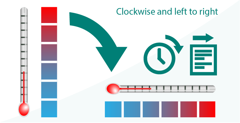
Orientation
When we set an outdoor thermometer up, it will stand vertically. The bulb at its base and graduations running from the lowest temperature near the bulb to the highest. (Ignore clinical thermometers for the moment - I don't want to scrape the bottom of those!)
If we turn the thermometer clockwise (and left to right) on to its side, the graduations run left to right, low to high, cold to hot. This meets our Western culture of left to right reading patterns. It may also challenge the culture of reading top to bottom! It probably doesn't matter. For reasons of accuracy, the bulb will be at the bottom, and when rotated (sensibly clockwise), it will be on the left. The graduations read from cold to hot, left to right. Yes?
The thermometer is directed to be a horizontal scale. Using a thermometer is not a learning objective. Identifying and expecting relative temperatures of things is.
We build an expectancy of how the thermometer should look. And if we do not meet expectancy, how may we push on toward the delightful experience?
We cannot assume the expectancy of our users. We may research and identify baselines of experience and expectancy, and everyone will be different. Our mental models against which we each measure or deploy our expectation will be different.
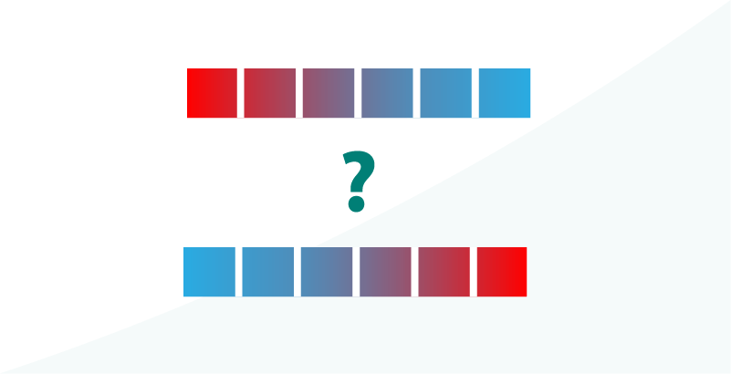
In the example eLearning illustration of a thermometer above, I asked which way the thermometer should lie in the horizontal representation; from cold to warm, or from warm to cold? Should we assume the young students have no experience of thermometers because the topic has not been covered in the curriculum yet?
And what of home-learning, learning through play, great childminders and pre-schools that take children into the garden and check how warm or cold it is today using a thermometer? We cannot assume anything, least of all that the student knows nothing. In their case, if they have experience of how to use a thermometer, the misrepresentation of it in an abstract graphic may distract them from the learning. ("That's not what they look like or behave".)
We must assume something. Assume a number of students will recognise a thermometer and know how to read it and that we must represent it in as concrete a fashion as we can without overloading the students to whom the thermometer is completely new.
This small design decision here of how to represent the temperature is important. We want our students to learn the objective being taught and not to be distracted by failing to meet their expectation or indeed, building a false expectation that may later challenge their learning how a thermometer behaves later in the curriculum. Illustrating the thermometer correctly is important.
And now we have an additional problem. What if our student cannot differentiate the shades of red and blue or cannot differentiate the difference in values between the graduations as cooler and warmer?
Colour perception
The following extract is from W3C WCAG Level A. As a minimum, I work to Level AA. Level AAA is the highest level.
1.4.1 Use of Color: Color is not used as the only visual means of conveying information, indicating an action, prompting a response, or distinguishing a visual element. (Level A)
Specific Benefits of Success Criterion 1.4.1:
- Users with partial sight often experience limited color vision.
- Some older users may not be able to see color well.
- Users who have color-blindness benefit when information conveyed by color is available in other visual ways.
- People using text-only, limited color, or monochrome displays may be unable to access color-dependent information.
- Users who have problems distinguishing between colors can look or listen for text cues.
- People using Braille displays or other tactile interfaces can detect text cues by touch.
Note: This should not in any way discourage the use of color on a page, or even color coding if it is redundant with other visual indication.
W3C, Understanding WCAG 2.0, Use of Color - Understanding SC 1.4.1
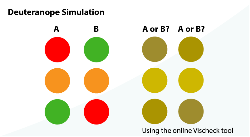
In our thermometer example above, we should agree that the graduations are arranged left to right, blue (cold) to red (warm). As at least 100% of our young learners are human, we can deduce that they may also have a difference in the way in which they perceive colours to how you do.
If we pass the thermometer graphic through the Vischeck color perception simulator, we may believe that there is sufficient difference between blues and reds. And if the graphic sits on artwork depicting a garden? Maybe then the red colours will merge meaninglessly into the green background? We could add a white border for contrast, and is that really enough for 10% of males and 0.5% of females to feel accommodated?
And that's not really the point. We must be in the habit of mixing the visual strategies of colour, contrast, shape, and patterns and adding an accessible HTML text back-up. That way, we always create accessible, usable, learnable, and useful content that can support a delightful user experience.
Web accessibility lore
Web accessibility lore suggests that we must not indicate change by colour alone. So why do so many graphicists not know this? Well, perhaps their mediums do not include accessible HTML?
As web accessibility lore is often enforceable by Law, we should ideally do better not to discriminate against any user groups?
So, in our thermometer example, adding graduations may be useful. And if the students are very young and not competent with numerals? Then we need to think more creatively.
Perhaps then, we can add a penguins or polar bear at one end of the graphic and a lizard or other recognisable warm-climate animal at the other? Snowflake v. fire. You get the idea. Just use something the age group has some experience of, or can learn quickly.
Or maybe, we should consider representing the relative difference between extremes of cold and hot rather than the measurements and address colour and shape in one simplified design? (I still like the polar bear. Can we keep it, do you think?)
Caution: We may now indicate temperature by the change of colour alone. We may still be breaking an accessibility and usability lore? More work needs done.
So, we need to enable a left to right blue to red graduation that uses a change in shape in addition to the change in colour to indicate relative values of warmth. That's easy!
Moving to delight—improving ROI
So, we've arrived at a visual design solution and want to get the tool and parent product out of the door. But wait! We are missing key elements in this design that will rocket our learning and user experience design to the very extremes of delight. And it's not difficult or expensive. In fact, we're about to discover an opportunity to secure and increase our and our customers' return on investment (ROI).
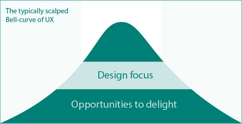
Our customers' buyers and our teachers are savvy. They know that every teacher, class, group, and student have different learning preferences and styles. They understand that the scalped statistical bell-curve our personas are written on do not apply to their class, groups, or students. They do not apply to the teacher. They do not meet the (undisclosed) needs of the customer. We didn't interview 4,000,000 teachers and now on Release, the 3,999,985 staff we could not interview have their say.
We have given them a product to compare to their known and unknown expectations. We may have met them. And have we exceeded them? Have we steered their reaction to one of delight: an experience worthy of their sharing and recommendations to benefit our enterprise (and resumes)? I'd say not yet.
Configuration toward a personalised experience of delight
What if our students are behind in their curriculum and have an increased learning maturity? We may fail to engage them as they feel the style is too young for them? What if our younger students are ahead in their curriculum and demand a more realistic rendition of a thermometer? What if this learning object can be reused as students progress through their schooling? What if the tool's presentation simply doesn't meet one teacher's needs in their classroom?
We can enable our teachers to configure the thermometer to accurately meet their and their students exacting needs? We can exceed their expectations and deliver delight!
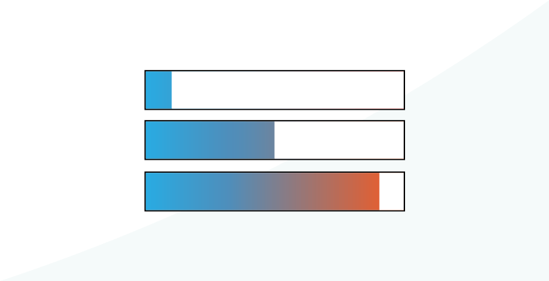
We can easily employ a little CSS and scripting to enable the thermometer presentation to adapt to our learning environment on our teachers' or our student's demand (using UI buttons or 'back-end' preferences). Some ideas:
- Add or remove graduations
- Add or a scalar at percentage, relative values, or degrees (C' and F')
- Adapt the style from the abstract to more concrete representation of the thermometer
- Make the thermometer accessible to alternative browsing technologies and strategies.
These three HTML wireframes share the same HTML. CSS classes change their presentation. The classes can easily be called by scripts on our users, or the program's demand. The HTML includes copy text available to alternative browsing technologies.
Here's the base HTML:
<-- * the .full class is intended added dynamically
* the thermometer class is updated to determine child styles (at 'n')-->
<div class="thermometer(n)">
	<div class="full"><span class="hidden">0 - cold</span></div>
	<div class="full"><span class="hidden">1 - quite cold</span></div>
	<div><span class="hidden">2 - cool</span></div>
	<div><span class="hidden">3 - warm</span></div>
	<div><span class="hidden">4 - hot</span></div>
</div>
And here's the unstyled HTML, illustrating where the script would insert <em> and <u> (re-established in HTML5) tags to be called out by alternative browsing technologies. (Requires research for copy texts and testing in an AT environment):
Any software developer worth their salt can knock this interaction out using a more ideal strategy before lunch.
Example presentation change
Note: This is a conceptual wireframe to illustrate an idea and not a final design.
Lefties and righties
We may also need to consider the position of the tool in relation to how left-handed and right-handed users engage with the presentation using their HCI of choice or need.
If we consider mouse users, there may be additional effort to move the cursor from the exploration of the scenery to the controls they must engage with to complete the learning. If the tools are on the right or left may impact on their meta-cognition and therefore disadvantage some users through distraction and even frustration.
By lore, left-handed mouse users will 'mouse off' to the left of the screen, while right-handed users 'mouse off' to the right. The 'mouse off' position is where the cursor most naturally falls when our user disengages with an interaction. The lore is only that. In practice, it seems that left and right-handed mouse users have their own preferences and we can only speculate on a generalisation indicated by research and observation.
So, where do we place the tool? Visually, it makes some sense to place it on the right of the page. Our explorer's primary action is to explore the scene and the secondary action is to observe what relative temperature is found. We can orient our users to a left-to-right 'normality' of eye and cognitive journey.
If the tool included an interaction then the logic left-to-right may still stand. However, if we are searching for delight, then maybe we can enable our user to drag the tool to where they want it, or perhaps have it track the cursor position? The tool does not need to be constrained by our enterprises' thrift as the effort to develop these delightful adjuncts is so light.
User control
With our tool's configuration and adaptability we have given our users control. Our users are likely to feel delight when they are in control.
Losing control of a situation is a major contributor to stress. Stress is a distraction from delight and leads to diminished performance, in turn leading to frustration.
Our users' (sense of) control of their environment is key to delightful user experiences.
And have we really fully addressed this problem? No. We have missed a solution suggested by the dichotomy between how electricians and their consumers perceive colour to indicate power on and power off.
Cognitive effort and memory
In one user case,our teacher asks the students to explore the scene. They then ask the students which area of the scene was the warmest? Our students have two strategies:
- Recall
- Note taking
If our students did not expect to take notes, then the new task will require working with memory, which takes effort away from learning. Of course, a good teacher will set the task from the off and not all teachers will have had time to prepare.
A solution is to add a recording function–perhaps to leave a temperature or temperature tool on each spot explored? Perhaps, for literate students, automated notes or a notebook?
Scope creep?
Now we are elevating the experience and perhaps the effort to build the learning episode? In my mind, we are adding value and quality to the learning. We are not designing a UI. We are designing the learning experience and maximising its accessibility, usability, learnability, usefulness, and therefore the delightful user experience.
I believe adding learning redundancy, reuse, and heightened engagement and utility offers an improved ROI that can only add to our enterprise's standing and sales. You may not.
We design what we can to reach a delightful user experience. Constraint does what it can to meet expectation. It's your train set.
Engineering expectations and effort
Loads of stories to write in our agile roadmap don't necessarily indicate great effort. Adding a button to configure the tool and a dragable container really doesn't test our developers or engineers, does it? Note taking or recording does.
Unless we didn't build in that expectancy from the start of the project or Sprint? And that's why a 100% UX Workflow combined with the thorough analysis within a UX process using (R)ADDIE aces any trite Photoshop composite approach...just saying.
This example highlights that the delightful user experience takes design. Design requires analysis and space in which to test ideas with our customers and with our 100% UX design focussed team. Our UI is one of inclusive cognitive and human-computer interaction. If the UI offers a delightful user experience, then it is not through visual design alone.
Looking beyond the problem
So, why did I come across the pattern we have identified as sub-optimal in a learning program? Because we did. And we will continue to come across examples of poor cognitive design until content design precedes UI design in graphics-led design studios. Hey, I'm just the commentator. If you are offended, then why?
Thermometer summary
This example aims to highlight the complexity of designing for a very simple concept for young students' consumption.
As complexity builds across our content, interactions, transactions, and visual design we must pay more and more attention to the incidental and intentional learning opportunities we create. Similarly, simplification may not always meet the requirements of a delightful user experience. Only thorough analysis can provide the answer.
With skill, we can manipulate meta-cognition and learning to our own objectives of engaging our users within a delightful experience. That's cognitive-led User Experience design applied to UI and graphic design. Not everyone does that well. It's why Learning designers may make the best UX designer candidates? It's why I can so easily pick holes in published designs.
And if we must roll-back the scope and compromise on the development and engineering effort? First, are we in the right business? And second, it's a business decision that will, as with everything in design, depend.
It's what I do - designing for cognition and a more effective human-computer interaction leading toward the more delightful user experience. The bonus is that I also consider motor effort and other human factors in my designs. And that's another story.
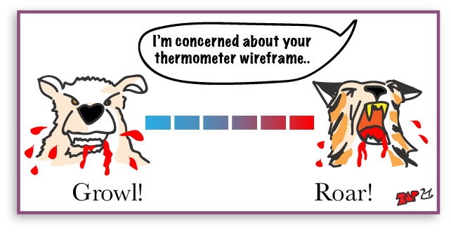
I still like the polar bear—grrrowl! The snarly dog was cool too?
Case study:
flagging achievement
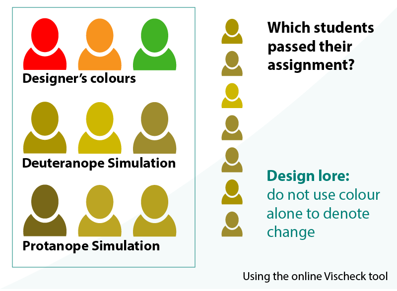
On Houghton Mifflin and Harcourt's HMH Ed, the dashboard and reports apply a red-amber-green traffic light semiotic to otherwise identical 'people' shapes that represent students.
This should raise a number of concerns:
- The 'people' shapes do not vary so colour alone depicts change in difference to Web accessibility guidelines
- The traffic light colours used may not be distinguishable by all users
- The traffic light pattern is upside-down; green at the top and red near the bottom, which is not the colour arrangement of traffic lights. If colour perception is poor, then applying the "traffic light" pattern may confuse results.
I am certain these concerns will have been raised during design. I cannot help feel that something has been overlooked in the areas of accessibility and usability? I fear HMH will miss reaching the levels of user experience delight that they deserve.
Note: the HMH video is not fluid-responsive and of poor resolution, so the screen grabs are of low quality.
Colour, patterns, and cultural meanings
Without dwelling too long on design for colour blindness, let's take a look at how the three colours shape up using Vischeck colour simulator. I was unable to sample the exact shades of colours from the video, and used mid-tones for this example play. The actual results may have been less 'neutral'.
Note: as always in design, your own results will depend on the tones of colour you employ. Some are better than others. Test.
Red and green perceptions
How do we feel about the colour red here? Red imparts feelings of warmth or notice of danger. It can also indicate anger, stop, love, and Off (unless you are a professional electrician). Here, it is used to warn of a students who have not demonstrated mastery of a test or standard. Green is for Go or success and amber is a caution.
Is red appropriate? There's a lore of the Red Pen in schools when marking papers, which may now be scorned upon for being, 'angry'. There is also a negative connotation of failure - and no student fails; they simply haven't succeeded as well as we need or want them to. Do they deserve representing in red after all the work they put in to get the best grade they could?
And are the different colour perceptions of red, amber, and green inclusive or exclusive to our users who have a difficulty recognising them? There is a reason airport workers cannot drive on the runway apron if they cannot distinguish Red and Green. They cannot learn which is which safely.
Why worry?
From a pragmatic standpoint, how many of our users have poor colour perception? Estimates of 9% to 10% of adult males and around 0.5% women are commonplace.
According to Colour Blind Awareness, in the UK that's 4.5% (1:20) of the population (around 3,000,000 people–roughly the same number of unemployed, or the combined population of 42 average-sized UK towns). As a population, for Ireland 3,000,000 people is pretty much everyone!?
So pragmatic or not, colour blind aware design is a significant advantage.
-->Summary
Visual design is vital to our users' experience and toward delivering the delightful experience we aim for. However, if visual design does not include the science of semiotics, knowledge of our users' abilities, and consideration for our users' control we will fail to exceed their individual expectations.
Learning or cognitive designers may hold the key? With their background and training in the cognitive sciences they may look for universal solutions that adapt to real-world user environments and reduce the 'errors' introduced through habits made of compromise. (think, MVP). Yes, we can fix stuff later, done is better than perfect (check me out!), but what review will our users share that will stay in view possibly for the next millennia? What harm can that do to our own enterprise or advantage can it give to our competitors?
In my MSc dissertation all those ten years ago, I concluded that a picture may paint a thousand words—if only we'd let it. Visual design, art direction, and UI design must consider that as a test question. Is our intentional visual presentation matched by our users' cognition and use of it? Is it accessible, usable, learnable, and useful? If not, then we are failing to be anywhere near delight - no matter how pretty the graphics and stock photography are.
Reference this article
Godfrey, P. (Year, Month Day). Article Heading. Retrieved Month Day, Year, from URL