Inclusive and Responsive Slide-show UX
First published by Pat Godfrey: May 2017
…
Slide-shows are a show/hide strategy used to chunk information that our users can consume on their demand. You may know them as carousels, named after round projector cassettes photo slides are loaded into.
Off-the-shelf slide-show plug-ins are complicated and seldom accessible, usable, or responsive. They often cycle slides automatically and have poor, if any controls. They also proliferate the myth that we are unable to create them for ourselves , which leads to our accepting the compromise in the user experience.
There is some knowledge and technique required to craft a bespoke slide-show, but they are within our reach to build well, if not better. Perhaps we should be encouraged to?
Shared Learning
Flag this content to your friends, connections, and colleagues.
Building a bespoke slide-show?
I do not rush to use off-the-shelf frameworks. Yes, they can be cost effective, but may create a compromise between what our users need, and what they are going to get. Some are very good but configuring them can take as long as building one.
I wanted to build my own slide-show to understand the complexities; consider their compromises; and to explore opportunities for improved accessibility, usability, and responsiveness. It's a work in progress, but my observations and ease of build remind me that these "off-the-shelf" interactions are generally well engineered, but provide far from an inclusive user experience.
Let's see if we can't fix that?
A scripted solution
Slide-show design
The slide-show widget is a show/hide strategy used to chunk information and to offer it for our users to consume on their demand. Automated slide-shows. require design adjuncts to provide the accessibility and usability our diverse users may require.
The improper use and design of your slide-shows may risk alienating some of your users and may even risk their accessing the information at all.
| Area | Potential Issue | Possible Solution |
|---|---|---|
| Document Object Model Architecture | The DOM semantics may be broken for some users if the slide-show is created in a non-semantic way. | Avoid over-use of non-semantic elements such as div and span: consider the tabindex, semantic headings, and the use of appropriate native HTML controls such as buttons for controls. Design the slide-show to degrade gracefully (to be understood without CSS or JS available in the browser). |
| Content Availability | Loading slide content from external files will fail if JavaScript (JS) is not enabled in the browser. | If the slide content is not essential, then do not include it. Place slide content on the host page so it will display when CSS and JS are disabled. Conversely, if you have a great deal of content to convey, then consider an alternative show/hide strategy such as tabs. |
| Timing and Navigation | Timed content may overload our user's cognitive or motor abilities. | Offer a pause control, or do not automate the slide-show progression but invite our user to interact with it. If content MUST be 'seen', then why are you hiding it in the first place? |
| Controls | Out-of-the-box slide-show solutions often fail to follow conventions or guidance for size, values (or native text), colour, shape, and (semantic) orientation. |
Use CSS and JS to show and hide control labels and values as required for our visual users while enabling an accurate control description to our non-visual users. Make the controls large enough to ease our users' motor effort. Although control design habits, such as the use of circles to denote a breadcrumb through the slide-show, have been largely learned, it is not right to use only colour to impart their state or meaning. |
| Responsiveness | Most off-the-shelf slide-show plug-ins or widgets are fixed height, which may compromise content presentation. | It is not difficult to make the height of the slide-show respond to its content. However, this may present a compromised experience when offering consistent placement of the controls. A solution is to move the controls outside the slide-show area, but the controls may then slip beyond the fold and leave our novice user disoriented? Test your solution, or limit the content in the slide-show |
| Images and Image Text | It is tempting to place text within images to display in the slide-show, which is not accessible equally to all users. "Responsive images" may "shrink" too small for the text to be read. | Take care to use HTML text in your slide-show, or to offer an alternative access to similar content taking care to offer the same experience of it - a major point of failure in many designs. Test your solution, or limit the content in the slide-show |
An alternative CSS approach
It is possible to employ only HTML and CSS to create a slide-show.
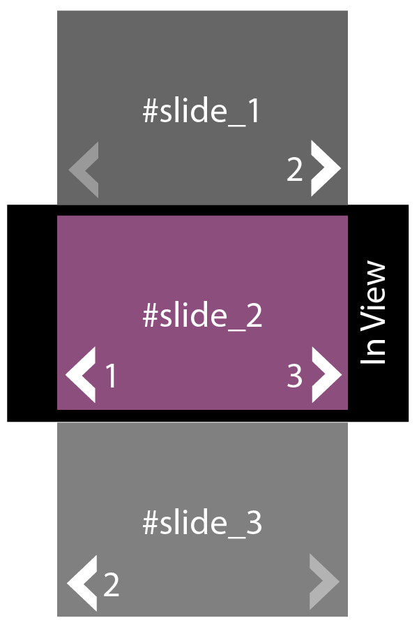
The technique was to create the slide-show frame from a div set to overflow:hidden;, and then to line up the slides as identified divs. The controls were then repeated within each slide div and set to call the bookmark corresponding to the required slide's <div id="identity">.
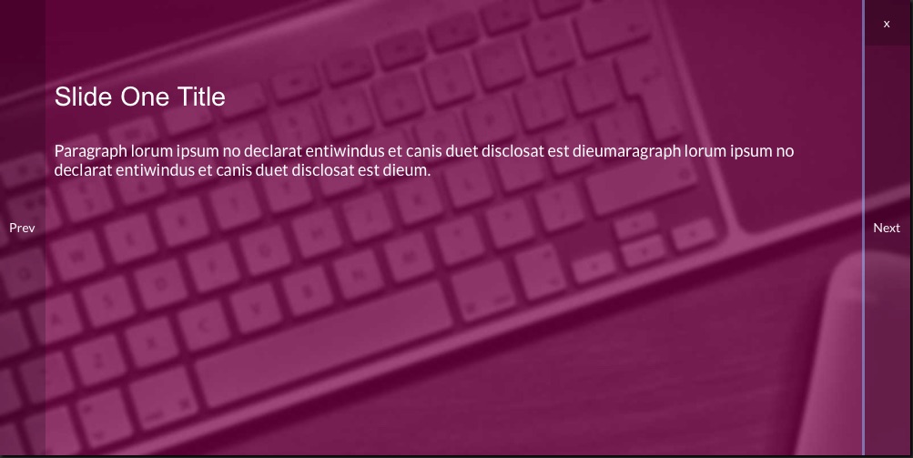
Show an example HTML/CSS slideshow as an overlay.

This alternative technique is effective where JS skills or availability are in question and ultimately it is accessible and usable. It takes a little more jigging about setting up the links but like everything, once templated it is easy to adapt to each new slide-show requirement.

CSS3 keyframes
This wireframe demonstrates the CSS3 keyframes animation technique, which results in an automated slide transition.
Adding control buttons including a Pause button and slide counters or links gives control of the presentation to our user and improves the usability and accessibility, and therefore the universal experience.
Important: Timed presentation of content outside of our users' control is not advised. Our users read, cognate, and interpret content at their own pace and not yours or our design team's.
For example, can you identify the tenth word from the end of Slide Three? (Hint: You can click the slideshow to pause and to re-start it, but try completing the task first without pausing.)
Summary
It's not difficult to make a reasonably inclusive, accessible, useable, learnable, and useful slide-show. At least, not with the support of a UI developer or engineer. So, why do we feel forced into using propriety slide-shows off-the-shelf that fail to meet our users' needs?
As with all things design of course, it depends.
Reference this article
Godfrey, P. (Year, Month Day). Article Heading. Retrieved Month Day, Year, from URL
Contribute to this article
Please add your comments.
