Show and Hide Content
First published by Pat Godfrey: May 2017
…
Content is King and it can place unrealistic demands on our users. Pyramid writing, brevity, active voice, information mapping, clear semiotics, and other writing and presentation strategies aim to reduce these demands, and volume of content remains a challenge in the already noisy web space.

Shared Learning
Flag this content to your friends, connections, and colleagues.
Why show and hide?
Voluminous content can appear overwhelming. Written poorly, and without sufficient headings and paragraph breaks, both visual and non-visual digital consumers can be overwhelmed with the work they feel needs done to consume it all.
So, sometimes we need an "Off" switch to shut down the overwhelming volume, or we stagger our presentation of the content over time to meet the learning strategies of progressive reveal or scaffolding. Of course, the timing must be on our users' demand. (Timed text, that is text that we show or hide automatically, is not inclusive design. Some users will want more time; some less).
Working within a legacy platform architecture there were only three methods of show/hide available within the visual dialogue: links, accordions, and tabs. They were enough for the legacy context but there are many other techniques and strategies that reveal content on demand.
Introduction
Progressive reveal:
- Is a learning strategy to sequence and scaffold contents
- Offers information to our users rather than pushing it
- Reduces overwhelming our user with quantities of content
- Assists visual scanning for meaningful or attractive headings
- Can introduce an exploratory feel, which may foster engagement with caution that clicking stuff does not equal engagement
Where this simple technique fitted best was in presenting the complex information architecture of a large support offering and in reducing the cognitive load presented by large banks of optional inputs and filters in forms.
Implementation
The principle of show/hide is employed to advantage a number of situations. Tabs like these responsive ones below are just one strategy of many available to us.
Caution: offering content does not ensure its consumption!
For example, in its presentation within a larger viewport, the first and second panels of the tabs below are long. Our user may scroll down the all the way down the content and forget or miss the unopened tabs. The addition of a "Next Tab" link or button at the bottom of each tab goes some to mitigate this risk, and may even be useful to our user.
Use in Presentations
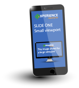
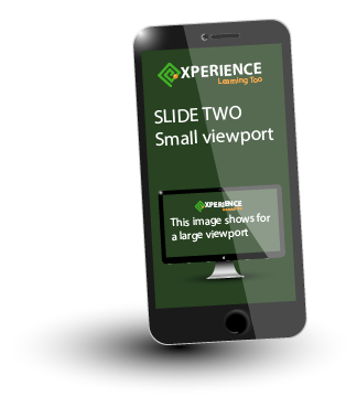
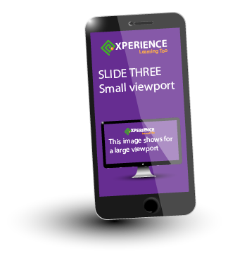
This slideshow is based on W3 CSS although I have built one that is more accessible and usable. It is made responsive by using the <picture> element with image source options for a smaller and larger viewport. (Try adjusting your browser width, or device orientation).
There are more participative dialogues and controls we can use, but "Next" and "Previous" will do here. The Go to Next tab button below is another example of a progressive reveal control.
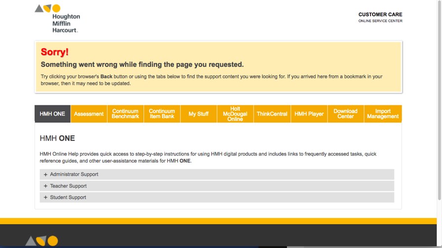
Use in Support Products
The HMH online support offering became quite large. Not all of it was accessible contextually from the parent product or platform. There needed to be a landing page from which our user could find and link to the support they needed. Ten products, each with three user account types of over twenty links each would produce a list of over 600 links.
Show/Hide presented a semantic search strategy and cognitive flow:
- Identify the parent product
- Identify the account type
- Identify the topic or support resource needed
Our user now chooses from 10 options rather than 600, and so on.
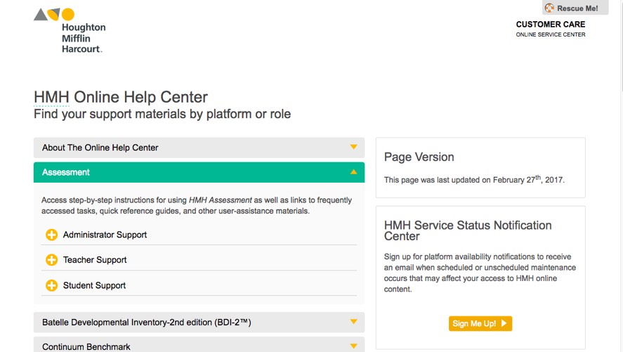
The first strategy was to use responsive tabs, but once the product numbers increased beyond nine, the presentation became bars almost by default. A new design was needed. The result has been very popular and applauded across HMH and by their millions of users.
The original responsive tab design could not cope with the numbers of products and eventually, the media query needed to be so wide that it tended to display accordion bars by default.
The new design was more capable and gave an equal experience across browsers and devices showing accordion bars by default.
Note: Because this tab is long and its visual design is low contrast, we can add a button to inform our user that they are still within a tab, and to remind them that there are other tabs available to explore. A stronger technique could be to repeat the tabs at the bottom, although this may add complexity and confusion.
Use in Forms
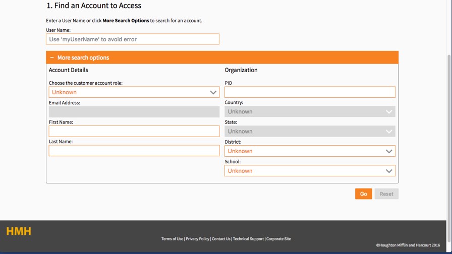
Even simple forms can be overwhelming to some users.
Through poor platform design, our users have learned that they may lose their inputs following error notification or after system time-outs, etc. Inputs may require research away from the workstation or error messaging may frustrate the experience.
The use of Smart Defaults aids error management. A smart default input may not be appropriate, but showing only the required inputs and offering the optional ones within a show/hide interaction helps reduce the immediate load.
The new design was more capable and gave an equal experience across browsers and devices showing accordion bars by default.
Use in Long Documents
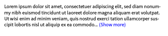
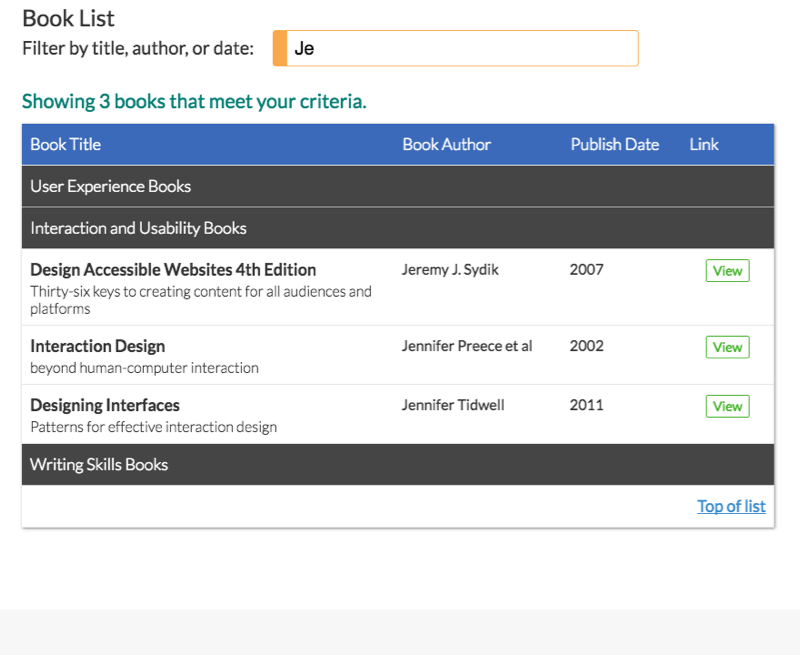
Show/hide in longer content doesn't need to be presented as a wide bar or button. It can be indicated with ellipses or a, "Show more" link (reversed to "Show less" on reveal), etc. Scripting can automate the interaction after a specified number of characters. It's an easy technique, but one best tested with your users to be certain of the right controls. (See the filtered data table in the next tab).
The skill is in choosing what is visible to attract our user, and what is supporting information that can be revealed on demand. That and not overdoing the show/hide leaving your user bored and wanting only to move on to the next site!
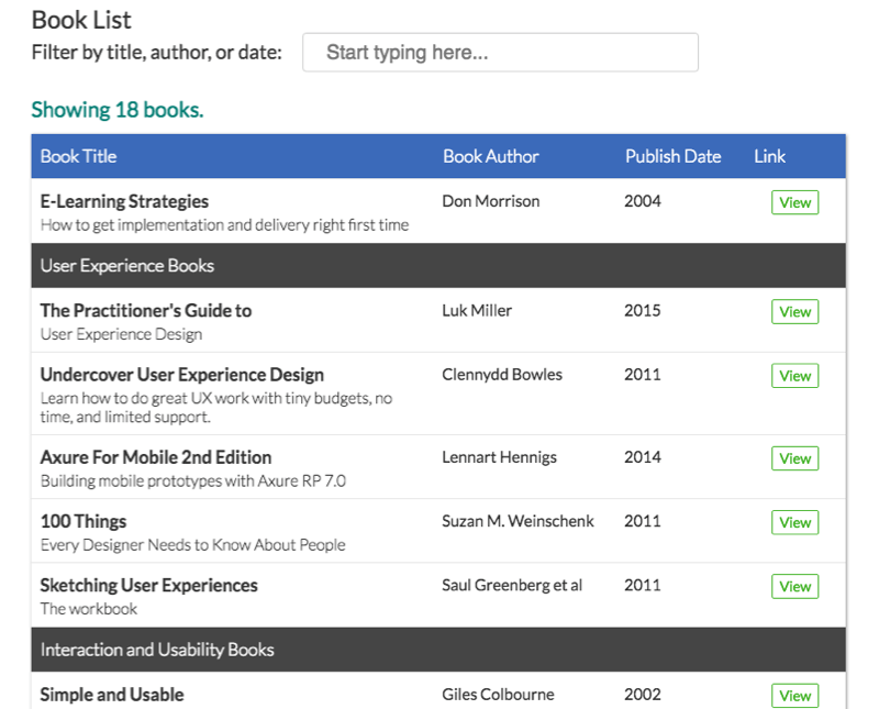
Use in Tables
Long tables can quickly overload our users' motor and cognitive experience. Rows can be hidden dynamically on our users' demand using any number of filter strategies. Care should be taken to explain what the filters are and perhaps to show how many records (rows) remain.
An example filtered table is demonstrated within my Inclusive and Responsive Table UX article (illustrated below).
Strengths and weaknesses
Hiding everything may be as frustrating, concerning, or inappropriate as presenting a mahoosive wall of content. The strategies available to us should be fit to purpose and meet our users' needs.
The user experience
Before hiding content, be certain of why you want to hide it. To reveal the content invariably takes some motor and cognitive effort on the part of our user. Be certain that their effort is rewarded and valued.
Accessibility and usability
Accessibility and usability are two factors we must consider. Our ability to present almost any HTML element as a show/hide button must be mitigated with accessibility adjuncts such as tab-index, element roles, ARIA controls, and scripting to ensure pointer, touch, and keyboard controls are consistent with their semantic element equivalent input buttons.
Where there is a need to show/hide, and where the strategy of choice is accessible and usable, our user can be oriented to our content and made able to scan headings quickly to find what they want, or what we need them to. We can "time" content, organise it, and reveal it progressively to encourage and ease learning. There are many and varied presentation strategies open to us and to our users.
As with any interaction, we must use it inclusively and when needed: it depends when or how that may be. For example, there follow some notes on the choice of symbols. They are supplementary to the main content. Feel free to reveal them.
Technology hurdles
The JQuery scripting library hides content by removing it from the HTML flow. To work accessibly, we first load the HTML, and then add a class and .hide() its content. Any HTML element can be used to trigger the event and we can add ARIA adjuncts to aid accessibility.
Content removed from the HTML flow is not accessible to some assistive technologies nor most browser reader views. The content has been removed from the flow, after all. There are three simple techniques to overcome this:
- Move the content to outside the viewport view.
- Toggle the height of the content.
- Use CSS to mask content overflow (i.e. use
overflow:hidden).
Which technique you choose depends on your and your UI's circumstance. Each have strengths and weaknesses. For example, moving content 9999px left of the viewport can cause browser performance issues (the browser is still drawing the UI even if we cannot view it). Bringing it back into view requires careful technique when using transitions, transformations, or animations.
Note: although we can use the tabindex and ARIA roles and controls to convert static elements into accessible buttons, it should be noted that the semantic HTML element of choice for this interaction is the input type "button". It occurs naturally in the tab index, is inherently accessible and usable, and can be styled as we wish.
Symbols
Symbols are not necessary but may help your visual user to discern the interaction's intent. Images don't need to be accessible: you can call them via the CSS. Use roles and ARIA controls for accessibility purposes.
Ellipsis
An emerging symbol for more is the ellipsis ..., or more correctly …, which is based on the universal semiotic for dialogue; there's more to say. That's fine for an element with a close button, but may not work in isolation for show/hide more and less interaction. Most usually you will see, "More…" and "…Less" with the ellipsis indicating the direction of the expansion or collapse of the dialogue.
The ellipsis is sometimes used to indicate a menu where our designer compresses the visual idiom of a "hamburger" icon. The "hamburger" becomes a "kebab" that can be created from a vertical ellipsis ⋮ (⋮).
Note: Read my, Defending the "hamburger" menu article for more about this culinary abuse!
Plus / minus and lever symbols
The "classic" icons for show/hide are the + and − symbols to show more and less, or levers that our user figuratively pulls or pushes when clicking on them. The levers are most usually signified by chevrons ❯ or triangles that rotate or otherwise transform between reveal states.
A pleasingly practical fashion today is to use the + as a lever symbol indicating expanding content and using CSS3 to rotate the lever to an x indicating "close". The "close" semantic may not be entirley correct and I see no harm if we consider the x symbol to more broadly mean, "dismiss".
When to use each symbol is really down to the visual dialogue you must follow, but care must be taken related to the Gestalt law of grouping. It is OK to place a lever within a long (and visually bounded) button away from the signifyer text, but the + and − symbols benefit being proximal to the signifyer text.
I found that they can be mixed. For support materials, I used the lever for the parent expand button, and the + and − for any children.
+ and − symbols to show a hierarchy of information
Arrows and chevrons
With levers, it is important to choose the correct chevrons and triangles as directional arrows to describe an abstract affordance of journeying through content: or potential. A link is a show / hide interaction too, which if styled as a button may benefit an arrow or chevron to show a direction of abstract or concrete travel.
Arrows and chevron directions are often mixed up, which confuses the visual dialogue and creates an uncertain UX. For example, a software that uses a ❮(left-arrow) on a link to return to a previous page should not use a ❯ (right-arrow) on a button expanding a panel or drawer from the bottom of the UI.
- ⇨ Pointing right: direction of travel across the page content or to new content. For example, linking to a new page as we might use for "Next", or a panel expanding from left to right.
- ⇦ Pointing left: direction of travel to a previous state. For example, linking to a previous page or expanding a panel from right to left, or closing a previously opened panel expanded from the left.
- ⇧ Pointing up: direction of travel up. For example, closing an expanded panel of content opened from beneath a button or link, indicating an expanding panel above the button or link, or indicating an upload (although better symbols are available with a horizontal bar above to indicate a destination of "up", or a bar beneath indicating the origin (device) from which the file will be transmitted).
- ⇩ Pointing down: direction of travel downward. For example, opening a panel of content beneath the button or link, or indicating a download (although better symbols are available with a horizontal bar beneath to indicate a destination of "down" as the ground, desk, or device, etc.).
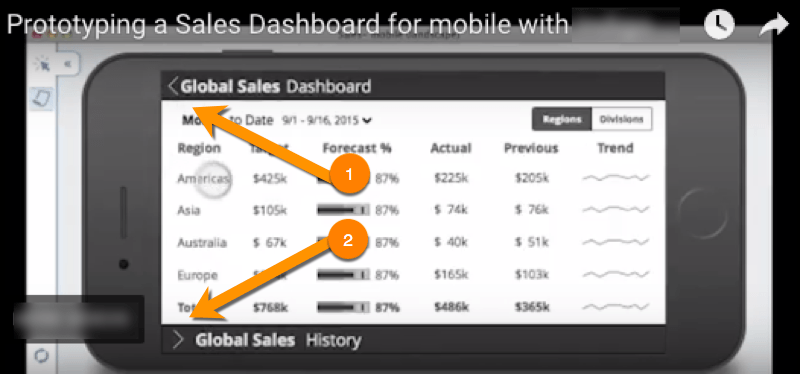
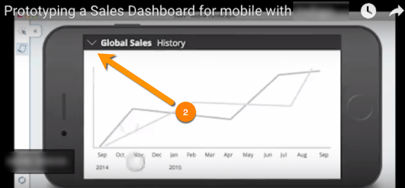
This example prototype captured from a promotional video illustrates how designers may mix up the affordance of chevrons and arrows and confuse the visual dialogues and our users.
There are some issues:
- Chevron numbered 1 correctly shows a return to a previous page.
- Chevron numbered 2 is to indicate an upward expanding tray or drawer, but uses a right-facing chevron with potential to move us right.
- On expanding the tray or drawer, Chevron numbered 2 takes the similar looking Chevron No 1's position. The continuity of control presentation may be compromised, or our user's orientation may be challenged. In either case, we may risk a poor UX.
Summary
Hiding content may complicate the UI. As with most UI strategies, it depends. Consider the show/hide techniques you can use effectively and employ the ones suited to the task and to your users.
A successful visual dialogue depends on a consistent semiotic (the match between the signalled, signal, and decoded). If our users' cognitive and motor expectations are challenged by change then we may obstruct their engagement and make for a poor UX. Test!
Reference this article
Godfrey, P. (Year, Month Day). Article Heading. Retrieved Month Day, Year, from URL
Contribute to this article
Please add your comments.