Defending the “hamburger” menu UX
First published by Pat Godfrey: August 2018
…
This article champions and defends the “hamburger” (☰) menu icon and glyph. It is fashionably and wrongly maligned as meaningless, which threatens our rare user experience of a universally recognised icon.
The glyph's obvious nickname, “the hamburger” has made it only a hamburger. Ill-informed designers and fashionistas appear ignorant of the glyph's semiotic conveying a content list—they actually believe it is a hamburger!
You know the “Hamburger” icon graphically represents a list of three items, yes?
A variety of new icons and pictographs are proposed and compete for sheeply support. Our users are threatened with learning new semiotics each platform they join. We will lament the rare universal reach of the ubiquitous “hamburger”. We must save the hamburger!
Shared Learning
Flag this content to your friends, connections, and colleagues.
Case for the prosecution
I believe the prosecution has overlooked the design and intention of the “hamburger” icon (its metaphore as a list) and taken as concrete the icon's “hamburger” nickname. Poor research, perhaps? I may be wrong or overly harsh? Recall, I am acting in the icon's defence.
Among others, dribble.com think the “hamburger” icon, “isn't that meaningful”. In the video below, UX consultant, Joe Leech (@mrjoe) devalues the “hamburger” icon as meaningless.
In this video snippet (at 23 minutes 35 seconds), Joe makes his case that the “hamburger” menu is a hindrance and has no metaphore or semiotic for a table of contents or menu button interaction. It's a hamburger. He says that swapping a navigation block in smaller viewports for a “hamburger” is:
…annoying people, making them upset just because you changed a basic interaction…
Case for the defence
The fashionistas bolster their portfolios with interaction Marmite. It shouldn't be that way. Not for the “hamburger” icon. We should all love it for what it is and what it achieves for our delightful user experience.
Borrowed beliefs
"Borrowed beliefs" about UX and UI design can prejudice a design studio's success. Always check the facts. Watch an example "borrowed belief" story shared with me by my good friend, coach and mentor, Brad Allen.
Responsive navigation design
UX consultant, Joe Leech (@mrjoe) makes a dramatic argument against the “hamburger”. He claims that when a navigation interaction changes from a visible selection of anchor links to a sole button requiring an interaction to show the same navigation anchor links, it annoys people. Is his research peer reviewed? Was it universal or in strict context of a lone product?
Perhaps Joe confused the “hamburger” representation of a contents list with the  more commonly used to launch settings and options lists in his research? Regardless, he clearly doesn't know the “hamburger” metaphor. Obviously hiding Search behind the “hamburger” or needs a careful justification.
In defence of this presentational swap, it is seldom if ever the only visual component in the viewport to update its presentation or position when media queries update the presentation on expanding and reducing the viewport width.
This website avoids presenting a traditional navigation bar. All viewports share the same “hamburger” experience. Does Joe's point about the responsive presentation update to a “hamburger” from a navigation bar apply?
Joe's New York example in the video above is valid, of course. "Hiding" a single or lone key item behind the “hamburger” is not often sensible; two clicks where there should be one; two cognitive loads where there should be one; etc. And obviously hiding Search behind it is far from optimal cognitive design!
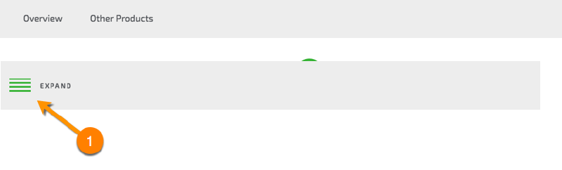
In this example it seems a waste to execute the switch to a “hamburger” menu for only two items, Overview and Other Products. Adding the icon's label, EXPAND makes it only silly if real-estate was the design driver.
Note: following my preferred 100% UX design workflow, the content-first approach would drive the UI design negating the responsive navigation presentation before more options were available. Find similar examples in my article, selling the UX short with 50% UI role.
Why iconise the Menu/Contents label at all?
Menu or Contents copy would do? Perhaps, Table of Contents or TOC? Oh, dear. There are so many labels to choose to signify a list of content or menu and each has a contextual, societal, linguistic, or cultural mantra. It is unlikely any one is universal.
A similar label example is those we impose on gender specific toilets; Ladies, Gentlemen, Women, Men, Gents, Male, Female, Accessible, L'homme, and Les Femme, etc. Replace the words with the right glyphs and regardless of style—and in some cases of language—we will correctly convey the semiotic and avoid embarrassment. The common Search icon and pattern is a great example, too.
Using the right icon improves the visual UX universally. It can remove the barriers of written language for one and present complex concepts simply using an universal visual language caveat finding the optimal alternative copy, which is beyond the scope of this article.
Why is the axiom to use the “hamburger” a good thing?
Design axioms should be a good thing. As always, that statement depends on the research base of any claim.
The key semiotic and psychological point here is that we do not perceive objects as THEY are. We perceive objects as WE are based on our own prior experiences. Our brains are each as individual as snowflakes. We are not fixed. We develop and adapt our perception, reactions, and consciousness according to what we learn. It's what makes metaphors work in UI design. We LEARN and quickly, too.
The problem with relying on learning is that it requires strategies to be successful. WE can easily overload our (each) unique brains with more information than we can process through working and into long-term memory. We can overload our cognitive processes and stop learning effectively.
As Learning and User Experience designers, we manage learning - the cognitive processes - by chunking information, promoting recognition, and simplifying.
Icons, glyphs, or pictograms are excellent visual strategies to chunk complex meanings in recognisable ways simply. They ease the cognitive load.
Change or confuse the axiom by introducing a new symbol and we create new learning challenges. We increase complexity and cognitive load. There is no recognition. Only work to decode the new semiotic. Confusion, hesitation, and fatigue build quickly into frustration.
Promoting design axioms universally aid our cognitive design and abilities. They are a good thing.
Why the “Hamburger”?
Once, all manner of concrete and conceptual glyphs and icons represented our digital content offer. None was universal; not before the “hamburger” arrived.
The “hamburger” (☰) really is the perfect pictogram to signify a menu or table of contents: a list. It visually represents a list: not a bulleted list, but a list.
The simplified glyph displays easily in the ubiquitous 16 x 16 pixel range and it scales seamlessly. It can be encoded within your HTML without an <img>, <picture>, or <svg> tag, etc. It is also a Unicode or HTML entity. For example, you can use ☰ in your HTML to create a ☰ icon within your copy and style it although you may not want to after reading this article as it is not natively a menu semantic.
As a show/hide button interaction the “hamburger” will manage a huge navigation menu that may otherwise clutter the UI and our UX. No wonder it is the go-to and globally user–and–designer recognised device.
The “hamburger” is universally recognised, royalty and licence free, accessible, usable, meaningful, and so easily learnable. What isn't there to like?
What's the beef?
The beef is in the hamburger, or more correctly the hamburger patty. The “hamburger” icon resembles a minced beef sandwich. And that's it. It "looks like" a hamburger edge on. If hamburgers didn't exist, then it may look like a Bertie Basset coconut candy and liquorice sandwich. Be thankful for the hamburger!
In turn the “hamburger” has been abbreviated to the “kebab” (among other names) describing when the three horizontal lines are compressed into three stacked dots like this ⋮, which is presented here using a vertical ellipsis ⋮ for the purposes of demonstration. No one is complaining about their kebabs? Let's not add semantic fuel using a symbol indicating omitted copy.
The “hamburger” icon's common entity's alter ego is as a Chinese symbol for Heaven or representing Jacob's Ladder. I think we may safely put that aside for now ? Some website menus certainly don't offer a pathway to Heaven!
What is it then?
The “hamburger” icon design is attributed to Norm Cox . He needed a glyph to indicate a show/hide list interaction in the Xerox Star UI. The list could have been two to ten or more lines. Three(1) looks great and is easy to cognate as a list as designed.
For that reason alone I will defend the “hamburger” icon to the end of time.
(1)Note: Apple has reduced the three bars to two bars. Talk about, “where's the beef?!”
As a button, its concrete affordance is to be clicked and its conceptual axiom a real-world button to be pressed. The device is simple and learning it is a low cognitive load. The more universal it is then the lower that cognitive load becomes.
On clicking the button decorated with a “hamburger” our user can expect a universal interaction to take place. A navigation menu or table of contents will display.
Where do we put it?
It depends and certainly not in the trash!
Contemporary comments indicate that local usability testing on hand-held devices (smartphones in portrait in particular) indicate it should be within the sweep-radius of our users' thumb. A variety of precise locations are proposed at the base of the screen. Many "studies" appear to fail to account for Left or Right-handed preferences.
Joe was certain that website navigations should go at the top or left of a page. Again, this does not allow for our users' preferences and only announces a popular myth formed from the visual "F pattern" usability studies of the early 2000s. I confess that I have not read much around this of late.
In my early UI work, I was keen to enable the navigation to float to whichever side our user chose when updating a setting. This is still my preference. In reality, few teams have the overhead even such a simple interaction demands.
On this website I have considered the menu button to be a persistent navigation device, which like Settings and Search shares the axiom of top-right. I've gone with that.
Beware imitations
The list appearance and the axiom to use a “hamburger” is very similar to icons depicting opening a text document or, in Google's case a transcript. The graphical differences are only slight. We must optimise our presentation, context, and support aids such as careful placement, scale, and instructional copy.
As always it depends. Evaluate.
An improved metaphor?
Fashionistas cannot see a list. They see a hamburger. Perhaps a more conceptually concrete metaphor will help them to apply the “hamburger” axiom universally?
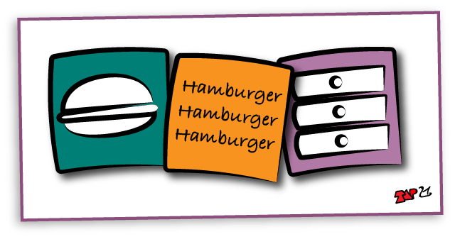
Chest of drawers
My favourite alternative metaphor for the hamburger’s three lines is as a chest of drawers.
Draws are employed in real-world museum interactions and of course throughout our homes and workplaces. In museums, visitors are often encouraged to open drawers to discover new learning opportunities. In the office and home we organise the drawers and their contents into ontological orders.
The real-world use of drawers to categorise, store, and access contents is a great fit to the “hamburger”?
From a Learning Design and Information Architect angle the drawers are comfortable and familiar to the sorting, storing, and display of content. The same applies to many of our users save cultural differences replacing expensive drawers with shelves. And shelves still fit the “hamburger” axiom, right?
Use the “hamburger”
Given the universal recognition of the icon's representation of a list (or drawers), the availability of Unicode and HTML “hamburger”–alike entities, or otherwise ease of creation it is equally useful and convenient to our stakeholders, developers, and to our users.
Calling the icon using CSS or scripts to swap out a visible label makes it entirely accessible to alternative browsing technologies. Decorative transitions and transformations can animate the “hamburger” glyph into a Close icon caveat swapping its accessible semantic. It is far from redundant or dull!
And finally, research whether the transition from a full navigation bar to a “hamburger” in responsive presentations annoys your users in the context of each application or website. Joe Leech may be wrong about the “hamburger” axiom being a hamburger and its universal appeal but he is not an idiot. You are the designer. Its use depends…
Using an HTML entity
Using an HTML entity is all very convenient and while being mindful of the semantic, particularly as understood by alternative browsing technologies, is perhaps the least ideal “hamburger” presentation method.
The glyph does not convey the semiotic required to indicate a menu or table of contents. There are issues you may encounter with cross-browser presentation, too. These are not insurmountable. However, why work so hard when there is a semantically correct method to create and present a “hamburger” icon available?
A fun exemplar of the HTML entity's utility and a discussion on its cross-browser issues are included in the figures below.
☰
<p><span class="styledemo">☰</span></p> <style> /*CSS style declarations…*/ .styledemo {… } </style>
You may not experience the (Chinese) ☰ entity in Android or other browsers. Test.
You can replace the ☰ glyph ☰ with ≡ ≡. It is possible to script a browser-specific replacement being careful to include a CSS string to update the default font-size and position. You may also choose the cross-browser entity.
Having discovered this, I may reflect on my occasional use of the ☰ entity and I am experimenting with a script to enable the use of both. Recall, I am NOT a JavaScript developer and my habit is to use HTML block elements and CSS with accessible HTML copy text! Check with your techies.
… //Detect the Android platform: if(isMobile.Android()) { //Detect the class of "hamburger" to update and style it: $(".android-hamburger") .html("≡") .css({"font-size":"2em","margin":"0","bottom":"0px","display":"inline-block"}); }
Important: This is only academic and largely nonsense. The preferred method is to create the “hamburger” icon using a semantically correct method. Our alternative browser technologies will then identify the HTML copy text instead of meaningless Unicode entities with their mixed semantics. Find an example below.
A semantically correct method
Using a code entity is not ideal for many reasons including accessibility.
Using non-semantic empty containers to build the icon graphic and including semantic (accessible) HTML copy allows you to style and animate the presentation while maintaining the semantic and therefore accessibility. For example, this website's “hamburger” icon presentation animates into a Close icon when active.

<button id="menuStart" aria-controls="menuPanel" class="not-pressed" aria-pressed="false"><!--displace the [span:first-child]-->
	<span>Toggle Menu</span>
	<span class="bar1"></span>
	<span class="bar2"></span>
	<span class="bar3"></span>
</button>
<style> /*CSS style declarations…*/
#menu-start {…
}
</style>
Note: the “hamburger” includes a span of text. This is moved off the viewport using the CSS left:n px; technique advised most accessible in WebAIM's 'Invisible content just for screen reader users' article. It is NOT :hidden by JavaScript and remains accessible to alternative browser technologies, which should convey the button's semantic function of, “Toggle the Menu”.
Summary
From our users' perspective, why fix what isn't broken?
Use the “hamburger” where and when it is universally recognisable. If the metaphor of a list is lost to you or to your users then introduce the axiom as a chest of drawers or shelving. These are universally recognised from our environment after all and perhaps more easily imagined than a list?
“The hamburger” is a pet name. Use it only inside the design studio. It is not descriptive of the icon's true value. It is not a hamburger. It is list or a chest of drawers to our users; the go to button interaction from which to access our content.
Now I'm hungry.
Reference this article
Godfrey, P. (Year, Month Day). Article Heading. Retrieved Month Day, Year, from URL
Contribute to this article
Please add your comments.