Selling UX Short With the 50% UI Role
First published by Pat Godfrey: September 2017
…
"UI design" has wrongly become confused with art direction or visual design.
Great UI design is 100% UX
UX and UI design are not graphic design or art direction: they feed it. I am a 100% UX designer and I shine brightest when paired with 100% art direction in a team where every specialty has a 100% UX focus. I use 100% UX methodologies to design an inclusive, accessible, usable, and learnable UI. My strengths do not lie in graphic design although my skills will feed the art direction.
I believe the 50% UX and 50% "UI" (art director) recruitment and design myth has been encouraged by graphic designers uncertain of what UX is. They now recruit like for like.
Perhaps the enterprise doesn't know what UX or UI design is, only that it is needed? UI design and our users' experience of it is much deeper than its visual appeal, or who likes it.
Mistakes, compromises, and ignorance
We all make mistakes, compromises, or have so much still to learn. There are examples of each on this website, which I have created solo. As a part of a multidisciplinary and 100% UX team, we can only improve our individual impact.
Shared Learning
Flag this content to your friends, connections, and colleagues.
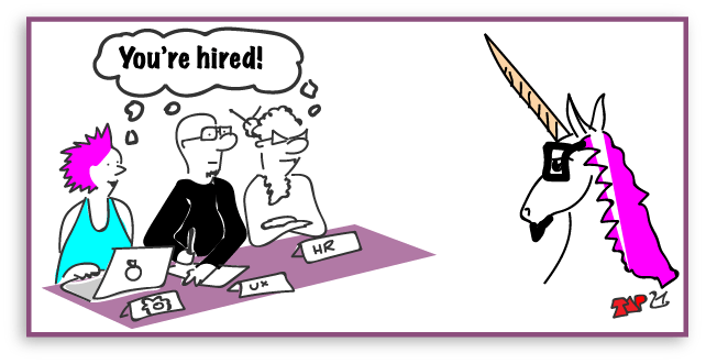
UX maturity and 'unicorns'
The term, "UX immature" describes an enterprise hiring a 50% UX and 50% "UI" (graphic) designer: a "unicorn".
It was coined during Ronan McConville's event, "UX Today & Tomorrow" hosted by Morgan McKinnley in Dublin on September 7th, 2017. Ronan's panel comprised Kelly Link, Phil Dwyer, Claire Bauden, and John Wood.
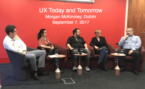
Learn more from Ronan McConville's event, "UX Today & Tomorrow".
UX Maturity is difficult to define. Do you know the signs..?
Designer flavours
It seems clear that an enterprise's UX maturity depends on what "flavour" of designer they specify to recruit, or promote to lead positions:
- Flavour A: a 100% User Experience (UX) and User Interface (UI) designer who understands the importance of great visual design.
- Flavour B: a 50% User Experience (UX) and 50% graphic design talent and art director ("UI").
I recommend flavour A: the UX and UI designer an enterprise needs to help grow their UX maturity.
If an enterprise wants Flavour B then maybe they believe in "unicorns", don't understand what User Experience is, or restrict the resources needed to assure their UX maturity and success?
What do UX and UI Designers do?
...the job title 'User Experience Designer' is becoming one of the most abused titles in the tech industry, full of fancy User Interface (aka, graphic) guys who’ve added wireframes to their portfolios and claim to be UX experts. Sounds harsh? Perhaps...
A light-hearted article by Emil Lamprecht, 7 Signs This Person Isn't Actually a UX Designer
Why are graphic designers so attractive?
Come on! Graphic designers are beautiful people! What's not attractive about them? Some even smell good. No wonder everyone wants to hire one even if they don't know what they're called any more.
They create smart art direction on what colours to employ, typography, white-space, and what shapes convey what. They can excel in the visual design of digital products and we cannot do without them in the presentation space. Graphic design is its own science!
It's just that our digital product is not all about the visual experience. Even fully-able users exhibit learning differences and preferences, cognitive and emotional complications, and a healthy distrust. They want great content, easy transactions and flows, and tasks that only meet their objectives. Looking pretty alone just isn't going to cut it. You need to partner up your graphics specialist with a 100% UX and UI designer to make best capitol.
And nor will a clever interaction-filled user interface crafted by your 100% UX and UI designer succeed without the close support of our graphic designer. They are symbiotic: not options.
I'm a 100% UX and UI designer and I work best with a team that's 100% UX inclusive of their specialties. I know the value of the graphic designers and their pink hair or fluffy beard, heavy rimmed spectacles and super-expensive MAC cases of envy: not for "skinning" a product, but for their collaboration toward producing best-in-class user experiences and conversions that work above and below the presentation layer.
They also communicate well with our developer and engineering friends - you know, in simple pictures they can follow and stuff... 😜
The 100% UX perspective of UI
UX and UI disciplines are not markedly different. Depending on the individual designers' backgrounds, the responsibilities will usually overlap around interaction design. UX and UI is symbiotic, each specialty with the unique insights that their 100% specialties bring. Perhaps we are all 100% UX and UI?
Our industry however, credits the 50% UX and 50% UI designer with giving great graphics (art direction) and a fabulous user experience. It may be true for some graphic designers. In the past, they were given the sexy creative tools. They attended (Macromedia) Flash and Fireworks training courses, etc. and by default, many became the interaction and UI designer de jour.
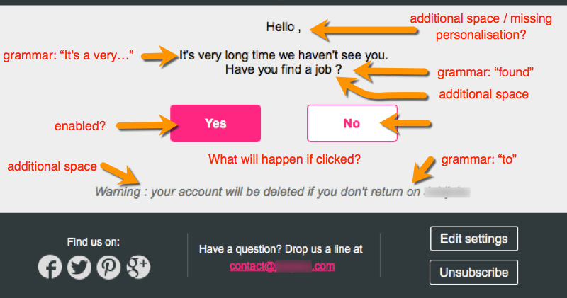
Received by email. Perhaps a phish, an ad campaign, or poor skills? It's enough to click Delete. As a part of my Universal Experience of this service, it demonstrates a lack of understanding and investment in our digital market.
Starting as a learning designer and early eLearning adopter, I took the same courses to test and prove my UX and UI design and to ensure it survived into production. I had to buy my own creative toys, is all: not that I'm still bitter.
Today, we are uncertain of anyone's skills in UX, UI, or graphic designer because the industry has made such a soup of our titles and requirements.
Is our graphic designer-cum-UI designer competent with the full-stack of UX or UI skills and knowledge that we expect of our 100% UX designer? Portfolios of finished pretty designs and skills with Photoshop may not demonstrate the depth of research and business acumen, empathy or creativity, or understanding of inclusive or technological UX strategies applied under-the-hood.
50% UX examples
The following are examples of superficially broken layouts and confusing contents from the random tabs open in my Google Chrome browser one evening. We don't need to look hard for issues.
Each example highlights the ragbag edges that can appear when your 50% UX / 50% "UI" (graphic) designer is spread too thin too quickly and when your team fails to follow a 100% UX design workflow, combining HTML-based design with quality assurance processes.
UX design does not stop with handing off to our developers, and forms a cohesive link in the quality assurance of our products too.
Learning from the Learning Industry
Our users are learning from the moment they open our page or app. They look for orientation to known patterns and are frustrated by the distraction and effort of learning new things they cannot use beyond our interface.
As users we instinctivly compare new experience with existing experience. The gaps between are where learning must take place. Design the UI to focus learning on your enterprise content.
There is too much emphasis on look and feel in 50% UI design and too low a priority on how we deliver our content - the learning - for our user.
Conversations about the presentation layer turn out to be very subjective. Instead of how the learner engages with content, there are personal evaluations of colour pallets, fonts, screen layout, illustration styles, etc. Of course screen design matters - but only when it serves instructional design. For some reason, we have developed a habit of jumping straight from structure, combination, and sequence to screen design...
...What's important at the presentation layer is the embedding of knowledge and skills.
Don Morrison (2004). p267 E-Learning strategies - how to get implementation and delivery right first time. John Wiley & Sons.
Cognitive or learning design is an essential part of the 100% UX workflow. We must design for our users' environment and emotional state, their preferences, and their learning styles.
As with everything in design, it depends. Within a busy classroom we may sometimes get wrapped up in the middle ground; the compromises between delivery to individuals and delivery to the median. Students either side of the median miss out and become disengaged. For example, the ideal learner group size may be 6. Why have school classes of thirty except to reduce resources supporting teachers and learning spaces?
This is a matter of resources. Limit the design resources and you limit the content's delivery to the median of users - a scalped bell curve of persona mediocrity. That is where 50% UI design is leading us.
Example1. Content decisions
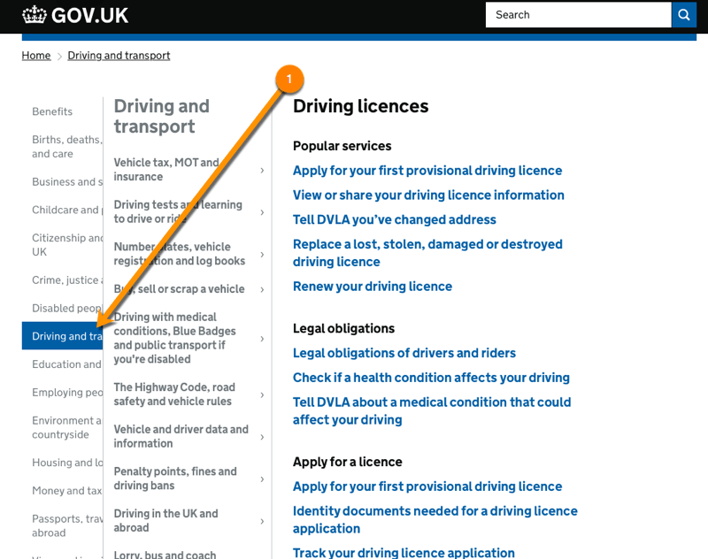
Our designer has chosen to sequence and number information from 1 to 3. On closing down the viewport width, the numbering disappears. If numbering is important to our desktop user, then it is important to the smaller device user. This is an example of fitting the content to fit the UI. Don't do it!
There may also be an argument for the action button to be right-aligned, whether to the overall width, or to the width of the text container. This may give a more useful left-to right visual task flow and strengthen the indication of a user journey "onward" to new information as indicated by the action button directional arrow.


You will notice that my own hand-coded website menu is collapsed as a "hamburger" or more correctly "drawers" at all viewport widths. As the number of menu items is growing, traditionally I might employ an expanding and collapsing tree strategy to organise them in a navigation button bar.
Reducing the click-to-reveal motor effort to just one click for all users feels the best UX solution. The UX is the same across all viewports. Our users are savvy to the design dialogue, which is now almost "standard" across digital products.
In this example there are only two menu items. It seems a waste to do the "hamburger" switch? If the designer had used a 100% UX design workflow, the content-first approach may have driven the UI design and negated the menu presentation update across viewports.
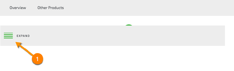
Which would you choose? For me, I'd leave the two options on view although, like when deciding to update a radio-button array to a select list; it depends on the content, context, cognition, and communication.
Example 2. Enable learning
Goodness me! How can our learning provider be so restrictive when their strap line is, "Learn your way to success" and personal claim is, "teaching is what I do best"? That sounds like a 50% UI designer to me. 😂
If our learners want to race ahead in their learning; to browse, or explore modules then let them. Who are we to dictate their learning styles and preferences? That's an important lesson to carry over into our UX design.
Example 3. Link writing for UX
In addition to accessibility and usability guidelines on writing for the Web, there are many writing 'standards' available to aid us in our writing for UX. We should start with the content, after all.
Given the authority of the (UK) Government Digital Standards (GDS) it is perhaps incredible that their GDS page should demonstrate the following example of poor link experience design.
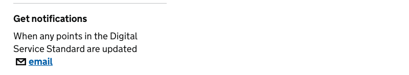
In context this is as an invitation to send an email. The aim is to arrange to receive an email notification after subscribing to the service.
Our users of alternative and assistive browsing technologies navigate page content by headings and links. Although there is possibly a class="related-item micro-data strategy in place, this link will be announced like this, "email". It doesn't describe our user task accurately and therefore, at all.
<aside class="related">
<div class="related-item">
<h2 class="related-item__title" id="related-subscriptions">Get notifications</h2>
<p class="related-item__description">When any points in the Digital Service Standard are updated <a class="related-item__email-link" href="/service-manual/service-standard/email-signup">email</a> </p>
</div>
</aside>
The situation is not improved for our "able" users. The email link and icon certainly invite us to send an email.
I remind you that this is on the GDS Standards micro site. Will the GDS team discover this in time or through analytics? Maybe. I wish them well.
Improvements might be:
- Get email notifications whenever the Digital Service Standard is updated
- Email me when the Digital Service Standard is updated
- Subscribe to Digital Service Standard updates
- Receive Digital Service Standard updates
The exact solution will depend on our diverse users' understanding. It will need testing and developing.
Note: these examples will pick up this site's external link icon style, which may not be approriate for the GDS site.
I've explored Writing for UX by not writing 'Click Here", and to Write for UX using "click" rather than "Tap" to promote World Peace. Your digital copy editor will provide more insights - if possibly less peace.

If the UI button's affordance was more "clickable", then our 50% UI author may not have felt the need to write, "Click Here".
"About Our Online Courses" or at a push, "Find Out More" could work fine?
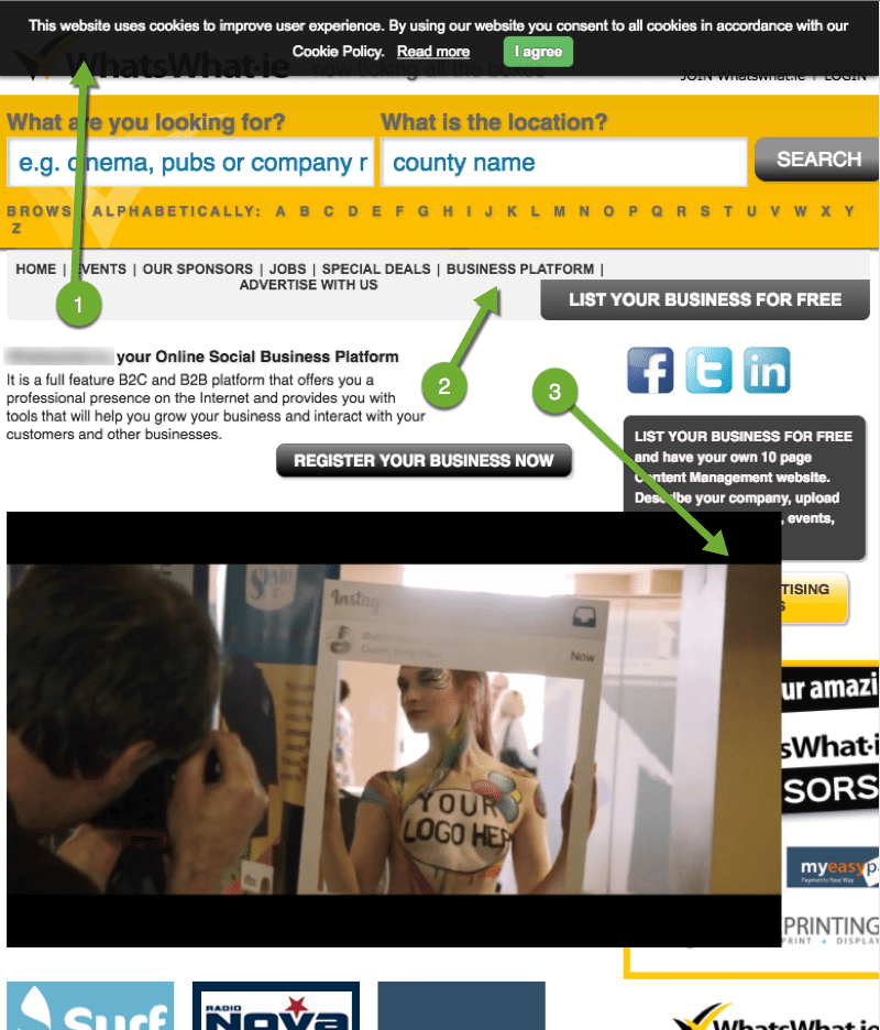
Example 4. Responsive design
In this example, it seems that our designer has deliberately chosen to slide the navigation list panels over one another as the viewport shrinks. They may be attempting a semantic-search strategy. The result is a hardly usable when browsing contents at a mid-range viewport width.
The UK Government Digital Service (GDS) is developing design processes in a transparent and inclusive way. It looks good with many great promises such as their progress toward problem solving with a design sprint relating strongly to my own Agile experience during my time working with HMH, Dublin. Perhaps they just haven't imporved this area of the site yet?
This is a busy UI with a less than optimal visual UX - or appeal.
- The cookie panel obliterates the header so we cannot orient to the brand or what site we are on.
- The site menu looks like breadcrumbs. It needs to be promoted and is messy: featureless, compressed, the upper-case risking readability, and it is drifting from centre and further hidden as the viewport is collapsed.
- The video is not responsive. If our user collapses the viewport width while the video is playing, it disappears from sight but can still be heard.
The disappearing video wasn't a design decision made in respect to our mobile data charges, but in reaction to its lack of responsive presentation. Is it a lazy or unskilled compromise resulting from a botched video presentation made to fit a UI design created with aesthetics in mind and no digital insight? I so want to fix this site!
We don't have to design "mobile-first" but we surely should develop mobile-first.
The "tell" is the left alignment of the screen-grab tiles in the narrower viewport, where the visual dialogue is clearly to center-align everything. If the media queries were encoded "mobile-first", the alignments would match.
Responsive or adaptive design responds to the size of the viewport when loading a page. Fluid Responsive Design responds to the dynamic width of the viewport while we or our software adjusts the width.
When using Google Ads' "responsive" setting the advert breaks when situated within a Fluid Responsive Design philosophy.
Although claimed an "improved user experience" it is not the one we should expect post-IOS 8 in 2017? I think the "Google gods" can do better? Perhaps I can help? I'd so love to work within Google!


Example 5. UI alignment solutions
Building a digital presence "professionally" takes research, analysis, design, development, and evaluation such as that enabled within my own UX design process with ADDIE. From CSS2, we learned that we could not present our digital layout as exactingly as a print layout. With CSS3 and Design Systems, now we can.
Picking on Budget Website Vendors
Using budget vendors is a necessary compromise for small enterprises without the time or resource to DIY or "go professional". Sadly, a €500 service is unlikely to give a €20,000 result. However, if an enterprise must rely on their vendor for their digital growth, then even a graphic designer and developer partnership wielding trite templates "out of the box" should deliver at the least a minimal quality.
It staggers me how for €500, a team can create your content, shoe-horn it into a template like it's Cinderella's slipper, and complete the SEO for "top Google search placement". And then, I reflect and thank them for being there at all. Our small enterprises need any help they can get.
Developing a dynamic and effective website from the ground up isn't difficult for a correctly resourced team. I'm not a developer yet I can present something on a page. I expect anyone touting their web page building to do better.
Split too many of the specialist development team roles between too few resources and you head in to trouble.
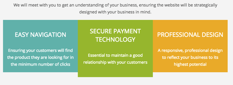
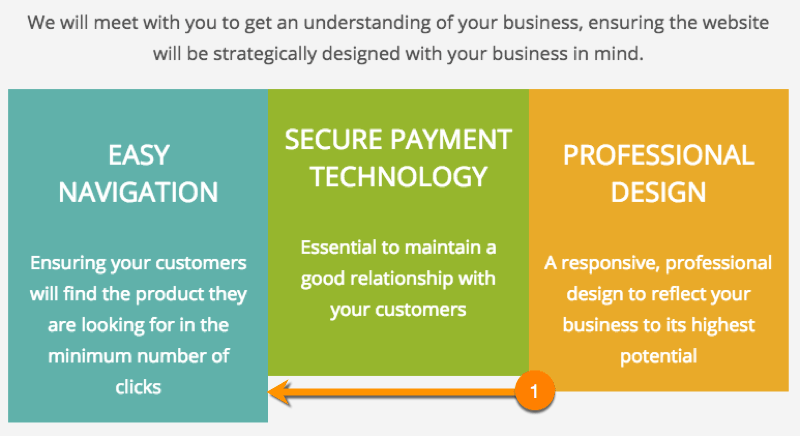
This is on the homepage of a website vendor claiming "a responsive, professional, design to reflect your business to its highest potential". It's quite an experience.
Is that too harsh? No. They take money and trust from our small business owners for this poor finish, which only demonstrates their poor design process and the paucity of any UX workflow or quality assurance conducted by a 100% UX designer.
Medium budget vendors
This example is from a "big league" WYSIWYG website vendor I was considering engaging with as a reseller to help small businesses. All I want to do is to send them a link to my article outlining my "Fluid Responsive Design Philosophy" 😉.
There is a poor insight or perception that viewports are fixed to device widths. "Breaks" in presentation caused by expanding and collapsing the viewport width are missed as testing is at set widths. This otherwise attractive team must work harder to deliver a more stringent quality assurance testing process like that described by a 100% UX design workflow.
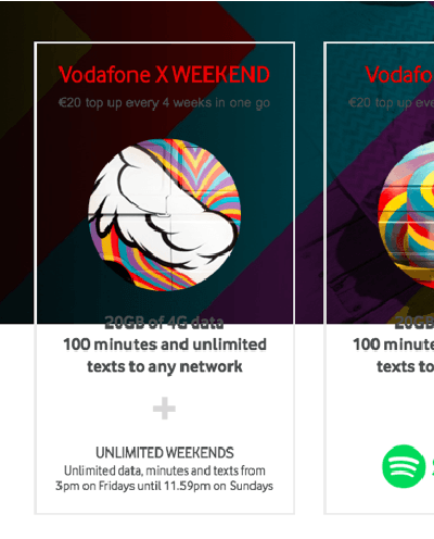
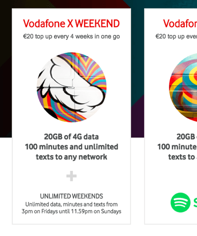
A smart workaround
We can totally control these layouts using intelligent HTML and CSS or we can create design capitol as Typeform have:
The designer has considered the escalation in price and service. The different panel heights are used to visualise a progression through the service levels. It informs our user at a meta-cognitive (or subliminal) level.
The developer has used Flex and margin-top: to control the alignment. We could give the panels a bottom alignment if Flex is contraindicated by our users' browser versions.
Whatever the technique, this visual strategy works, doesn't it?
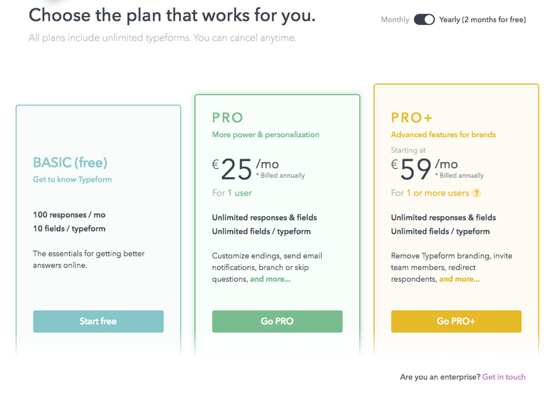
My only criticism is the subtle Monthly/Yearly switch being too subtle and positioned away from the centers of visual attraction where it may go unnoticed. Perhaps beneath could work? That'd be a great conversation with our graphic designer and also to test with our users.
Example 6. Graphic design
There are some interesting and some essential guidelines concerning placing text over images and contrast.
In a responsive environment, we should observe them closely. These two examples result from a lack of insight into digital presentation of typography and an abysmal quality assurance process, which would be improved using a 100% UX design workflow.
White text over a black and white image. Really?


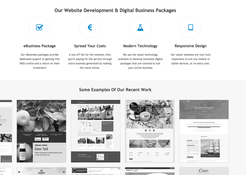
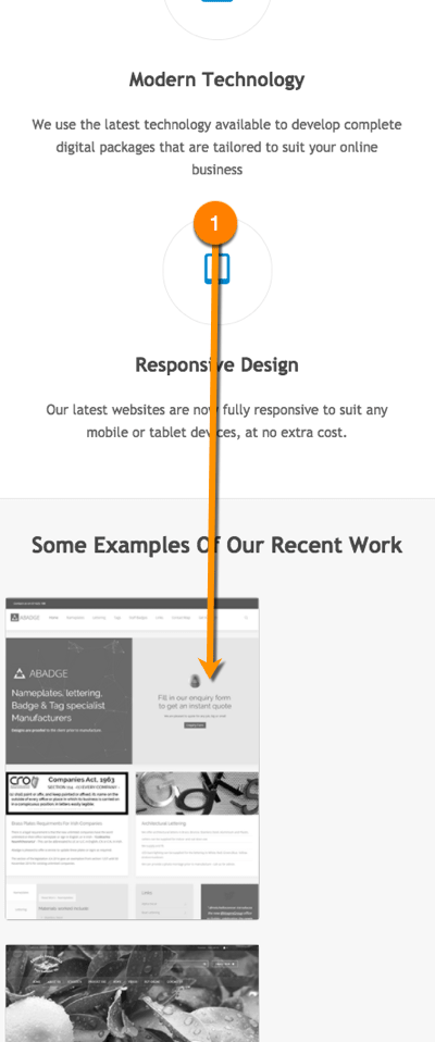
CSS3 brings with it new tools for making our 3-in-a-row content align perfectly. However, in these cases it may be the different icon graphic heights that have caused layout problems?
This may indicate a lack of a UX design workflow that would involve the developers and engineers in 100% UX and the UI (or graphic designer) would be asked to make the icons at a consistent scale within a collaborative environment.

Example 7. Trust and credibility
In their book, "White Hat UX: The Next Generation in User Experience" (available on Amazon.co.uk), Trine, Kim, and Martin characterise ethical and honest UI design as "White Hat". The antithesis is "Black Hat". In between lies "Grey Hat".
In this example of "Black Hat" or "Grey Hat" UI, we are hoodwinked into enabling permission for the company to sell on our personal data. The point is, if we cannot trust the owners to be honest here, what other conniving thievery are they up to with our account?
In this example, there are five data inputs. The visual user flow is marked on the illustration:
- Read the title and invitation
- Choose from the four select options
- Click Continue
The fifth checkbox option, "Participate in anonymous usage feedback" is checked by default on entering the UI and is positioned outside of the natural user flow. Why?
Our users are aware of their security and data protection. If you are found to obscure their choice to participate in what may be perceived as invasive data gathering then you lose trust from the relationship. Why do that? What are you hiding? You are only showing that you are prepared to be sneaky.
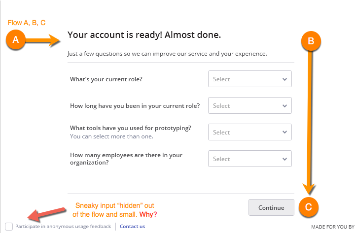
I suspect our 50% UI designer felt a compression for UI space or was acting on a stakeholder's borrowed beliefs described by Brad Allen, and their instruction to de-emphasise" it? The Contact Us is likely there only to cover the crime! 😂
Be honest! Ask your customer in the open and explain the benefit, the "what's in it for me?" It will take more space in the UI and pay back in dividends. Communicate with our consumers. Do not "hoodwink" them?! If it's naughty - don't do it. Simples. Our user's universal experience of our brand is just too important.
In this case, move the option into the visual flow, or uncheck it by default. An explanation of, "what's in it for me" as an enterprise and user will benefit.
Example 8. Responsive video
An often encountered responsive video presentation error lies in the player's CSS and HTML scale attributes. Using a code Inspector, even a non-technical can fiddle with the settings until the player responds to our will.
A responsive video presentation supports our user's experience. It ensures the player remains in view. HTML5 video opens opportunities to style and transform the presentation, too.
My client outsourced pieces of video content to Brightcove. In one instance, the host page HTML presented such a poor user experience for our platform users that I investigated, created, and shared the solution with the Brightcove agent - for FREE! Our own users' experience came first.
Brightcove had not deployed a solution by the time I left the client team. (Shrug).
Note: stock video-background music can drive you nuts. I compose and produce my own video-background music: I design the experience of being driven nuts 😜.
It can happen to us all?
Every day, you use bad products. Websites that don't make sense. Doors that open the wrong way. Things built the easy way or cheap way, rather than the right way.
…big companies employ mediocre designers as well as excellent ones. There’s no guarantee that a solution is right just because it’s on a famous website. It might just be there because no one got around to changing it.
P.2, P.118, Bowles, C. and Box, J, Undercover User Experience, New Riders (2011).
It can happen to us all, but should it? Vodafone has a huge and talented team of designers, developers, and engineers. Even a large team can suffer an "issue" or a bug. The 100% UX process is an on-going one. Test, test, test!
Here, their <div class="plan-layout"...> is missing a CSS background: colour attribute possibly in their ...simplicity_1/ pbw_youthoffer.css? _1505140702000 file.
At first, I thought this was a simple fix. In fact, their site is a bit of a UX mess (September 21, 2017).
Here's the UI fixed using Google Chrome's inspector to insert the missing CSS attribute.
There again, the UI is a little messed up in general. On scrolling, the copy text disappears into the hero background image, which is intended to give a (W3C-style) 2D "parallax" effect. It must have been a Friday...😎

Perhaps design and testing is by device at fixed viewport sizes, so the layout issues show up only when users move their browsers around our desktops? It does seem a deeper issue than that. I don't mean to whinge...
Perhaps they have moved to "parallax" before understanding it: or perhaps the content is deliberately light to limit the damage? Either way, this appears to be a troubled UI led by untested graphic designs better suited to print output? (See the video example below). I do hope it is a bug!!
I'd like to see some ARIA attributes on the site too, to aid accessibility around interactions that update or hide the UI.

Summary
Our products will always have UI "issues" at one time, or another. Building a digital environment is complex. A 100% UX workflow will result in many less issues because the team works more closely together to identify them throughout design.
Many of these UI issues appear superficial. If a client is wanting to pay a gazillion dollars for a digital platform or to subscribe to a Standard, then we need to know that the vending team can identify and manage simple issue in their own environment. These issues need a higher priority. Else, how will the vendor manage our product? Each issue is then very expensive.
100% UX design involves the discovery and the solution of our users' emotional and environmental needs, differences in learning and activity styles and abilities, conservation of motor and cognitive effort, engagement and motivation, and above everything sequenced information.
The visual UI design is a part of the experience, but it is not everything.
Return on investment
If you want a 50% UX and 50% (UI) graphic designer you will get 50% UX and 50% UI that looks great, and may fail to achieve your mission. You may believe that you are saving on payroll, but the time taken to fix pretty and broken products, or lost in losing emigrating customers will quickly compensate any perceived additional costs in hiring both a graphic designer AND a 100% UX and UI designer.
The compromise may show issues such as the examples above. Worse, if the department is run by a graphic designer then visual design and art direction may overrule sound UX research and design. The issues may never be identified because maybe "the lunatics have taken control of the asylum"?
UX is deeper than the presentation layer. Be sure to engage a 100% UX designer.
Engage a UX design workflow
Both the graphic and UX/UI designers should communicate design using HTML. Illustrations in Photoshop or Illustrator are for their own consumption, not the team's. Combine their specialties with a modern 100% UX design workflow, and your products will be researched, designed, and executed optimally. The world of 2D static illustrations and specifications will break on our dynamic viewports.
Note: for strength in depth, consider adding a business analyst and copy-editor to the team and flow. It's worth every cent.
Reference this article
Godfrey, P. (Year, Month Day). Article Heading. Retrieved Month Day, Year, from URL
Contribute to this article
Please add your comments.