Applying a UX Design Workflow
First published by Pat Godfrey: July 2017
UX design workflows will differ between products.
Workflows that start with visual design are selling out the UX and will take and cause more effort than workflows based on research and content. In today's competetive digital marketplace workflows must and can only be 100% UX.
The workflow is akin to ISO 9241-210:2010 Ergonomics of human-system interaction -- Part 210: Human-centred design for interactive systems.
Shared Learning
If you think this content is useful to your Friends, colleagues, or connections, then please consider flagging it to them.
I love to Experience Learning Too. Your feedback is welcome.
The UX workflow
The Design Process and the Basic User Journey inform each stage of the workflow from research to evaluation. The workflow involves the collaboration of our users, our enterprise, and our whole team - each operating as 100% UX participants.
The 100% UX workflow may create fewer "deliverables" and be more streamlined. For example, an HTML wireframe files may evolve into the completed product with the team's understanding and input over the project period. The HTML wireframe files act as the content inventory and copy script, the interaction and UI design, and test bed. The fidelity may even be fit for production!
The 100% UX workflow is totally flexible to each designer's environment and preferences. Ideally, the whole team owns the process: everyone is 100% UX. The process is never set in stone. It evolves as experience and success builds.
In some situations screen grabs and proprietary wireframes suit our audience better. UX and visual designers may need to share ideas rapidly, or the vision may need communicating to stakeholders at outset. These are possible sub-processes within the overall 100% UX worklow. As with anything in design, it depends.
Note: Read more about my Design Process and the Basic User Journey.
The argument for a 100% UX workflow
All UX workflows benefit being flexible to the constraints and opportunities that evolve or emerge throughout a project or Agile cycle. Ridged "Photoshop" visual specifications or interaction wireframes increase the effort needed to adapt to change, which will lead to frustrating compromises in time, resources, and effort.
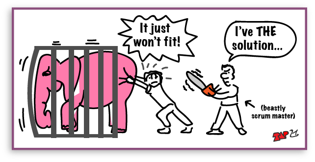
UX job descriptions reading, "...wireframes using Photoshop, Omnigraffle..." fall short of the maturity now required of our users' expectations of UX. A great universal and user experience design starts with research, analysis, and content: not scaled and finished artwork. (Read my article, Selling UX Short with the 50% UI Role for more on this).
The content that is needed must guide the visual design and not become subordinate to it. A fluid-responsive philosophy will adapt to content changes where fixed "composites" may not. Differences in the browsing needs of our "mobile" and "desktop" users need to be accounted for adaptivley. Performance issues, security, and data protection need designed for, which can only be included in the UI if our 100% UX team is involved in the design process.
A 50% UX and 50% UI (graphic) workflow is both a compromise and a risk.
A 100% UX workflow supported 100% by the UI and informed 100% by the team is a unified solution.
The business case
A UX-focussed workflow will benefit a product in many ways including:
- Improved content, flow, and presentation. Less bluff, bull, bells, and whistles.
- Changes are easily made throughout design to deployment.
- Ability to continuously involve stakeholders and our users with research, testing, evaluation, and insight.
- Early if not immediate identification of process issues at design-time: Quality Assurance over Quality Control.
- Less wasted resources creating speculative specifications or other documentation that may not survive Release.
- Improved team collaboration and engagement with the product.
- A 100% UX.
There is only every advantage to the enterprise and our users.
Starting out
We need a UX plan. The plan is predicatable: no plan survives. (Unless the plan is made by the indomitable Bob Butler. They tend to survive.)
Plans serve as shared guidelines against which the team can react to changing circumstance and intelligence toward meeting a shared vision.
My own plan in the 100% UX workflow is to cycle through the (R)ADDIE design process and apply the Basic User Journey to each stage of research, analysis, design, development, implementation, and evaluation.
With our users', stakeholders', and team's input and skills, the product will evolve to meet our agreed aims and objectives with the best possible universal and user experience.
The plan will help steer the collaborative 100% UX workflow to uncover and solve potential issues and roadblocks much earlier than any UI-first approach will do. It may not provide a "design sprint", which is a "waterfall" methodology by any other name, and still head off issues and roadblocks early.
My preferred Research, Analysis, Design, Develop, Implement, Evaluate product design process ((R)ADDIE).
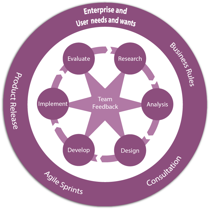
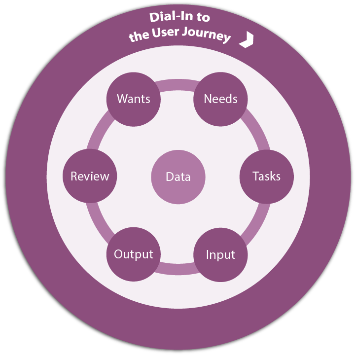
During each stage of the (R)ADDIE process from research through to evaluation, I consider the user journey against the enterprise's wants through Needs, Tasks, Input, Output, and Review the implications.
Note: Read more about my Design Process and the Basic User Journey.
Following the UX workflow
The workflow is flexible and iterative. It is not a compulsory checklist. It is a guide to practice (a plan) that can survive the Agile Scrum process and will invite active input from our full 100% UX team. It may even save us all work!
| Workflow Stage | Activities |
|---|---|
| Preliminaries and Understanding | Project set up, initial research and analysis, competitor analysis, and perhaps early workshops take place.
The designer will research and understand the enterprise and known user needs, constraints, and opportunities. |
| Research | Definitive user, enterprise, and competitor research and analysis is planned and takes place to prove or disprove hypotheses, borrowed beliefs, and other discriminatory distractions. Research is a science and best conducted by research scientists. And not everyone has that budget or resource. Your UX designer should be capable of designing meaningful user research. Enable them. Methodologies may include:
The whole team will benefit their involvement too. Research is not a specialist silo - or shouldn't be? |
| Analysis | The usefully making sense of and sharing research data may be abused to create theatre and to justify paybands. Done well, it leads and shares with the design and team a far stronger and user-centered communication of problems, solutions, and product. Methodologies may include:
Walls of stick-notes characterise the UX design process and are not necessary to it. The displays are a sharing device to include the whole team. Be sure to include the whole team! Everything that follows relies on the validity of these processes. There is no room to bluff - only pressure to compromise. |
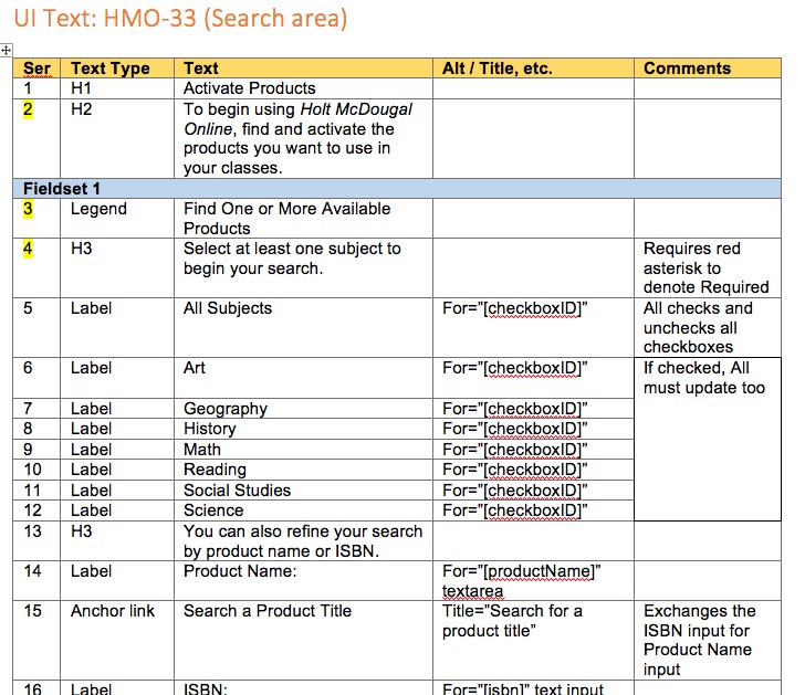
| Design: Content | Content is determined by and supports our user and enterprise needs and goals. Content design leads logically to an appropriate UI. The content-first workflow will identify accessibility, usability, learnability, and usefulness from the get-go. There are at least three content activities, which may be discrete, and may not follow any specific order. The Content Inventory is invariably the first phase. It depends! |
| Content (Phase 1): Inventory |
A list of high-level content areas and headings. A flexible, low-effort strategy for sharing, review, change, and expansion of ideas and idealisation of the user journey, UI requirements, and product architecture. As the team's intelligence and analysis develops the content inventory may already inform an information architecture and any chance of scope-creep within the product. |
| Content (Phase 2 or 3): Writing and Chunking |
The content inventory gains detail from an outline to script. A semantic HTML architecture will emerge including instructional copy, interactions and labels, and data presentations. Opportunities to chunk content will be identified. Accompanying notes or diagrams will inform the team of the user journey and risk of excessive cognitive or motor effort. This basic learning or cognitive design period is to review and update content and the design intention in one easy-to-edit and (visual) distraction-free space. The tools of choice may be a text editor and, or a simple HTML wireframe. It depends. Writing should match the corporate style and a voice shared with our users:
Consult with the team and the visual designers early to avoid surprises! And if your UX designer can't write so well? Then bring in a writer to work with them. It'll speed the process up and set a high quality mark. |
| Content (Phase 3 or 2): Layout |
The draft HTML wireframe will evolve with the stakeholders', team's, and user sample's understanding and input. Being simple HTML, it is easy to update: certainly easier to manage than updating "PhotoShop" specifications at this stage! The content inventory coupled with our detailed script will inform the UI in essential areas such as input labels and elements. Supplementary and optional content is also identified. Copy editing will be easiest and most effective at this stage. Test with users. |
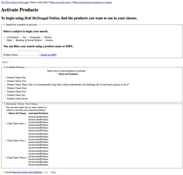
| Design: Wireframing | When the content is finalised, design patterns can be applied to the wireframe to meet the "specification" inferred by the content. Semantic HTML elements assure an accessible and usable interface. Sometimes we must create and test larger widgets. We must now strengthen our conversation with our visual designer. They can work live (perhaps with assistance, but ideally they are HTML and CSS-savvy) with the wireframe presentation and take screen grabs where images serve communication best and manage stakeholders' expectations. Ideally, the HTML wireframe will become the visual specification. No PhotoShop! Be cautious with presenting visual design and distraction too early. There is a reason wireframes start off "vanilla", or more likely grey. With care, we can develop our wireframe using external CSS that can be "switched on and off". This may take effort to plan and to manage. The investment is worth it. For more complex interactions beyond our developer skills, a wireframing app like Axure can be used to illustrate our ideas. Test with users. |
| Progressive Enhancement | The HTML wireframe is evolutionary. It will evolve quickly under the scrutiny of and feedback from our team. As fidelity is enhanced, so user testing - using the wireframe - may be appropriate. (It is still more efficient to adjust the wireframe than a visually constrained Photoshop template). |
| Design: Prototype | As the cognitive, content, contextual, and visual design elements embed, so the simple text-only wireframe will evolve into a working prototype. Stakeholders, business analysts, engineering, and designers can each add and test complexity. User testing is enabled within a realistic environment. Wireframing software (such as Axure) may help solve complex data and interaction problems although it is more efficient to find solutions within our prototype. This is easy when our engineers are fully engaged in the design workflow and will save resources, time, and effort. Test with users. |
| Design: Performance support | As complexity is added and testing is achieved, the need for user performance support can be identified with considerable accuracy. Our users are unlikely to want or need a technical user manual if our design meets their objectives and expectations. Instead we should design user support to be available within our product. Support must be timely, contextual, accurate, and accessible at all times. It should be local, contextual, and in-line. Sometimes separate support documents or products are required: it depends. Support that is a part of the product design is key to its success and will avoid over-egging of its content, possibly by an external resource outside the team's design thinking and synergy. Test with users. |
| Development: Growing Fidelity and Deliverables | This workflow's return on investment is that our team's input and the the increasing fidelity of the prototype will become the product specification and style guide, and may evolve into the final product. No more PhotoShop? Well, that depends on how our UX and visual designers idealise, conceptualise, and want to communicate and garner feedback most efficiently. Their deliverable remains the shared HTML and CSS. And, test with users. |
| Evaluation: User Acceptance Testing | Our team and stakeholders may be impressed by our deliverable. If we do not test it against quantifiable and qualitative criteria, then our users may not be as impressed. It is good reason to involve a user working group in the workflow to identify areas for improvement during design when adjustments can be made easily. Leaving everything to the last day leads only to compromise or pressure on adjacent workflows. Be cautious with presenting visual design and distraction too early. There is a reason wireframes start off "vanilla", or more likely grey. With care, we can develop our wireframe using external CSS that can be "switched on and off". This may take effort to plan and to manage. The investment is worth it. |
| Release and Global Evaluation | Following this workflow as a team, there will be much less nail biting. The important design and development has gone to plan and with less effort than a "traditional" visual design first workflow. There is nothing as real as a release to our audience. The feedback, analytics, and insights we can capture directly from our live users will feed into the next rounds of design. With this workflow, we may be delighted to find our product works first time. As with anything for design, it depends. In this case, it depends most on the team's adaptation to and engagement with the workflow. |
Note: See an application of the Basic User Journey that enabled an 'eleventh hour' rapid understanding of, and design update of a failing UI, which may not have occurred had this workflow been applied.
Preliminaries, research, and analysis
Research and analysis methods will differ between enterprises and teams. The essential research should populate the hypothesised Basic User Journey through analysis of quantitative and qualitative data. Everything else adds value and hones accuracy.
Research needs a focussed design and also a flexible approach to respond to "curve-balls" our users and other participants identify for us. It does not need to be expensive. It needs only to be right for the product.
Deliverables
Researchers must share the research conclusions with the team. Stakeholders may want wider-reaching presentations to justify resources – and they'll get them. Only, should we invest in board-room presentations or the design?
Reports raised from research need to be formatted consistently. Findings and observations matter less than conclusions and recomendations. No one reads long documents (or specifications!?)
If every team member is to be 100% UX then every team member must share in the ramifications of the conclusions. Their experience and insight is invaluable toward imagining and implementing particularly novel solutions.
Note: Read more about my Design Process and the Basic User Journey.
Deliverables such as Journey Maps, walls of sticky-notes, empathy maps, etc. are not UX qualifications. Nor are the most beautiful presentations of user personas or other popular communications definitive UX practice.
Deliverables communicate research and analysis findings. That's it. And we choose the most appropriate to the task.
The content inventory
I coin the term, "content inventory" from Stephen Hay's book, Responsive Design Workflow. It can as easily be termed the content scope and scope can be ambiguous, so "content inventory" has entered my vocabulary.
The content inventory will differ between page, app, and content types: it will depend on what our users and our enterprise need. Consider our aims and objectives as well as our initial analysis of the Basic User Journey.
- Title
- Meta-data (description, keywords, code links, etc.
- OG and Facebook meta-data
- Heading
- Navigation?
- Executive Summary
- Introduction
- Argument
- Summary
- Comments
- Back to Top
- Footer
- Title
- Meta-data (description, keywords, code links, etc.
- OG and Facebook meta-data
- Heading
- Navigation to support?
- User name Label
- User name input
- Password label
- Password input
- Lost password link
- Submit button
- Footer
Note: At this stage you can already add, or have added by our developers a detailed HTML and CSS mark-up including Roles, buttons, values, etc. Engineering could add JS and database functionality too. It depends on your workflow at what stage these enhancements should or could be added.
The UX design focus must be the content at this point. If you rush ahead, then you will simply have more to update as changes emerge, which will force you into the common compromises of time, resource, and effort that we are trying to avoid. We are not a 50% UI unicorn charging through fantasy land and pooping rainbows.
Basic content layout
Using the Content Inventory, we can already build out a simple layout wireframe. Stephen Hay, in his book, Responsive Design Workflow, recommends adding the class of "wireframe" to the <body> tag here, which can be updated as visual styles progress toward a final product. This enables user consultation and testing to continue in a "vanilla" style and to test the evolving visual design by removing the class.
Don't get over detailed as we need to write the content yet. Even this quite detailed example is already a great content outline structure to work to, no?
<!-- WIREFRAME ID:00-00-00 -->
<!-- Pass questions and insights to Pat Godfrey via inquiries@learningtoo.eu -->
<!DOCTYPE html>...
<head>
<title>The Page Title</title>
	<meta name="description" content="...">
	<meta name="keywords" content="...">...
</head>
<body class="wireframe" itemscope itemtype="http://schema.org/Article">
<header>
	<nav>Navigation</nav>
</header>
<section>
	<h1>Page Heading</h1>
	<h2>Executive Summary</h2>
</section>
<section>
	<h2>Introduction</h2>
</section>
<section>
	<h2>Argument</h2>
</section>
<section>
	<h2>Summary</h2>
</section>
<section>
	<h2>Comments</h2>
</section>
	<p><span>Back to </span>Top</p>
<footer>
</footer>
</body>
</html>
Page Heading
Executive Summary
Introduction
Argument
Summary
Comments
Important: This is not the most exciting wireframe and before we go "skinning" it enthusiastically into a minimalist Photoshop or Illustrator masterpiece, we need to know what we are skinning. "Baby steps". We need to know what content is needed first.
Content writing and chunking
In writing for a modern, research-based UI design, the trick is to remove all content to create a 'zero interface', and then to add back what is needed.
Caution: if our design is too 'zero', then our users can become lost in the UI.
If we compromise learning and content design for minimalist visual fashion, then we may fail to understand what content is needed or missing. If our team is familiar with the UI, they may not judge what content is needed to support our user. Our user should be consulted.
Writing
The aim of writing content up front is to shape the design from the content out. Content is the first brick in the HTML wall, after all? For example, <label> or <input>. Certainly not the presentation CSS. Content should fit expected UI patterns. It may suggest new ones!
With the team, determine what is essential content and throw out what isn't needed. Par it down; test it out; apply existing learning, our users' and the team's experience. Start with just words - not interactions. What needs to be there and what is noise? Then start writing - not sketching or styling- but writing the fill-in content. Sometimes it is best to start with nothing at all and spot and then write only what is missing!
Note: This is a workflow, not a prescription. Use what works for you and your team and sell the advantages of this workflow to the neigh-sayers by involving your team in the drafting.
The sub-workflow could be:
- Understand the user journey
- Write the information, inputs, and data required to complete the journey
- Add the content to the wireframe
To be most effective, we should workshop and "sign off" with our team as we go. Working in a design silo risks needing to carve valuable time later to make changes as our own intelligence catches up with our team's collective viewpoints. It's why some design iterations fail despite all the hard work put in and compromise wins.
Important: We cannot bypass design but should work with the Basic User Journey within the Design Process. Good designers may create content in their head and better ones create short documents that can be shared with, evaluated, and improved by our team and users.
See an application of the Basic User Journey that enabled an 'eleventh hour' rapid understanding of, and design update of a failing UI, which may not have occurred had this workflow been followed.
Chunking
Semantic HTML mark-up and user journeys are chunking strategies available to us "out of the box" in web, app, and platform design.
Chunking is the learning or content design applied when organising information into easy to consume stages or groups. The convenient if incorrectly applied cognitive theory is that we memorise no more than 7 to 9 'things' at once. By chunking 7 to 9 things into each larger 'thing', then we may memorise more things altogether.
- Our user opens the sign-in page and is oriented to the platform and enterprise brand and feel.
- Navigation is to our Help and Home pages. Users can skip this.
- The sign-in form should be a semantic priority and the data entry task made clear.
- Information and support needs to be inclusively available.
- The Submit button is disabled before input rules are met.
- There needs to be a “Forgot password” process.
- Inputs are given focus when our user requires it.
- On validating an ‘error’, our user is informed of the error in focus, indicated the location of the error, and informed of the solution.
- On completing the task, the Submit button is given focus and enabled.
- On clicking the Submit button, our user is informed of their success and to wait for the platform to load its homepage.
- Our user may abandon the form by clicking on the logo or navigating away.
- There is no session time-out.
- Browsers must not store inputs for use on return to the page.
Writing as UI design?
It may feel counter-intuitive to write the UI copy before the UI design has been finalised as we would in a waterfall process? Yet as our writing gets more detailed, so will our thoughts about the UI design. Just be patient. The basic building blocks of our HTML UI are simply strings of text enclosed in semantic elements, after all.
We have an opportunity to specify our semantic HTML architecture here without the visual noise and constraints of a Photoshop layout. Forms can be forms with logical native layout using fieldset: headings, sections, and paragraphs, lists, footers, and rules can be seen to react to your content rather than your content needing to react to the UI. Our medium is HTML and CSS - not PSD or JPG files.
As user and universal experience designers we should embrace this workflow as an advantage. We can check on usability and accessibility without the noise of complicated or restricting visual adjuncts in the code.
Caution: There needs to be a buffer process between writing and adding content to the HTML. Our preliminaries and understanding may help us write directly to the HTML but even a simple UI HTML and accessibility adjuncts may add too much complexity to work with . WYSIWYG presentation may help, but working in a text editor should be our starting point. Some apps can generate HTML from your content. It depends. We do what works best for us, our team, and each project.
Note: sketching is not forbidden. Even with an established visual dialogue to follow, the designers are busy sketching to communicate and develop flows, etc. Share the sketches with stakeholders and during user consultations by all means. Ideally, no PSD, PNG, or JPEG files should reach our developers: skin in the CSS where possible.
<!-- WIREFRAME ID:00-00-00 -->
<!-- Pass questions and insights to Pat Godfrey via inquiries@learningtoo.eu -->
<!DOCTYPE html>...
<head>
<title>Sign In or Register</title>
<meta name="description" content="Sign in to or register for our great service">
<meta name="keywords" content="...">...
</head>
<body class="wireframe" itemscope itemtype="http://schema.org/Article">
<header>
<nav>Help</nav>
</header>
<section class=“sign-in-form”>
<form [micro-data required]>
<fieldset>
<p id=“instruction-for-sign-in-form”>Please type your <strong>Email Address</strong> and <strong>Password</strong>, and then click <strong>Sign In</strong>.</p>
<label for=“username”><span><span>Type your <span>Email Address<span> in the box provided</span></span></label>
<div class=“input box”>
<input aria-labelledby=“usernamelabel" described by id=“instruction-for-sign-in-form” type=“text” id=“username” name=“platform-username” value=“[]” placeholder=“Type your email address”/>
</div><!— x .input—>
...
[…end snippet]
The value of digital copy-editing
When working as an instructional or interaction designer or as a technical writer, I cannot over emphasise the advantages that a competent digital copy-editor can bring to your production team.
Writing style guidelines don't write themselves and there are times that the Microsoft Manual of Style just doesn't service the tone of your enterprise. A correctly researched and well developed digital writing guide is indispensable aide to improving the User Experience of any product featuring written content.
If we outsource the digital copy-editing, budget time to on-board the copy-editor into the workflow as well as into the team.
Progressing to prototype
We should know as designers that progressive enhancement is a good thing? Progressing our evolving wireframe collaboratively to prototype can only be a good thing too?
Even in an Agile Scrum and Sprint model, it is tempting to treat each Sprint as a waterfall development model: design, build, engineer, user acceptance test, quality assurance, and release in strict order. It's just not efficient. And bringing design forward of Sprint risks our team not paying attention to the detail until they come to develop and that only causes more turbulent Sprints and invariably, compromises.
This UX workflow highlights that regardless of our 100% [insert] specialty, we are all 100% UX. Collaboratively working on the content, its very basic layout, and its developing into a bono-fida UI involves everyone. Engineering can evolve their output in pace with and while informing the visual design, which is established from the team's vision and collective knowledge, experience, and skills applied to meeting the shared objective.
Wireframing and prototyping platforms and software tests and communicates UI complexity quickly. But how many UX deliverables do we need, really? As with everything, it depends.
Creating a wireframe in HTML and initally without CSS encourages the team toward a semantic flow and mark up. Who wants div and span soup now HTML5 has come of age?
Note the links at the top of the illustrated prototype are to different states, error management, and initial visual design. These will be unnecessary in a 100% UX worklflow.
End point?
With a team-shared and progressively enhanced HTML wireframe workflow everyone has produced the prototype; everyone owns it; all the team are stakeholders in its success. No one is only a secretary. Better still, that prototype has become the final deliverable. It's Done. There has to be advantage to this model over the "traditional" waterfall methodology veiled by Agile?
Most importantly, the UX is made paramount. Solutions overcome problems early. Solutions are easier to implement early.
A caveat
Writing smaller stories to the Agile backlog to progressively enhance a feature may not meet the utopic vision I have outlined here. Perhaps the vision could remove some of the need to write such small stories where the team's effort is more efficiently deployed? As with everything, it depends. It always does.
Snippets, templates, and design systems
Once your content has driven a great design, we can extract snippets and templates to speed future process. An Agile environment can present feature challenges and a design update and why "green field" every change? And our users benefit from consistency, don't they?
A shared library of snippets and templates can help any design or change process. Smaller snippets are easier to update and test globally than completed pages and can be pasted into new documents to create new features and pages rapidly.
Repeating content, patterns, styles, and standards can become your Design System. Shared by the whole team, you also have a rapid wireframing, prototyping, and testing resource from which each team specialist can draw resources to develop ideas before "bringing them to the table".
Everything you need to on-board new talent or to update features can be designed into the system, too. The return on investment is worth investigating, and as always with design, it depends on your enterprise, product, and team situation.
Example: when converting a platform with legacy HTML and table layouts into a CSS-driven presentation, we started to form a small design system.
Common HTML elements became "building bricks": self-contained units styled centrally and containing the label, input (with name, id, and value place holders) and validation message needed to be placed in almost any page. The now centralised scripts and CSS obviously took care of everything else bar a tweak needed from engineering for data requirements. The CSS became the visual styleguide too, removing a great deal of graphic work.
A change of UI that had previously taken a developer and engineering resource some days to complete could now be done in an afternoon including a coffee break.
Evaluation
Your designers and the team must remain appraised of the Roadmap. It is best to analyse upcoming changes together and be ready for when that first update Sprint arrives. And we must constantly evaluate our design. We can evaluate our work informally and formally, iteratively and summatively, internally and externally.
The analysis of our evaluations may feed or even correct the Roadmap. It is better to manage change early than to continually compromise? Compromise is too easy for our users to notice.
A googly example
Even the Google gods must evaluate. Our users certainly do! Here's an example to pick on for some thoughtful, and respectful fun. Google is a class leader with Material design, which is emulated by happy followers. Are the Google gods perfect?

When I encountered this UI I was immediately struck by my reaction to it: I clicked the Action Button. Without hesitation, I clicked it. And I was immediately soured for doing so and I had to navigate back to the page to discover and then watch the video. I had missed the Primary task!
Am I a dope? I hope not (it depends). So why did I click that button before experiencing the video content? I will explore the reasons here. You may not agree with my observations: we're all different, after all. This is only an example of an informal evaluation to encourage our critical thinking.
Who are we to criticise Google?
Gasp! Who am I to speculate, or to criticise the Google gods?
I am one of their users, that's who. I have my own UI preferences, experiences, and expectations; I am in my own environment and following my own physical and cognitive processes. I may not be entirely focussed on the UI or the task and only on achieving my aims to learn. That's who a user is. Even as an "edge case", when a user experiences a problem with our UI and content, then we should really pay attention?
In reality, I know that the UI is unlikely to have been "knocked together" without reason although I suspect the pattern has been re-purposed without much additional evaluation or design. I would like to know the research and testing that took place, else. What drove the UI pattern, or enabled its selection if it does not fully meet our user's needs (my own, certainly). I may learn something.
Do not squander or waste learning
I love to learn. It was why I was in the Google environment in the first place and learning is not always focussed or organised. It is a meta-process: learning occurs on all the time. It is what makes us human; that and ice cream. And to observe or to help our industry improve the experience of our UI for our users is one of my most noble aims.
We must never agree that just because Google (or another designer everyone looks up to) has done it, that it is de-facto or that we should emulate it.
Evaluation of our own and of others work is the only process that will lead to our improving our Universal and User Experience. We may not like what we find. We may take some of the feedback personally if we have put in the work I expect us to. The consolation is that we will Experience Learning Too! (A shameless plug).
...Big companies employ mediocre designers as well as excellent ones. There’s no guarantee that a solution is right just because it’s on a famous website. It might just be there because no one got around to changing it.
P.2, P.118, Bowles, C. and Box, J, Undercover User Experience, New Riders (2011).
A key takeaway
Yes, as our user I may learn the UI's visual dialogue over time. We could sit back and do nothing. Let our users sort themselves out. Our user is unlikely to go through our corporate feedback loop just to report this, after all. That's just lazy design! Our users' cognitive load is finite: don't squander it on their needing to learn our UI at expense of their achieving our objectives.
Evaluation should take place at every stage of the design process. If we leave it to the last prototype or even to release, then it is going to take a whole load more effort to fix anything later than if we fixed stuff before we built it. We must evaluate early and iteratively and always for our user, and not only to ask our users how they feel about it after.
Summary
The instinct is to draw layouts and form templates before the content has been finalised and in time for engineering to "do their thing". Then the content or layout must be compromised or modified to accommodate everything later. It can cause a great deal of additional effort and go unnoticed because, "the unicorns always did it that way".
Stripping back the work-flow to bare-bones content, bare-bones HTML and CSS, and then evolving the wireframe with the collaboration of our enterprise, team, and users gives maximum opportunity for change and a massive advantage to our visual designers given all the intelligence they need to make our content sing out first time.
The change from time consuming vector and raster layouts and PDF style guides to simple wireframes and evolving prototypes will ease the effort required by every member of the team. The team's involvement increases each individual's ownership of the product. The iterative nature enables testing hypothesise with real users early resulting in less effort put to making changes late, or later, or not at all.
So why does any recruitment for a UX or UI designer specify proficiency in Photoshop? Well, following an evening listening to a UX discussion during Ronan McConville's event, "UX Today & Tomorrow" hosted by Morgan McKinnley in Dublin on September 7th, 2017, I can confidently agree that it is because the enterprise represented, and maybe the agents representing them are "UX Immature".
Perhaps our and the recruitment industry needs to educate our clients and inform them of the most efficient UX workflows and maybe the 50% UI (graphic) and 50% UX practitioner "unicorn" should remain a myth? That UI design is 100% UX design.
Your Feedback
Please help to improve this and other articles in the series by leaving a comment using the Facebook plug-in or by completing the short Feedback Form below.
Leave a Comment
Feedback Form
If the form does not display, then please view the form on the Typeform website. (Powered by Typeform).